Stars & Stripes

Happy Birthday USA!

In May 1776, Betsy Ross sewed the first American flag. A year later in 1777, the Continental Congress passed the first Flag Act, establishing an official flag for the new nation:

“Resolved, That the flag of the United States be made of thirteen stripes, alternate red and white; that the union be thirteen stars, white in a blue field, representing a new Constellation.”

However, between 1777 and 1960, Congress passed several acts that changed the shape, design and arrangement of the flag and allowed for additional stars and stripes to reflect each new state. This broad span of time without specific guidelines resulted in many design interpretations – which in a sense also reflects the deeply rooted sense of freedom so cherished by Americans. The expressions were rich and proud, eventually evolving into the flag we pledge allegiance to today.

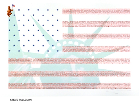
Carrying that theme of evolvement forward, in 1986 I discovered a beautiful book by Kit Hinrichs, called “Stars and Stripes” – a compilation of exceptionally creative American Flag images created by some of the finest graphic artists of modern time. I found it absolutely delightful, and a great tribute to the creativity and talent that abounds amongst us – and the creative freedom we’re able to enjoy in this great land of the free and home of the brave.

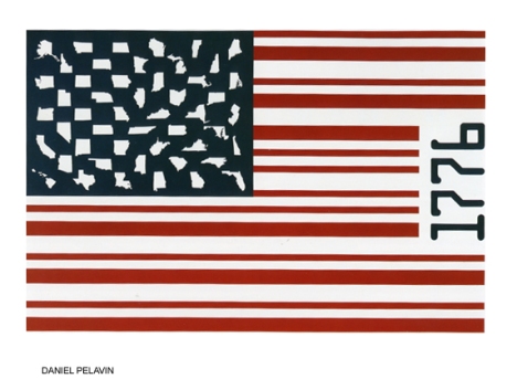
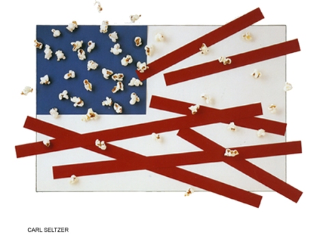
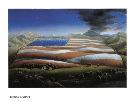
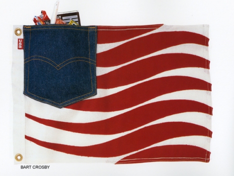
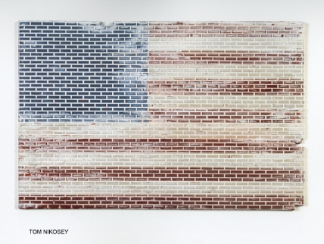
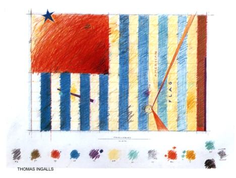
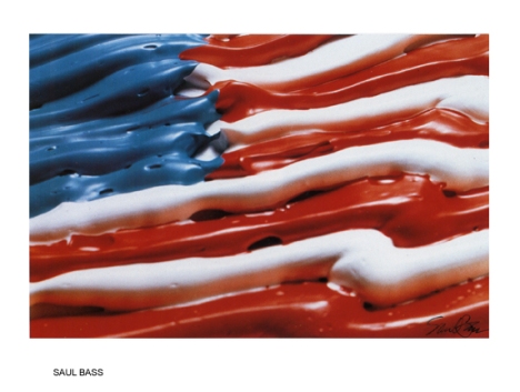
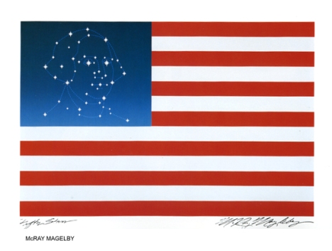
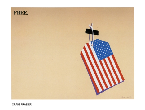
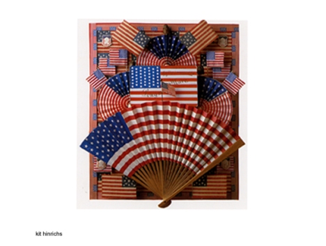
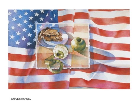
Below are just 13 samples of the many ingenious designs from that book honoring our American flag.  Enjoy!
flag1flag2flag3flag4flag5flag6flag7flag8flag9flag10flag11flag12flag13all images copyright of creator


0

Education & Creativity According to the great Sir Ken Robinson

How did I miss this? It’s wonderful. If you haven’t already seen this terrific piece, I dare you not to enjoy it and take away some inspired thinking (as well as an appreciation for some pretty darn good whiteboard drawing!). If you have seen it, enjoy it again. : )

0

It's All About Relationships

A recurring theme has been emerging in my world quite a lot lately. In talks over the past several months with colleagues, in twitter posts directed to Seth Godin’s blog, and most recently in a conversation over lunch this week with Milton Glaser who has unarguably seen and done it all, combining art and business with unparalleled success.

The theme? It’s all about relationships. Here’s my quick take on it, with regard to the graphic design business (or any business, for that matter):

………………………….

In this day and age of computer savvy, a glutton of designers and a climate of economic strife, it’s no wonder many artist’s and agencies are having a hard go of it lately. It could be there’s too much talent and not enough demand, as everyone – from individuals to families to small businesses and large corporations – is holding tight to their purse strings.

But in any business climate – whether it’s booming or equilaterally depressed – three key elements always reign supreme: creativity, quality, and relationship.

An unfortunate side effect of a distressed economic environment such as the one we’re experiencing now, is that some media-buying decision-makers may opt for mediocrity, somehow aligning their efforts with the mood of the times – the sense of “lack” or “needing to do without”  – by shopping around for the lowest price, regardless of creativity, quality or relationship. It’s easy enough to do nowadays; just google graphic design and hundreds upon hundreds will come up.

What can also happen in this kind of situation though, is that while it’s still possible to find creativity, and still possible to find certain levels of quality, relationship may well be left out of the equation. And that particular absence can kill a project, or make people wish it did.

Despite all the wonders of online connecting, the enormous choices and competitive pricing available, if you don’t like the people you work with, it can be a miserable experience. It boils down to the old adage of being a pleasure to work with.

You can be as creative as DaVinci, with the quality and craftsmanship of a Frank Lloyd Wright; and likewise, you can be a brilliant business mind with a world-changing product. But regardless of whether wallets are open or whether they’re closed, at some point human nature always plays its card – and wins.

Share

2

American Flag: A Visual Tribute

In May 1776, Betsy Ross sewed the first American flag. A year later in 1777, the Continental Congress passed the first Flag Act, establishing an official flag for the new nation:

“Resolved, That the flag of the United States be made of thirteen stripes, alternate red and white; that the union be thirteen stars, white in a blue field, representing a new Constellation.”

However, between 1777 and 1960, Congress passed several acts that changed the shape, design and arrangement of the flag and allowed for additional stars and stripes to be added to reflect each new state. This broad span of time without specific guidelines resulted in many design interpretations – which in a sense also reflects the deeply rooted sense of freedom so cherished by Americans. The expressions were rich and proud, eventually evolving into the flag we pledge allegiance to today.

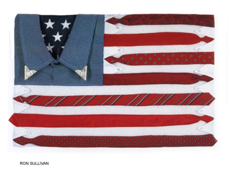
Carrying that theme of evolvement forward, in 1986 I discovered a beautiful book by Kit Hinrichs, called “Stars and Stripes” – a compilation of exceptionally creative American Flag images created by some of the finest graphic artists of modern time. I found it absolutely delightful, and a great tribute to the creativity and talent that abounds amongst us – and the creative freedom we’re able to enjoy in this great land of the free and home of the brave.

Below are just 13 samples of the many ingenious designs from that book honoring our American flag.  Enjoy!
flag1flag2flag3flag4flag5flag6flag7flag8flag9flag10flag11flag12flag13all images copyright of creator
1

Saxton's "A Book of Fairies" Receives Reviewer Praise

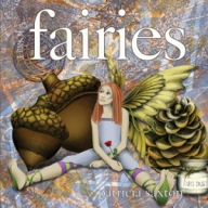
fairy.cover

available for pre-order on amazon.com

From Midwest Book Review:

A Book of Fairies is a fantastic children’s picturebook that presents a fascinating listing of imaginary facts about imaginary creatures. From the nature of Fairyland, to finding fairies, the tasks of fairies, fairy secrets and language, fairy medicine, and more, A Book of Fairies is a fun source of mystical speculation. The beautiful color illustrations perfectly complement the thoughtful text. A Book of Fairies is sure to bring joy not only to young readers, but also to adults who still believe in fairies!

“Of all the earth fairies, flower fairies are around us the most. Flower fairies are the ones skipping through the ivy, or tending your vegetable patch – yet they can be awfully hard to spot. They make their clothing from leaves and colorful flower petals, so they blend right into the gardens where they play.”

Share

0

The iPhone and Fun with Type

hugetype

While adding some weblogs to my blogroll,  I came across one called Huge Type.  I was intrigued.  You can’t consider yourself a serious designer without some form of adoration for typography. Clicking on the site, I found it was an experiment / experience kind of thing. Further intrigued me.

Then I saw that this project / experiment incorporated the iPhone. (There again, who doesn’t love the iPhone?) And I thought, what a great, entertaining way to direct people’s attention to the sheer volume of outstanding typography –  and its fantastic craftsmanship – that surrounds us daily, to the point of viewer non-chalance.

We see type so often – on magazines, buses, billboards, our computers, our books – we use it to write with, design with, read with – that typefaces run great risk of being taken for granted.  They’re just “there”, they show up, they look good or bad.

Alot of people aren’t all that aware of the important role played by type.  But it is an amazingly important, critical part of any visual layout.  One word can evoke entirely different feelings based on what font is used to say it.  That’s pretty powerful.

So, while I’m at it, kudos to all the font designers out there, who painstakingly render their works of typographical art.  Thank you to the type design greats of history, and the modern font artists who carry on a strong tradition of skilled mastery.

Well I got off on a bit of a tangent there – but well worth it, if it reminds people of the expressiveness possible through the use of type and a gathers a little appreciation for the unsung heros of typography.  (We all know of Leonardo DaVinci and Frank Lloyd Wright, but how many know Giambattista Bodoni?)

So, take a look at this site if you’re interested in combining the iPhone and a little fun with type.  You may start seeing letters and words in a whole new way.  http://www.hugetype.com/

Share

0

In Praise of Black and White: Part I

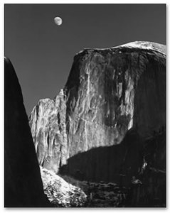
Ansel Adams, Moon and Half Dome

Ansel Adams, Moon and Half Dome

Each year, a new Ansel Adams wall calendar hangs on the door leading to my studio.  His superbly articulated, stunning black and white photography reminds me daily of my love for the natural world as well as the innumerable shades, shapes, shadows and tones that create, change, and emerge from, the world around us.

Yet in a time when everyone wants color, the classic beauty and the powerful visual possibilities of black and white are often neglected.  In the design world, black and white is often completely overlooked or passed by in favor of any use of color.  As if black and white implies something less important, or something dull – even something “cheap”.

But when used well, black and white can be anything but dull, nor without value.  Black and white can be intensely dramatic, elegant and rich.  It can get a strong point across without the distraction of colors.  It can be brilliant or moody, edgy or slick in ways that color cannot.  It can sparkle with cleanliness. Black and white carries undisguised strength, character and integrity … when used well.  Not all photographers have the eye nor skill of an Ansel Adams. Not all designers see in black and white.  Clients rarely consider it.  But it would be nice to see a greater appreciation of the noble duo of black and white.

When people want straight talk, they’ll say “tell me in black and white” – which infers that they’ll get to the truth of the matter.  But more often people speak in shades of gray, or dress it up in garish colors for dramatic effect. So it is with design – a multitude of colors have the potential to become an undifferentiated sea of grays, or gussied up so much the point is lost for the color.

Of course color is beautiful.  As an artist, I can’t help but adore color. Bold, rich fusions of color. Yet color alone will not make a bad design good. And it’s not so much that color is overrated, but that black and white is underrated. You don’t see it alot, which is unfortunate, because the effects of black and white can be pretty spectacular.

It’s a rich experience to see things in black and white; stripped of color, a million shades of gray become a lansdcape of lights and darks that blend and bounce against one another to create a whole. Even if you don’t see things quite like that, a striking black and white image often touches people unexpectedly.  It’s raw and fundamental – and like a good story, it’s satisfying, and it allows your mind to fill in the color that’s left unsaid. Like a well-told story, black and white art can be refreshing, engaging and wonderfully, surprisingly inspiring.

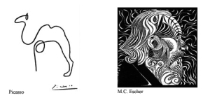
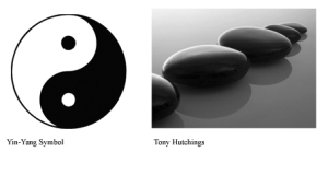
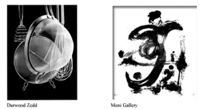
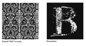
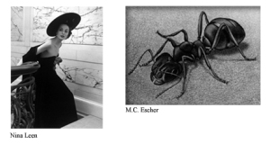
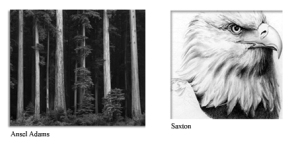
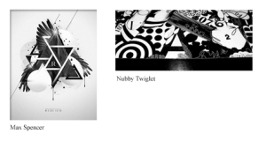
Below is a broad sampling of some pretty nice black & white work. There’s a whole lot more  (though not enough)  than shown here, but it’s a good smattering of styles …

bws3

bw1bws2bws4bws5bws6bws71bws8

Share

3

Never Out of Style

we’ve been there.  we’ve seen trends come.  and go.  and come back.

what drives a style, a “look”, or an effective ad campaign? what’s at the pulse of changing appetites? how do you keep from missing a beat – the one beat that counts? the one they’ll want to dance to, shout about, make the call for.  we believe it has a whole lot to do with the one thing we know for certain never goes out of style:  creativity.

…………………………………………………………………………

I have alot more to say about creativity, but will have to add on at a later time.  For now I’ll leave you with this 20-minute video from a TED conference, in which Sir Ken Robinson gives a brilliant, witty, very-listenable and thought-provoking talk on education and creativity.

Share

0