To Logo or Not to Logo…
A client posed the following question: “What’s your perception of logos and are they a cost-effective investment?”
I love this question. It’s not new, nor is the discussion. But considering the unstable climate of our financial times, one worth a revisit. Everyone’s trying to be more careful and make more intelligent decisions about where their dollars go. So, I felt inspired to share my answer:
A logo is the hub of your brand identity. The grand central station. It’s the singular consistent visual that appears everywhere, on everything, carrying your identity into livingrooms and faraway lands and back.
It’s what you put on the packages you send out that says “we’re a real company”. It’s your signature, your great “identifier” ~ so that when people repeatedly see a certain shape or combination of shapes, colors and letters it prompts a psychological association with a company, a person, a quality. You get the idea.
It’s recognition by repetition. And that’s a good thing, because you want to be noticed. And you want it to be strong at-a-glance; something that’s, if not remarkable, at least memorable. Like these classics:
That all said (and I kind of hate to say this since logos are something I do) … you can have a “look and feel” without a logo per se. You can create an “identity” with colors and fonts and use of space.
Case in point: another client wants to establish herself as a voice in the fashion world via writing, and her cash flow is tight. She was convinced she needed a logo and a whole brand identity scheme (all of which can add up to a pretty penny) ~ when in truth, for her needs, she doesn’t “have to have” a logo. What she does have to have is great content and great imagery.
Sure I would have preferred that she need a logo and could pay me to create it, but this is how I advised her because in her case it makes sense ~ not only from a monetary perspective but in terms of creating an online presence that can grow as her own voice grows.
A logo can appear very simple. A simple type treatment, or one with a clever twist, or a symbol as its core. The value, aside from it being “just yours”, is in its consistent use across the board, applied to all things “Business X” and serving as a steady, stable ambassador. And that is no small thing.
But a logo is not, as I’ve said in previous conversations, in and of itself, The Brand Identity. It’s a big part of the whole (and not to be fooled with or “just anything” tossed up). There are many factors that make up that whole, and sometimes it’s both necessary and okay to approach it from a different perspective. Worth pondering before jumping in. And if you do jump, understand its value.
Another Legend, Another Lesson
Milton Glaser is Graphic Design and Illustration.
Referred to as the design industry’s “icon”, he truly is the Master, who long ago reached the pinnacles of success. With intelligence, passion and integrity (and amazing talent!) he’s stayed fresh and irrevocably admired well into his 80’s.
Talk about longevity, he’s it. His work inspires millions, his discipline influences countless students. He’s done it all, exceptionally well.
And just the other day, he posted this picture on his Facebook page, which I thought was pretty neat. I looked through the comments, remarks of honest admiration. What do you say to this, after all?
But this simplest of “sketches” is more than a cool memento. It serves as a reminder of the raw power of an idea. And what we do or don’t do with it.
Ideas can come in an instant, we all know that. The key seems to be whether we acknowledge or dismiss that instant. And in the next breath, whether we grab a pen and the nearest scrap of paper, napkin, gum wrapper, and jot it down.
What happens after that has a lot to do with the validity of the concept, the practicalities, the applications, the creative development. And lots of those “sudden insights” end up in our own sort of slush pile.
But sometimes…. it’s golden.
So thank you Milton for this humbling image, reminding us to give ideas the light of day, the freedom to breathe, roam, and define themselves.
Draw it, write it, sketch it, record it. … do it!
“52 Weeks of Peace” ~ The Book!
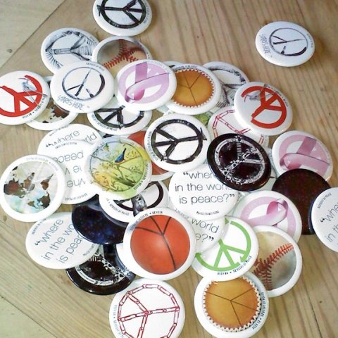
Two years ago to the day, I launched a creative series called “52 Weeks of Peace”, posting a new design on my blog each week for a year.
Today, I am so pleased to announce that thanks to my publisher Lightbox Books (a division of Shenanigan Books), the entire collection is now in gorgeous postcard book format, available for sending, framing, or just enjoying. You can order copies here, or by clicking anywhere on the announcement below.
A side note ~ you might find it interesting (I did!) that the book’s release coincides with the 50th anniversary year of the Peace Corps ~ and that a selection from the series is part of an upcoming 9/11 tenth anniversary exhibit. It’s really something how that all lined up ~ maybe the universe had a hand in it!
I thank you all for your support and encouragement, your appreciation of the art, and helping to spread the idea that “peace starts here”, with each individual, in every day ways.
A Plethora of P's / #31: Ping Pong
proactively punctuating life with the plausible, powerful possibilities of positive thought presented through a plethora of “P’s”.
– ♥ –
Few games are more fun than a battle of ping pong. It’s blood-pumping, spirit-lifting, good old-fashioned fun. And that’s really about all there is to to say ~ except maybe to suggest you find a friend, a table and go play!
Vector Dreams
Computers are magical. Young designers don’t know how good they have it. Back when the earth’s crust was cooling and dinosaurs roamed freely, there existed the most horrendous, antiquated processes for creating a finished design project.
I worshipped computers the minute they eliminated rubber cement and laborious hand-cut color separations. T-squares and triangles and type galleys. It was a downright primitive experience. The production aspect was neither fun nor a walk in the park, although you did acquire a fairly intimate relationship with the inner workings of color and tone and bandaids (for the exacto blade cuts).
With computers you can take a piece of handmade art and ~ *presto!* ~ it becomes digital, ready for use in a multitude of ways on a multitude of products.
Of course, there are varying levels of *presto!*, so that what looks clean and effortlessly polished is very often laboriously and painstakingly rendered behind the scenes.
I’ve recently been working with a great client on a project that falls precisely into this category. The end result is a pretty picture, but getting to that point is literally a matter of connecting hundreds of little dots, like these:
And a strange thing happens when you get into a groove like that ~ it starts to take over your subconscious mind. It’s kind of like when I draw a lot, I see things in shapes and shadows, lights and darks … except in this case I start seeing things as if they were pieces of vector art**.
Just the other day while driving a winding stretch of road, my mind decided to imagine the curves as they would be drawn on the computer. It was a pretty weird sensation. I wonder if dreaming in vector is next.
Dreams or no dreams, the laborious elements of yesteryear’s graphic design have really only changed in terms of the tools used. Personally, I still adore illustrating classically with a pencil or paintbrush ~ but for design, I remain ever grateful that paste-ups hit the dust long ago.
**in brief, for those who may not know, vector art is the use of computerized lines and anchor points to create shapes that in the dark ages would have been done by hand.
Beer, Chocolate and The Web
Beer, Chocolate and the Web … for some reason makes me think of “The Lion, the Witch and the Wardrobe” ~ maybe not with such an intricate storyline, and I’m not sure C.S. Lewis would like the comparison, unless perhaps, he was a beer and chocolate person… but either way he would certainly appreciate the imaginative quality.
So, thanks to my good friend and fellow designer Jim for knowing that I would love this. Sagres, Portugal’s leading beer brand, launched a new product this year: Sagres Preta Chocolate, a chocolate flavoured stout beer.
I can’t attest to the beer itself, but their decision to launch the product with a website crafted entirely from chocolate gets a big thumbs up from this corner.
Personally, I’m not convinced of the “rightness” of beer and chocolate co-mingling in one drink, but I definitely give these guys credit for ingenuity. And (for possible future reference) I’d have gladly been on the team that made all the chocolate pieces!
Here’s how they did it:
And here’s the final website for Sagres Preta Chocolate. Enjoy!
What’s the Big Deal About Branding? (part two)
Branding. No, not the hot iron kind on an animal’s behind (ouch! ~ do they still do that?), but marketing’s buzz-word of buzz-words.
As with many notions that take the spotlight ~ often becoming overused, diffused and diluted ~ one has to question it at some point. It’s never wise to take popular culture at face value, or hear a fancy phrase and automatically buy in. To borrow from the now old-fashioned new-age-speak, first it has to “resonate”. If it resonates, I’ll pay attention.
So, what IS the big deal about branding?
First of all, your brand is what I like to call your visual voice. It’s what you bring to market over and over and over. It’s how you’re identified, and yes, judged. It can, in effect, be the life or death of your business.
If you read “What’s the Big Deal About Branding? (part one)”, you got some of my thoughts on why it’s important. Namely, the pull and power of consistency and integrity ~ two key qualities that provide a valuable backdrop, a kind of moral yardstick for your business, while serving as a clear window for your audience to understand what you’re about.
Take a red target image for example. “Target” stores easily come to mind. It’s a consistent, steady symbol – exhibiting visual integrity. And that’s very good.
But take it a step further. If your experience at Target is repeatedly a good one, they’ve just about buttoned up the integrity piece, because you, the customer, feels confident, “safe and secure”. Trust has been earned; integrity deepens.
There are hundreds of similar examples. Like Mercedes, Nike, The Morton’s Salt girl. They’re consistent, identifiable, they stand for something, and the customer knows what that something is … and … there is trust.
So here’s the thing: imagery and words alone do not make a brand “work” … Three fundamental things feed into your success: your product, your service and your brand. One without the other will leave things flat (or send them spinning out of control) ~ but in tandem, goals are attainable. Basically:
- If you’ve got a great product, but poor service, expect trouble.
- With great service, but a bad product, good intentions won’t matter.
- If you’ve got a great branding scheme, but a poor product or poor service, people are going to catch on – and move on.
- A great product and great service, but a mixed-up brand message, creates confusion. Confusion is loss.
But when all three elements come together, singing the same song, in harmony, you’ve got strong branding and a heck of a better chance at success.
The wrapping on the package is that all three ~ product, service and “brand” (your visual voice) ~ are your branding, and any business, marketer or designer worth their weight should consider all three in brand development. Ask the questions to find the commonality. Keep those 3 elements consistent, and integrity follows. And where integrity lives, people want to hang around.
Next up: Authenticity. Stay tuned.
A More "Refined" Jack Daniel's… But Why?
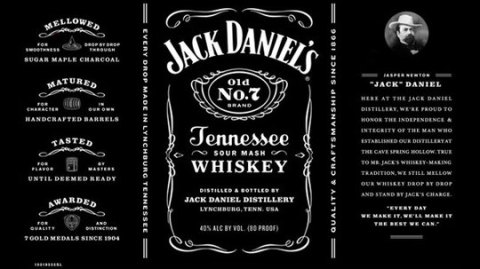
Brand makeovers are all the rage. And as a designer, I often see the value. But honestly, in this case I’m missing the point.
You wonder sometimes what drives a change like this,” when it ain’t broke”… unless it is. Or somebody with clout says it needs to happen, and it becomes more about what’s on the cover than what’s inside. Hmmm.
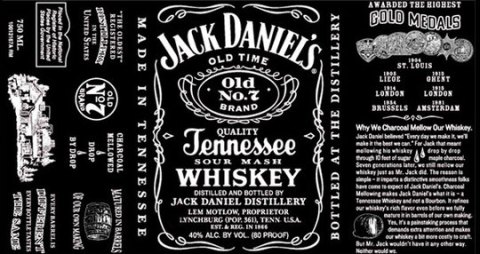
Not that the new label isn’t a good one. Thankfully it doesn’t kill the brand by overly modernizing, and I admit the cleaner look is attractive. I just don’t know why they bothered. The old label was just … so … Jack Daniels. Classic JD, forever, the way it was…. until now. Cleaned up and more refined. (Only Jack Daniel’s isn’t supposed to be refined, as I recall?)
I have to admit though, that reading some of the articles about it were pretty interesting. For example, I never knew that Jack is brewed in a dry county. That’s a little crazy.
As for the label, they got rid of a lot of the text, including fun details like the population count of 361 (so what if it wasn’t accurate? ~ it was an interesting historical tidbit). Gone is the folksy description of how they achieve the rich flavor. They’ve also removed the claim that Jack Daniel’s is America’s oldest distillery, and they took off the name of Lem Motlow.
Now as I’ve learned, Motlow inherited the distillery when his Uncle Jack died in 1911. Motlow promptly put his name on the bottle and kept the company alive throughout the dark days of prohibition and through the controversy arising after he drunkenly shot a man dead while riding aboard a train in 1924.
This is great stuff. But maybe legends are passe’ now.
Even Jack Daniel’s portrait boasts a new name: apparently his real name was Jasper Newton. Okay, that’s cool to know, but since he’s been called Jack since 1866, I wonder what he’d have to say about that.
Oh well, the deed is done, but the vote is out. The label is still very black, and I assume the whiskey is still quality Tennessee sour mash, and at the end of the day, no one will really care that the label got a facelift. Of course, they wouldn’t have cared if it hadn’t, either.
…………………….
Afterthought: If no one cares either way, and the company isn’t suffering, maybe they did it … under the guise of updating and being more “honest” (ie, population, possibility that JD might not be the oldest distillery, etc.)… but really and simply, just for the heck of it?
A Plethora of P's / #22: Pasta
proactively punctuating life with the plausible, powerful possibilities of positive thought presented through a plethora of “P’s”.
– ♥ –
 Here’s an easy one to get your noodle around. Because, seriously, doesn’t everyone in the world like pasta? When you think about it (though it actually doesn’t take much thought…), a steaming bowl of spaghetti with sauce and parmesan, a green garden salad and some fresh, piping hot garlic bread has to be one of the best meals ever invented.
The thing about pasta is that it’s simple. There’s nothing convoluted about it, and there’s nothing “bad” about it. It’s easy, yummy and comes in all kinds of clever shapes. Which is really the hardest part: choosing between fettuccine, vermicelli, linguini, cappellini, cavatini, farfalle, fusilli, gemelli, manicotti, rigatoni, penne, ziti, rotelle, lasagne, tortellini, macaroni, etc. (Of course, I’ve learned from Italian friends that all pastas are called macaroni.)
In the end, it doesn’t matter which you pick. They’re all tasty, all satisfying, and they’re all in the “comfort food” department … which in my book is all positive.
Buon appetito!
ps: for the fact-minded, scientific health benefits of pasta can be found here and here.


