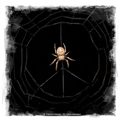
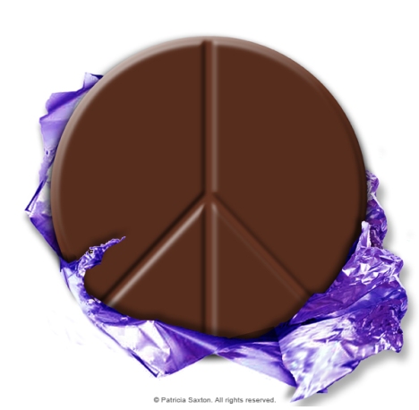
Week 9: "52 Weeks of Peace"

Note: Weekly peace images are displayed (as a unit) under the “52 Weeks of Peace” tab above, where there is also a more detailed description of the series.

Note: Weekly peace images are displayed (as a unit) under the “52 Weeks of Peace” tab above, where there is also a more detailed description of the series.
 Note: Weekly peace images are displayed (as a unit) under the “52 Weeks of Peace” tab above, where there is also a more detailed description of the series.

Note: Weekly peace images are displayed (as a unit) under the “52 Weeks of Peace” tab above, where there is also a more detailed description of the series.

Note: Weekly peace images are displayed (as a unit) under the “52 Weeks of Peace” tab above, where there is also a more detailed description of the series.

Note: Weekly peace images are displayed (as a unit) under the “52 Weeks of Peace” tab above, where there is also a more detailed description of the series.

Note: Weekly peace images are displayed (as a unit) under the “52 Weeks of Peace” tab above, where there is also a more detailed description of the series.


Note: Weekly peace images are displayed (as a unit) under the “52 Weeks of Peace” tab above, where there is also a more detailed description of the series.
Week 2: September 7 . 2009

Note: Weekly peace images are also displayed (as a unit) under the “52 Weeks of Peace” tab above, where there is also a more detailed description of the series.
Here is a link to a recent interview given by host Nanci Arvizu of PageReaders.
Nanci is a delight, by the way – and she provides a genuinely positive service by helping to promote authors via her blog talk radio program. I was pleased to take part in our talk about books, art & design.
Click here: Page Readers talks with Patricia Saxton, author of “A Book of Fairies”
September 1 . 2009
Today is my birthday and I’m making my wishes. Lots of them! But among them is a wish that I’m going to explore and illustrate all year long in the form of a personal project, which I’m calling “52 Weeks of Peace”.
Now when I use the word peace, I mean it in a broad, sweeping way .. from the kind of peace that permeates an individual’s soul with a sense of well-being, with love and with joy – to the kind that can move whole groups of humanity into harmony.
Peace is generally considered a quiet thing, like a particularly beautiful sunset – but it can also be loud, like a chorus that lets go and sings boldly to high heaven. Peace can be a meditative, sit-on-the-mountaintop feeling, or the heady, centering adrenaline rush that comes after good, hard athletics. Peace can be a sleeping cat, curled up in a sunny spot, the picture of complete contentment. Peace can be the joyful peels of a child’s laughter. Peace can be a bubbling creek, a cup of tea, the mending of a friendship – or the letting go. It can be found in a kind word, a job well done, a stranger’s smile. Peace graces a spring garden, and kicks up its heels in a snowstorm or a boisterous, pounding waterfall.
Peace doesn’t fight; it calms and exhilarates. Peace is freedom from pain, worry and doubt. Peace reaches over and takes your hand; it delights your heart. Peace feels right from our head to our toes.
And my wish is not just for me, but for you – and for all of us – to see more and experience more of whatever brings more peace, more often, into our lives. (This is one instance where less is not more!)
I’m also going to have a little fun with the designs I’ll be sharing over the next year, and I’ll hope some of that rubs off on whoever may be checking in. And in the end there should be a wide range of feeling and unexpected expression represented.
Some of you may be familiar with my pencil point series. For those of you who aren’t, the pencil point is my logo, and over several years I’ve celebrated that wonderful, marvelous little tool by creating nearly 100 design variations. If you’ve not seen them, and if you’re interested, you can see some of them here: saxtonstudio.com.
I’ll be taking a similar approach with this venture – except there will be a lot more pieces in a much shorter time period. And instead of a pencil point, I’ll be using the universal peace symbol. Each week I’ll post a new creation.
So, without further ado, here is the first – in honor of the first day of September and the first week of “52 Weeks of Peace”. (After this first one, I’ll post them under the “peace” tab above.)
Peace to all – enjoy!


