Twelve Months of Flowers

If only it were true. Unless you count holly berries, there’s really not much in the way of floral color in northeast winter months.

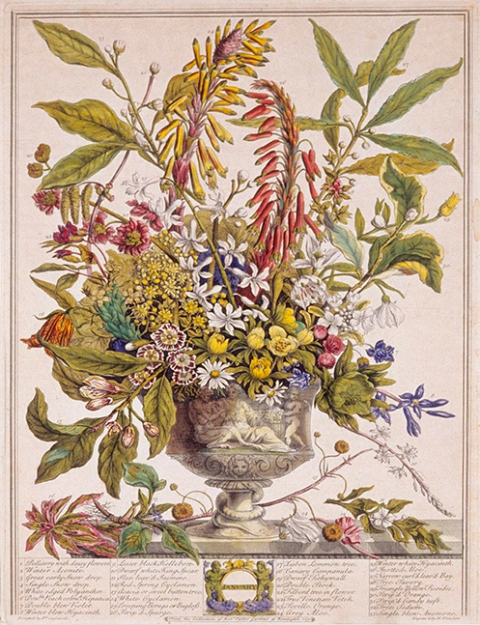
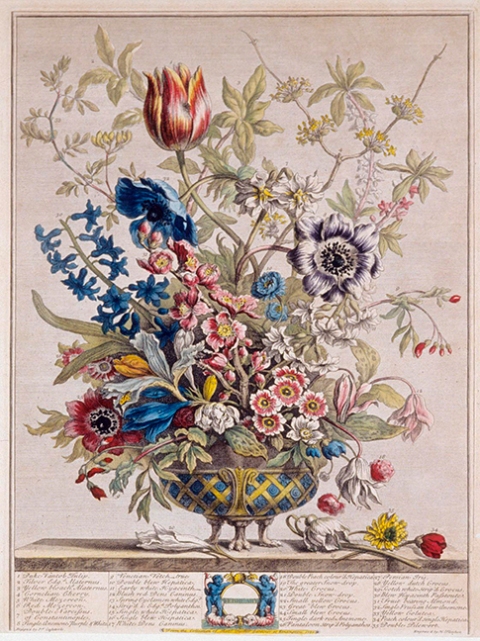
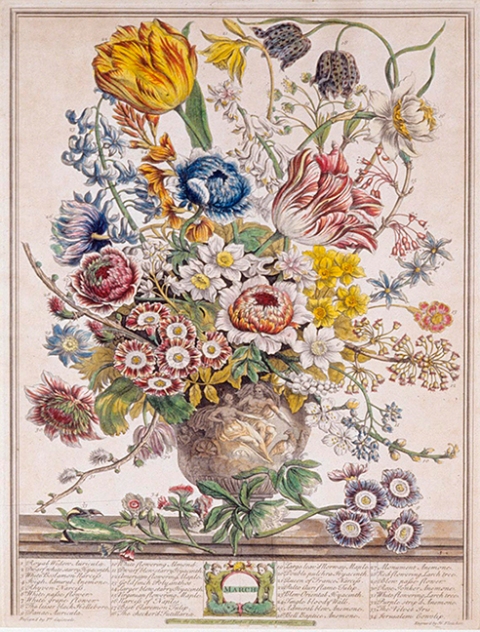
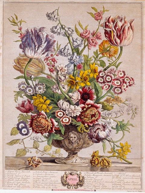
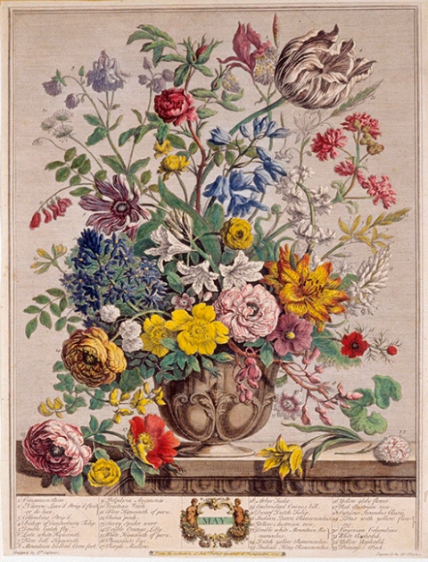
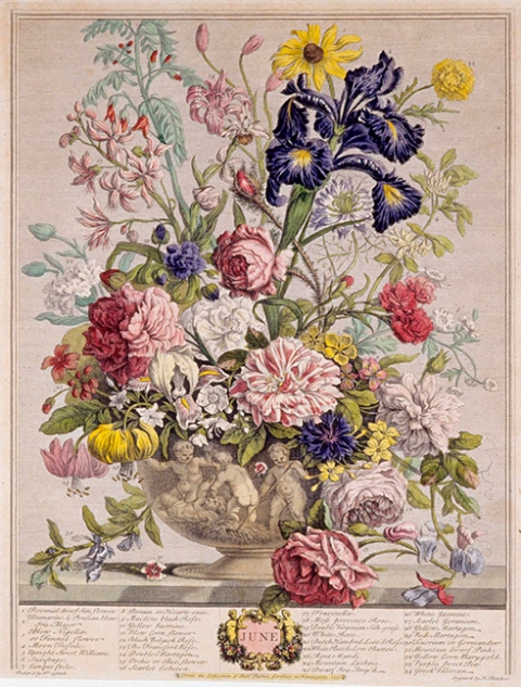
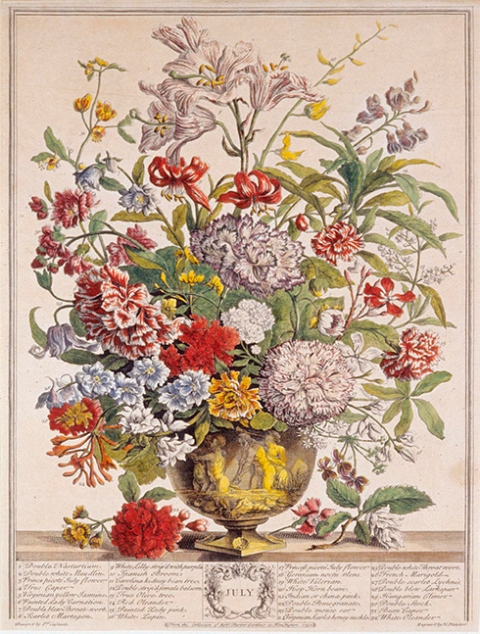
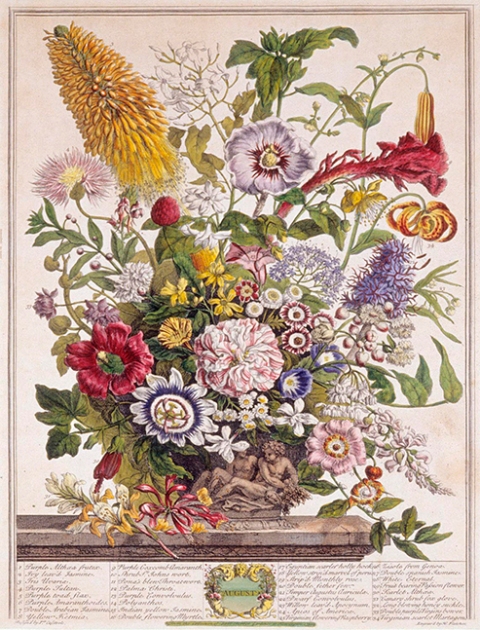
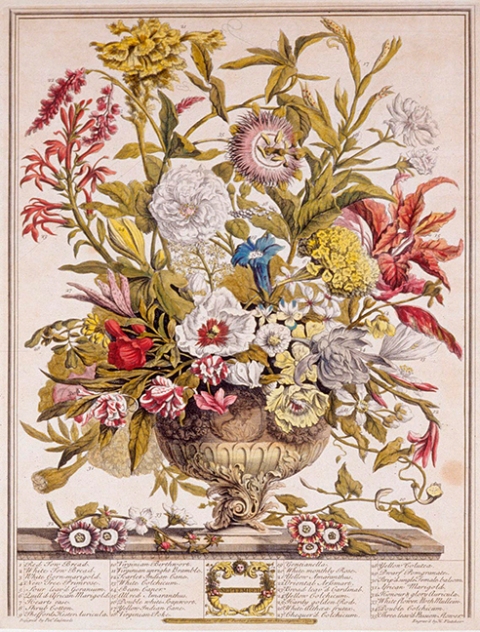
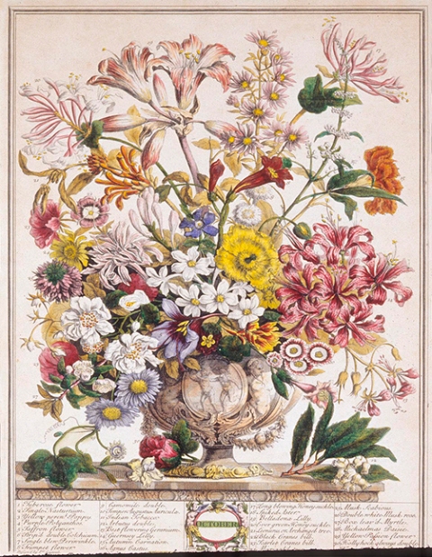
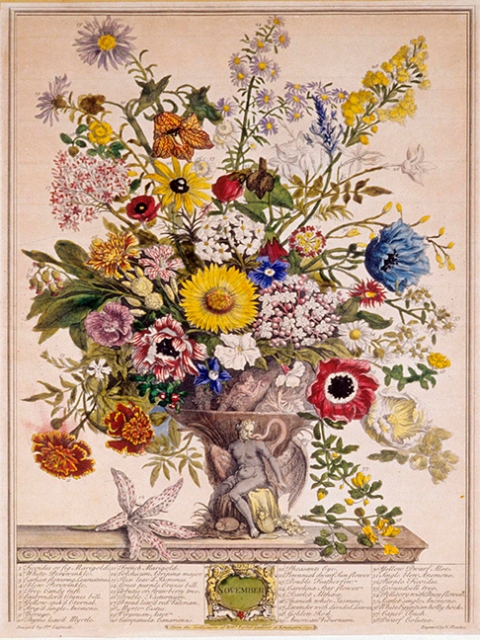
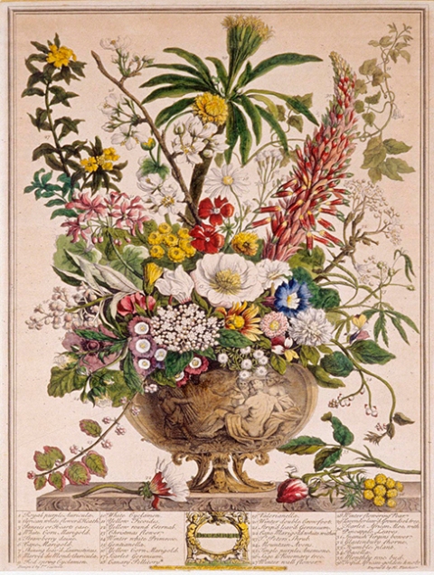
But “Twelve Months of Flowers” can be had via art prints, from the series published in 1730 by renowned British horticulturist and author Robert Furber. Mr. Furber’s name is highly attributed to these exquisite prints, and while I’m grateful that he had the insight, substantial research and knowledge (and, no doubt, the funds) to produce the collection, I’m mostly interested in the artistry.

We had two of these prints hanging in our dining room during my growing-up years – one May, one November, the months of my parent’s birthdays. Admired by all, they adorned a modest space with a rich, subtle elegance, (and now that I think of it, may have had an influence on my own interest in drawing things botanical) ~ but in all those years, while we probably did, I don’t remember talking about the artist. Regardless, for some reason they lodged in my mind’s eye today ~ so I went looking.

First of all, they are hand-colored engravings, produced by English engraver Henry Fletcher from paintings of Flemish-born artist Pieter Casteels . (They also produced an equally stunning second series, Twelve Months of Fruits.) Each work is a glorious detail of plants in seasonal bloom, with each plant numbered, and, at the time, a list of the corresponding names. More than 400 plant species were featured. This was no small project.

And so a few centuries later, I thank them ~ all three of them: Furber, Fletcher and Casteels ~ for their fine, luscious collaboration of study, talent and skill. They are so beautiful, I might even venture to call them a labor of love. But that’s what art is.

TwelveMonths1_sm

TwelveMonths2_sm

TwelveMonths3_sm

TwelveMonths4_sm

TwelveMonths5_sm

TwelveMonths6_sm

TwelveMonths7_sm

TwelveMonths8_sm

TwelveMonths9_sm

TwelveMonths10_sm

TwelveMonths11_sm

TwelveMonths12_sm

0

Dear Microsoft Word: Let's Break Up.

no.love
It’s no secret amongst my clients and colleagues – and let me preface this by saying I don’t “hate” much of anything, except maybe cheesecake (I know, I know…), and rudeness, or falling on icy steps – but sometimes I do hate Word. Microsoft Word, that is. It’s fickle. It’s not intuitive. It messes up. It can be nasty. A wolf in sheep’s clothing, I tell you!

Oh, and by the way, it is not, nor was ever meant to be, a design tool. Yet millions upon millions of people use it as if it were. I do not understand this. It infuriates me.

But I “must” use it because of those millions upon millions of people who use it, some of those millions being clients of mine and it’s a useful tool for sharing information. Note: Sharing information. Words. It was intended to process words.

Instead, it’s evolved into this messy catch-all of “things it can do”, most of which are not well done, hard to find, and tend at some point to rain on its own parade by crashing. Not crash as in “crash a party”; crash as in stop functioning. Nosedive. All systems out. As in, you’re barreling along when suddenly the spinny-rainbow-wheel pops up and begins its incessant twirl round and round and round and round, often caused by a task as excruciatingly simple as cutting and pasting a paragraph from one place to another. (Maybe it just doesn’t like Macs.)

It’s not well. It’s neither fun nor savvy. It’s a frustrating blend of “tools” that make people like me crazy. People who have worked with beautifully designed software programs that do what they’re supposed to do. People who have come to expect things to “make sense” when using them. (Personal flaw: Don’t like my time wasted, I admit it.)

Because it’s not going away any time soon, we all continue to use Microsoft Word. So we can’t actually break up. It owns the world. It’s the Big Cheese of Word Processing programs.

But, why-oh-why can’t they get it right? Why can’t they make it smarter and less finicky? Why does it try so hard to be things it isn’t, and why can’t it do the things it’s meant to do with efficiency and finesse? To paraphrase Abraham Lincoln, if you’re going to do something or be something, be a good one.

Meanwhile, I’ll now go back and ONCE AGAIN, find the saved document remnants from my computer’s trash bin. And keep “saving saving saving” every time I dot an i or cross a t in my Word document.

Vent over.

0

Twelve Months of Flowers

If only it were true. Unless you count holly berries, there’s really not much in the way of floral color during northeastern winter months.

But “Twelve Months of Flowers” can be had via art prints, from the series published in 1730 by renowned British horticulturist and author Robert Furber. Mr. Furber’s name is the one most highly attributed to these exquisite prints, and while I’m grateful that he provided the insight, substantial research and knowledge (and, no doubt, the funds) to produce the collection, I’m mostly interested in the artistry.

Two of these prints hung in our dining room during my growing-up years – one May, one November, the months of my parent’s birthdays. Much admired, they gave a rich, subtle elegance to a modest space (and now that I think of it, may have influenced my own interest in drawing things botanical) ~ but in all those years, strangely, I don’t remember talking about the artist. So I went looking.

I discovered that the meticulously hand-colored engravings were created by English engraver Henry Fletcher, based on the paintings of Flemish-born artist Pieter Casteels, and that Twelve Months of Flowers was originally produced as a gardening guide in catalogue format and sold by subscription. (They also produced an equally stunning second series, Twelve Months of Fruits.) The images were aimed at wealthy landowners interested in growing plants for beauty more than functionality.

Each work is a glorious detail of plants in seasonal bloom, with each plant numbered, and, at the time, a list of the corresponding names. More than 400 plant species were featured. This was no small project. Huge talent. Enormous dedication to both botany and craft.

And so, a few centuries later, I thank them the three of them: Furber, Fletcher and Casteels ~ for their luscious collaboration of study, talent and skill. They are so beautiful, I would even venture to call them a labor of love. But that’s what art is.

TwelveMonths1_sm

TwelveMonths2_sm

TwelveMonths3_sm

TwelveMonths4_sm

TwelveMonths5_sm

TwelveMonths6_sm

TwelveMonths7_sm

TwelveMonths8_sm

TwelveMonths9_sm

TwelveMonths10_sm

TwelveMonths11_sm

TwelveMonths12_sm

0

In Praise of Black and White: Part V

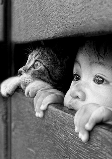
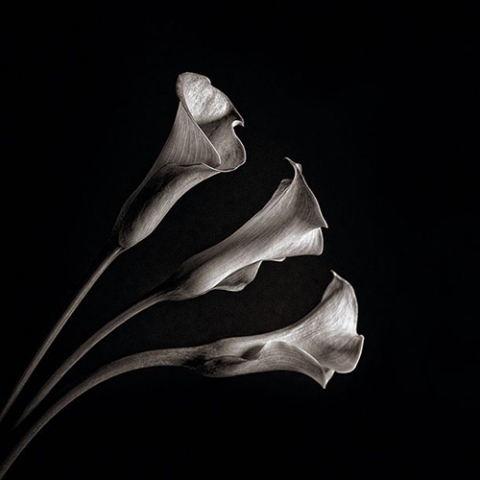
Almost like clockwork, every January I’m reminded of my love for black and white. Maybe it’s the monotones of winter. Maybe it’s the bright white snow against a black sky. Maybe it’s because each year a new Ansel Adams calendar hangs on my studio door.

Whatever it may be, I’ve long been drawn to the beauty of black & white art, going back to the first time I picked up that favorite tool of mine (the #2 pencil) and sensed that magic was held within its lead.

From pencil or pen to the magnificent drama of a fine black & white photograph, I’m captivated by the power and emotional breadth that can be achieved without a spot of color. No distractions. Just character and grace, depth and strength and guts and mood. And like a good story, well done black & white allows your mind to add its own color by filling in what’s left unsaid.

Enjoy!

1d2f5f2d2fa35f176b5f04697a47bca2

Jornal da Fotografia

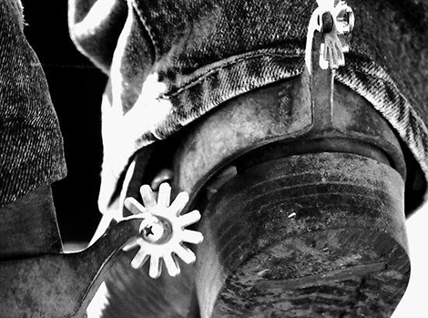
cowgirl.boot2

Clare Colins

paris.fog2

Michael Rajkovic

amish.field2

Jenő Dulovits, 1935

snowy.field2

Gorazd Kranjc

ocean.wave2

from UltraLinx

eagle.photo2

Yves Schüpbach

baby.wolf2

Jeff M for Short / Lifecreations

cobweb2

Patrick Hübschmann

batman.robin2

Batman and Robin

apple.waterdrops2

by the-definition.deviantart.com

old.woman2

found on The Happy Mango @ pinterest

violin2

Nelson Rietzke

old.camera2

source unknown

254f3753a74f73789254a5f768fec4e5

Joko on 500px

244fb0961cf7fd30105e0d9b06f44700

source unknown

gatsby

source unknown

Andre Kohn

Andre Kohn

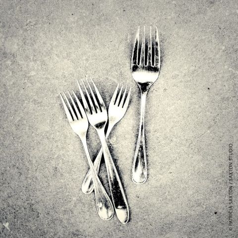
Patricia Saxton


Stéphane Berla

Stéphane Berla

Patricia Saxton / Book of Dragons

Patricia Saxton / Book of Dragons

source unknown – possibly claudihexlein?

wedding.cake2

Modwedding

Portrait and wedding photographer East Yorkshire

Ally Byrom

white.cat2

Vishuddha

sea.rocks2

Michel Rajkovic

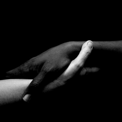
mlk.blackwhitehands

source unknown


Please note, I’ve tried to find image sources for all of these images, and sometimes failed. I would love to give proper credit where due, so if you know the original source of any of these labeled “source unknown”, please let me know!

0

Writing by Hand

saxton_quickbrownfox

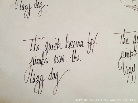
In my late teens I had the opportunity to have my handwriting analyzed. It was the coolest thing. An old woman in a hospital, whom I never personally met, looked at my swooping p’s and looping y’s and sharply crossed t’s, the height of my h’s, the slants, the weights, the close-or-far-apartness of the letters, if they were small or large, tidy or swirly. What she discovered may well have been the best description of me I’ve heard. Her analysis also told me things I didn’t yet know, almost like a fortune, or a map. It was pretty fascinating.

Which reminds me that the physical, pen-in-hand act of writing is not only a form of communication, it’s a form of self-expression; another window into the soul.

It’s also a fabulous collector of thoughts. Sometimes a pen can’t keep pace with my thoughts, but sometimes the slower act of hand-writing keeps my thoughts in line, keeps them from running off to oblivion, balances my mood. Plus I get to make doodles on the page. (Silly? Not really – it’s actually part of the thought process.)

Something happens between the mind and the hand that’s different than what happens between the mind and the keyboard. Maybe it’s simply that hand-writing is organic. It’s breathing deeply instead of a quick lap around the track.

There’s a place for both the handwritten and the typewritten – one is not “better” than the other; in fact both are good, and both are necessary – but even without the scientific evidence at my fingertips (no pun intended), I am certain that both methods exercise different parts of the brain, some how, some way. (And yes, there are differences between printing and script to form our letters as well.) The entire mind-body-spirit is involved ~ how we think, how we process, how we sit, how we move our hands, how we feel. There’s got to be physiological implications.

And so, while this may be old news, the fact that teaching cursive writing in school is being phased out of the curriculum just blows my mind. I can’t believe it’s even up for discussion, much less already happening.

What about hand-eye coordination, thinking patterns, better comprehension when writing things down “painstakingly” by hand, knowing how to spell and use proper grammar and punctuation without spell-check tools, and yes, expression and creativity?

When it comes to writing by hand, there’s so much in the pro column here, and, as far as I can see, a big zero in the negative column. What is so damn important that basic penmanship skills get the boot?

All this really brings my inner cynic out front. Anyone interested in positive teaching, in my opinion, wouldn’t even consider taking this out of our schools.

Sure, electronic-based writing is more practical, and block-letters are easier to master than script. But there’s enormous value in writing by hand, and to imagine this capacity no longer existing is a truly disturbing thought. The very human-ness of writing by hand should not be relegated to dusty archives, hidden corners, calligraphers and ancient texts.

Please teach your kids to write! (I can hear it now… “But why do I have to do this? I’ll never use it!) Are we to be tethered to electronic devices for everything we do? (Next it’ll be paints. No more Grumbacher. Good bye Winsor & Newton! Why use real paint when you can do it with software?) Who decides the value here? How is that value measured? Will we cordon off whole parts of our brain?

There’s just too much telling people what to do, what to think, how to think, how to feel, how to be. Stop it already. And let kids learn to write. Print letters and script letters. By hand. It’s important.

And not that this is the crux of my argument, but you know, maybe they’ll even gain insights from having their handwriting analyzed one day… their own personally unique formation of words on a page, from head to hand to paper.

0

Tools and Other Worthy Indulgences

saxton_calligraphypens

Some things are more worthy of indulgence than others. Long, hot baths come to mind. Good books. Time with friends, time alone, laughter, comfortable shoes.

And because I was just speaking of pens (previous post), my mind turns to the tools we use and how much the right ones matter. Even a simple, everyday pen can be a tool of ease or frustration, depending first on how well it’s made, then how well it’s taken care of, and finally, knowing when its time is up.

Not all pens are created equal; nor pencils, nor hammers, nor computers, nor cameras, nor carrot peelers. The list goes on.

Several years back I worked on a mural with a group of other artists. A handful of brushes were available, paints were provided and we’d all been part of the design, so it was just a matter of painting. Fun, right?  Sort of, but not really. Why not?

The thing is, we worked in acrylics, which was, at the time, a medium I was less familiar with than some of the others artists were, and I’d been feeling irritated by the way the paint went on. Then one day, towards the end of the project, someone handed me a different paintbrush. In that moment, within seconds of the first brush stroke, night became day. Winter became spring. Skies turned blue. Birds sang, trees blossomed! I was stunned. The paint suddenly flowed. All that time … struggling, thinking it was me, when really … what a difference a brush can make!

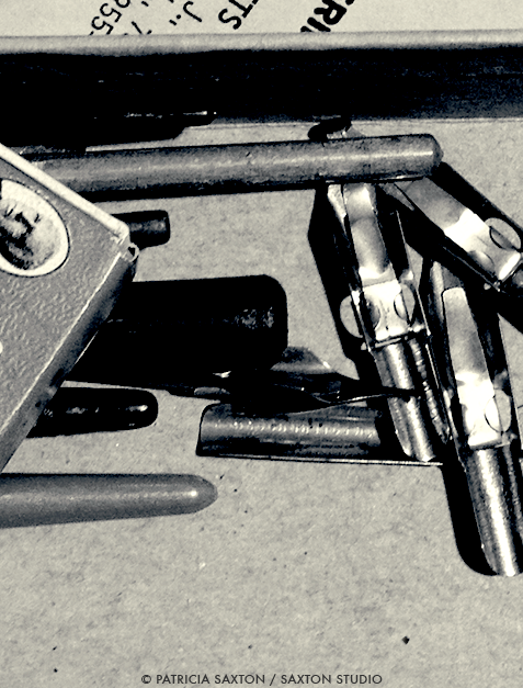
And back to pens for a minute ~ in the early days, when not using my trusty #2 pencils, I’d draw with an old-fashioned calligraphy pen – the kind with metal nibs; the kind that people of centuries-gone-by used for letter writing, under the light of a candle or a kerosene lamp, dipping the pen in and out and in and out and in and out of a bottle of India Ink. Precision was difficult, mistakes and ink blobs were relatively easy to perform, but if you took good care of your tools and practiced your craft, beautiful results could happen. I got pretty good at it.

Then, (thank the Pen Gods), someone invented a pen called a rapidograph. At first I was pessimistic. It wasn’t “the real thing”. But two minutes in, I was hooked. It was real, and wow ~ manna from heaven! ~ it made the whole drawing experience so much better. Changing and cleaning nibs – easier. Mess – hardly. Potential for precision – worlds apart.

Of course there will always be poor imitations, in which case any newness is hardly worth it. Just because it’s “new” doesn’t mean its “good”. Since the dawn of time tools have been made to make life 1.) easier and 2.) more efficient. If those two criteria aren’t met, (in my best New Jersey accent) “fuggedaboudit.”

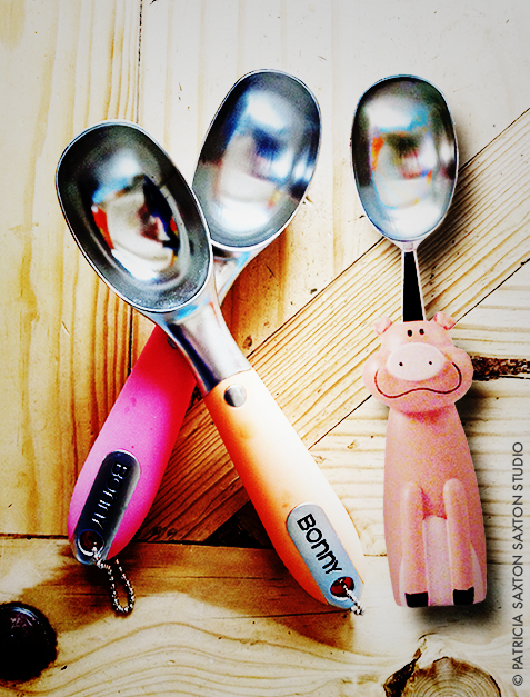
Holds true of everything. Take ice cream scoopers, which also happen to be a favorite tool of mine. They have to be sturdy, with the scooper-outer part just the right depth, the handle firmly attached and nicely grippable. Definitely not made of cheap plastic stuff. The last thing you want is a sprained wrist when indulging in a much-deserved treat. Ice cream is intended as a happy experience.

I’m sure most of you have a “bad tool” story, and probably know as well as I that when it comes to tools, quality counts. So indulge, I say! – not because they’re a treat, but because the difference can be like night and day. The right tools can replace cursing with whistling. And time spent, that most precious commodity, becomes more productive and pleasant if not downright fun.

So here’s to the value of tools; no matter what you do, wherever you go, may the right tools be yours. : )

scoops_lomo


0

A Plethora of P’s / #70: Pen (and Ink)

proactively punctuating life with the plausible, powerful possibilities of positive thought presented through a plethora of “P’s”.

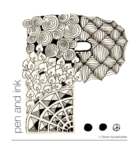
saxton.P_penaandink“The pen is mightier than the sword.”

I’ve always liked this quote. It assumes the great power of words, language and intention, which are just a few of my favorite things, along with pens themselves, of course.

[Side note: I’d always assumed this was a line from Shakespeare. Sounds like it ought to be, right? But I was wrong. This is what learned: This line was quoted in 1839 from a play written by Britain’s Edward Bulwer-Lytton, both an Author and Politician of his day. No one remembers the play (Richelieu: or, the Conspiracy) but we’ve all heard the line. Apparently he’s also famous for the opening “It was a dark and stormy night”. I just love learning new things. 🙂 ]

In any event – back to P for pen. This is actually a guest P, created by a friend of mine and presented as a surprise, which truly delighted me. She’d taken a Zendangle course, and this was something she produced. Isn’t it great?! I adore it.

It’s also great because pens have always been an important positive in my own world. I am, in fact, most comfortable with a pen in hand ~ I just think better with a pen in hand. I’m also able to doodle if things are dull on the other side of the table or the other end of the phone, or in meetings, or just as an unconscious release of nervous energy. They’re great for making lists, and of course, for jotting down flashes of brilliance (that may or may not be brilliant on second look). My thoughts flow most easily when writing. As if the connection between mind and hand takes just enough longer than the one from mind to mouth, allowing for a richer expression, rather than a quick one.

Pens and I go way back. As a child I was always drawing and writing. My mother, a poet, was always writing. My parents had fallen in love through letter-writing. Pens were the natural order of things.

Then as my drawing skills developed, I got more and more courageous and soon stepped out of my comfort zone with pencils (which can be erased) to pen and ink (which cannot be erased). This is when I learned, sometimes the hard way, that mistakes a.) happen and b.) are not always remedied, but c.) can sometimes be made into something better. A life lesson from an unlikely source, but a good one I’ve carried with me.

So I, yes, am grateful for pens. And I do believe they are mighty. <3

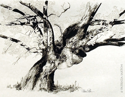
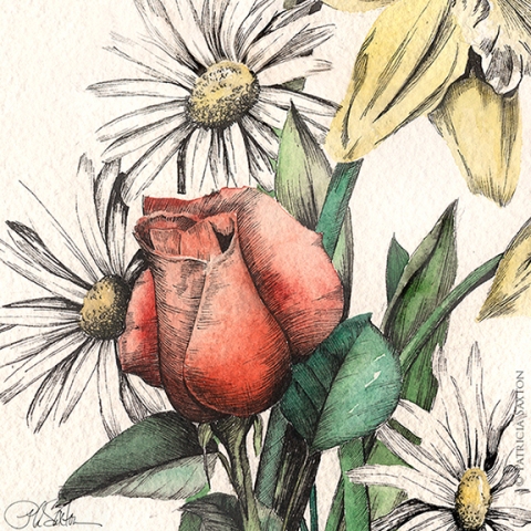
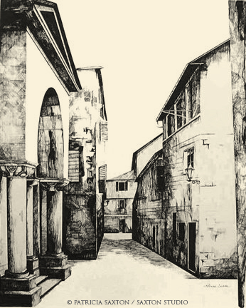
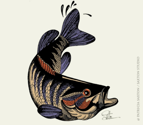
Here are a few pen and inks from my archives.

old.treeFB

flowerswatercolor.crop8X8sig_72

saxton_yugoslavia_sm

bass2


(see our ongoing Plethora of P’s here)

0

Twelve Months of Flowers

If only it were true. Unless you count holly berries, there’s really not much in the way of floral color in northeast winter months.

But “Twelve Months of Flowers” can be had via art prints, from the series published 1n 1730 by renowned British horticulturist and author Robert Furber. Mr. Furber’s name is highly attributed to these exquisite prints, and while I’m grateful that he had the insight, substantial research and knowledge (and, no doubt, the funds) to produce the collection, I’m mostly interested in the artistry.

We had two of these prints hanging in our dining room during my growing-up years – one May, one November, the months of my parent’s birthdays. Admired by all, they adorned a modest space with a rich, subtle elegance, (and now that I think of it, may have had an influence on my own interest in drawing things botanical) ~ but in all those years, while we probably did, I don’t remember talking about the artist. Regardless, for some reason they lodged in my mind’s eye today ~ perhaps an unconscious nod to my parent’s wedding anniversary? ~ so I went looking.

First of all, they are hand-colored engravings, produced by English engraver Henry Fletcher from paintings of Flemish-born artist Pieter Casteels . (They also produced an equally stunning second series, Twelve Months of Fruits.) Each work is a glorious detail of plants in seasonal bloom, with each plant numbered, and, at the time, a list of the corresponding names. More than 400 plant species were featured. This was no small project.

And so a few centuries later, I thank them ~ all three of them: Furber, Fletcher and Casteels ~ for their fine, luscious collaboration of study, talent and skill. They are so beautiful, I might even venture to call them a labor of love. But that’s what art is.

TwelveMonths1_sm

TwelveMonths2_sm

TwelveMonths3_sm

TwelveMonths4_sm

TwelveMonths5_sm

TwelveMonths6_sm

TwelveMonths7_sm

TwelveMonths8_sm

TwelveMonths9_sm

TwelveMonths10_sm

TwelveMonths11_sm

TwelveMonths12_sm

0

O’Keeffe and Me

blue.iris1

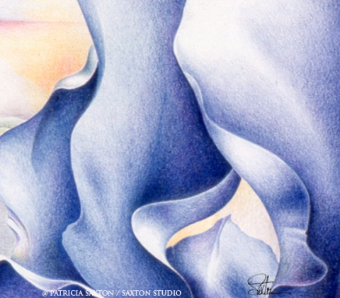
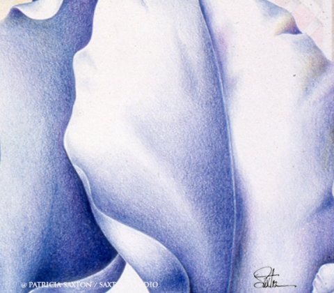
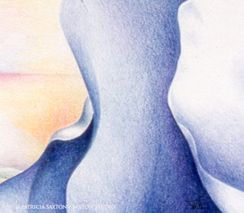
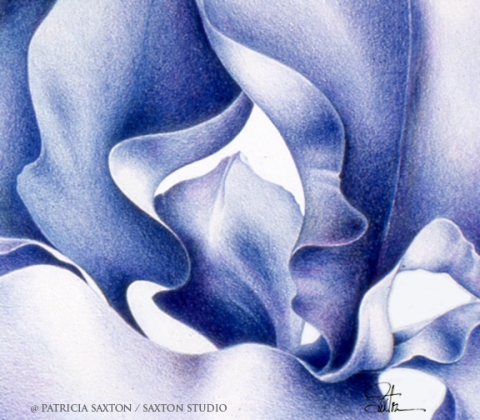
I came across some old art, and made it new again. That was fun for me, looking at it with fresh eyes and different life experience behind me.

It also reminded me of “events that shape us”, and never-answered questions like whether our paths are determined by planning, grit and circumstance or if they’re a pre-ordained destiny. Conscious decisions vs. fate. And if it’s a little of both (which is more what I believe), and how they play with or against one another. Because looking back on a lifetime of making art, it’s clear to me that it was there all along, whether pushing up like weeds from concrete when I turned away or fought it, or blooming with passionate contentment when embraced. How it played itself out could have been different, and I’ve often wondered just how much impact different choices would have made ~ but life being both so mysterious and interconnected, who’s to say what other things would come into play when taking a different fork in the road that may have landed you right in the same place.

And what does all that have to do with O’Keeffee and me? It’s a bit of a twisty tale, a piece pulled from the “how I got here” files ~ which I suppose all started with a love for flowers.

In my early art years, I was very focused on honing my skills and basically marveling at the whole process of watching something come to life, through my hands, onto a blank piece of paper. It was “something I did”.
But when it came time for college and higher learning, I didn’t go to an art school. I had an aversion to the possibility of being surrounded by self-important people wearing berets thinking high-minded, overly-grand things about art ~ so I went to a wonderful liberal arts university with a champion football team and kids who studied everything from geology to literature to chemistry, pottery and music. I was already “immersed” in art and that seemed enough reason to study other things. Too much of one thing would have been, well, too much.

At the same time, a quiet rebellion thrived inside me against studying other artists. “Why?” you may ask. Mainly because I didn’t want to be influenced. I wanted my own style to emerge freely on its own. I didn’t want to copy. Second reason, I found art history incredibly boring. History was great, and art was great, but the two together caused much clock-watching, seat-squirming and suddenly heavy eyelids.

Given my ignorance of art history, you might then understand that I hadn’t a clue when during one of my early shows some of my work (like those shown here) was compared to the work of Georgia O’Keeffe.

“Who?”

Well of course I had to find out who this Georgia person was. I didn’t want to be like somebody else! Or worse, have people think I was trying to mimic.

It wasn’t hard to find examples of her work, and as it turned out I was pretty impressed. Flattered too, really. And I understood where they found the resemblance, unwitting as it was. Then I went on to read about her life, discovering that my O’Keeffian connection went beyond art to things like walking similar terrains (Lake George, the southwest and New York City) and even having my own version of a Stieglitz at the time.

My work is not very O’Keeffian these days, but it was a cool pairing back then, and that kind of over-sized styling never left my realm of creative thinking. And while I’m still not a full convert, it also marked the beginnings of my first real interest, outside of a classic admiration for Michelangelo, Norman Rockwell and Andrew Wyeth, in the subject of “art history”.

All because of a thing for flowers. Goes to show we never know what will lead us where, and the journey will happen regardless.

blue.iris4

blue.iris6

blue.iris3

0

Tuesdays with Chris: “The Gift of Listening”

Chris Staley, early work

In his typically wise yet humble way, Chris covers another of my favorite subjects in this last video of the series ~ unobtrusively reminding us that the world could use quite a bit more good listening.

Hope you’ve enjoyed the series as much as I have. It’s been a pleasure filling our Tuesdays with the creative insights from a great teacher, a great person, a wonderful artist and an old friend. Thank you Chris, for the opportunity for more of us to listen to you.

(If you missed my introduction about Chris Staley, master potter, educator and Penn State Laureate 2012-2013, you can read that here.)  Enjoy!

0