Lessons from Daffodils
It snowed last night. We’d all hoped it wouldn’t, and that spring might have been here to stay. It’s March though, so not a huge surprise.
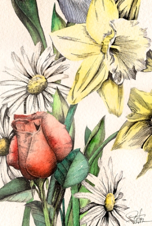
But what about the daffodils? They were almost full grown, and while I knew they’d “weather the storm”, I still felt kinda sorry for them.
And in the same breath, I felt admiration. They’ve got looks, delicacy and toughness all wrapped up. We could learn a lesson or two from the daffodil.
Maybe it would be to rest in winter, allowing our roots to replenish. And after the cold weary days have dragged on… and on …, be the first to send out hope, defiantly and boldly sprouting up in February’s first light.
And maybe then, ignoring naysayers who suggest “it’s too soon, nobody else is growing yet”, or “don’t you know something bad could happen?”, or “silly daffodil, such a dreamer” … we stand by our conviction. We encourage others. We grow taller. We bask with confidence.
And when the inevitable happens ~ (but is it inevitable? they say it is, so it must be) ~ when the inevitable bad thing showers down upon us (the one we were warned about) ~ we cover our heads, huddle together, look inward and brave it out, the strength from our nourished roots holding us tight. Knowing this will pass. Knowing we’ll stand again, straight and tall. And knowing, that bending in the breeze, we’ll bloom, and share our blossoms with all who pass by.
Some may never notice our brilliance ~ (and we all have some) ~ but a few will notice, and will be the better for it. Perhaps that’s all we can ask for, and perhaps that’s good enough.


