Do Typefaces Really Matter? (silly question…)
Here’s a confession: I belong to a Facebook group called “Correct Spelling, Punctuation and Apostrophe Use.” It pleases my inner nerd. Yes, indeed it does. Plus, when you grow up with a literary parent, the whole kit and caboodle of spelling and grammar becomes second nature … so if it’s used wrong, it produces a screeching nails-on-chalkboard feeling. A travesty. A stain.
But I digress.
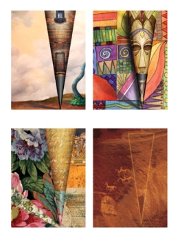
So … I happened to make a brief detour over to Facebook to check on something or other, and there, to my delight, was a pretty cool article about the impact of typefaces posted by the “Correct Spelling, Punctuation and Apostrophe Use” folks. It’s actually a BBC News Magazine article, and I don’t think it’s okay for me to re-post it, so I’m just going to give you the link. This is only for those of you interested in type and fonts… otherwise you may not care, and can just admire the pretty picture above.
(I sure hope I didn’t make any grammatical errors in this post!)
Great Book Covers: Part II
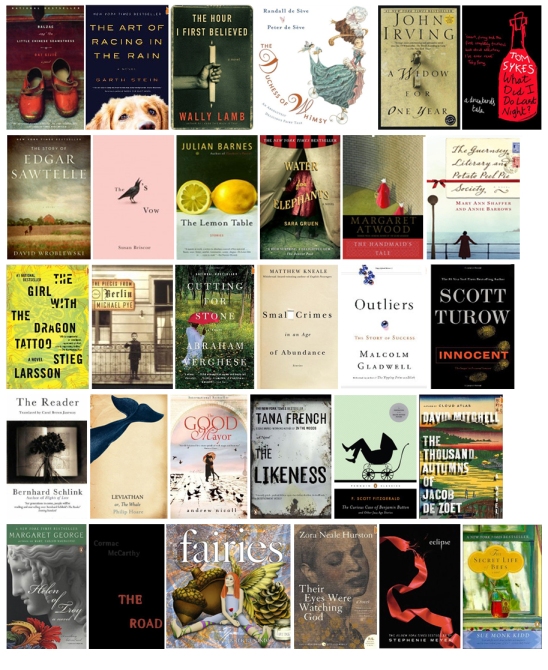 It could just be me, but I think bookstores are like candy shops. Maybe it’s the difference between a sweet tooth and a sweet eye … okay, I made that up (not a bad analogy though, if you think about it!) … but whatever it is, I get a feeling of yummy anticipation when opening the door to a well-stocked, nicely laid out bookstore.
I really, truly, love books. I love to hold them, turn the pages, get lost in great story-telling. I love to see all the different covers, and pass judgment (c’mon ~ we all do).
And when great cover art matches up with a great story, it’s almost as good as really good chocolate. (apparently I’m still on the *sweet* reference) It’s like the marriage of ice cream and hot fudge. You could get by with one or the other, but together they make perfection.
Trouble is, sometimes they don’t match up. You might have an outstanding story housed inside a mediocre cover, in which case you could pass it by and miss out on something real special. Or, a stellar cover might disguise a less than stellar reading experience. Talk about disappointment.
One aspect of my job as a designer is to make book cover art that weaves its best magic for the author. The goal is to get folks to pick up your book. So regardless of reviews (or lack of), accolades from Oprah (most likely lack of) or best-seller lists ~ when it comes down to considering a book as a potential read or possible purchase, the cover can make or break that first opportunity to grab someone’s attention.
And it’s important that that attention is both dynamic and pleasing. It’s a tease of something good to come. It’s welcoming. And of course, it has to speak to what the book is about, which very briefly answers the reader’s question “is this something I might be interested in?”
If a book has made the first cut where people have taken notice, reached out and picked it up ~ congratulations! But remember, then they’re going to look at the back cover. Then they’ll look at the inside flaps. Personally, I also like to read the first page of a book before making a decision ~ to see if it’s gonna “grab me”. If all these elements find favor ~ cover, back, flaps (and maybe the first page)~ you’ve got a win.
So, while we all judge books by their covers, it still holds true that the cover alone will not sell a book. What it will do is determine whether it warrants a closer look. It’s a critical first step.
So what makes a great cover? What makes it jump from the shelf onto your personal radar? Something like this:
- It looks professional.
- It reflects the nature of the story.
- It respects the audience.
- It’s visually appealing.
Sounds easy, but there can be a fine line between what works and doesn’t work. And that fine line can create a huge gaping difference. If it looks unprofessional or lackluster, the perception is set that that’s what’s inside as well.
Making it work is, very literally, in the details.
Fonts. Not always, but generally speaking, conservative/traditional fonts work best. And whatever the fonts, it’s all about size, color and placement. Even hints of difference in those treatments can change the look dramatically. There’s no one-size fits all plan, unless you have a published series with an established look.
Art: Art speaks to the soul of the book. Is photography best? Illustration? Both? Neither? (Believe it or not, there are occasions when no art is good art. Coming from an artist, you might think that sounds crazy. But [excluding children’s books] type alone has a place if used exceptionally well and manages to convey the book’s essence.) Bottom line, the style of art (or type) used is a huge deal, because not only does it suggest the story, it suggests the feeling of the story. This is the emotional grab.
Trends: What’s out there, what looks good (or bad), what’s selling well? These will serve as style guides… but the best covers will bend “the rules”. In fact, they’ll break a few. Because there really are no rules, just guides. Visual justice should be given to the uniqueness of the each book.
Over-design: Aside from being next to impossible, attempting to put everything about the story on the cover, or trying to capture all the nuances, is not a good idea and will scream “unprofessional”. Cover art should simply portray a sense of what’s inside. It’s a tantalizing piece of candy from the jar, not the whole store.
…………
I positively adore a great book find. I get excited. I chomp at the bit to find that moment in a day when I can get comfy, make the light right, and sink my over-thinking brain into another place and time and cavort with all sorts of fascinating characters.
But just as much, I savor the look and feel of a book. It’s also one of the fondest parts of my work ~ designing covers that can make that magical first connection between book and reader.
Great Book Covers: Part I
It’s true: we do judge books by their covers.
This is one of my new favorites. For more scrumptious designs, check out the Book Cover Archive site. It’s filled with yummy, inspiring finds that will thrill designers and possibly even inspire more people to pick up a book and read. : )
Week 46: "52 Weeks of Peace"
Dream-Catcher
Art Exhibit: "The Melting Pot"
Opening Reception: Sunday, July 18, 1:00 ~ 5:00 pm, Passaic Public Library, 195 Gregory Ave, Passaic, NJ. This event is free and open to the public.
The U.S. has long been called “The Great Melting Pot”. We’re a cocktail of ancestries and genetics, continually mixed and re-mixed. We’re a land of hard workers and spirited dreamers; a multi-cultured, multi-colored bouquet designed to thrive in the same garden.
The “Melting Pot” exhibit, under the curation of Nelson Alvarez, sponsored by La Ruche Art in collaboration with the Manos a la Ayuda Foundation and hosted by the Passaic Public Library, will feature the work of artists honoring the bonds and diverse cultural backgrounds that create the rich tapestry of our country.
Unique to this exhibit, each artist has also prepared an essay on what “Melting Pot” means to them personally, and how it is expressed in their work. I have no doubt the artists’ words will be just as intriguing and thought-provoking as their visual interpretations.
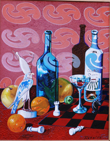
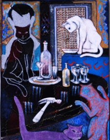
For a tease of what will be shown, I’m including works below from just a few of the exhibiting artists (Dr. Jose Rodeiro, Patricia Saxton and Bonita Norman).
Week 45: "52 Weeks of Peace"
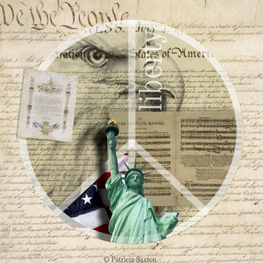
Peace is liberty.
Today we honor of the United States of America. We honor our founders ~ their courage, their foresight and their brave ideals. And we honor our collective indomitable, independent spirit … as night skies across America burst with color, rumble and crack with cannon-like blasts, reminding us of all those who have fought for our freedoms and fought for peace, who have dreamed and toiled for life, liberty and the pursuit of happiness.
Happy Birthday America. May you have many, many, many more.
Week 44: "52 Weeks of Peace"
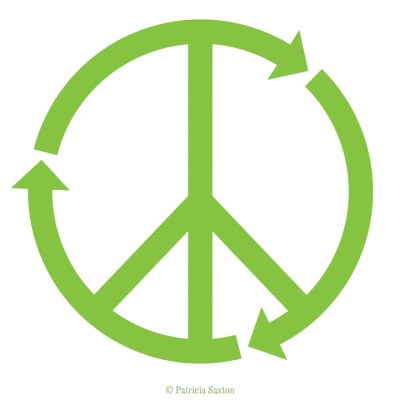
Peace: Reusable. recyclable, and pretty darn remarkable.
Week 43: "52 Weeks of Peace"
We’re down to the last 10 weeks of “52”… hard to believe! It’s gone by so quickly. Hopefully it’s been as fun, and in some ways enriching, for you as it has been for me. But we’re not done yet, so please enjoy the countdown to 52!
……………..
Summertime. The weather’s hot. The sun is high overhead, gardens are bursting and most people think about of ways to cool off … pools, sprinklers, lakes, oceans, and streams take center stage.
Being near the coast, my mind gravitates to the sea; its grandness, its wonder and its gifts. And one of those gifts, so simply and exquisitely designed… seems to perfectly carry the message of peace and good will; a message worth remembering as life’s waves alternately cleanse, toss and tumble us about …


![bonita'spaintings[1] (8)](https://saxtonstudio.files.wordpress.com/2010/07/bonitaspaintings1-81.jpg?resize=307%2C225)
