Exquisite!… Type, Art & Design

Thanks to a spontaneous visit and a link on the I Love Typography blog, I stumbled upon one of the most exciting and inspiring pieces of design I’ve seen in a long time. It’s absolutely fantastic. And entirely fun.

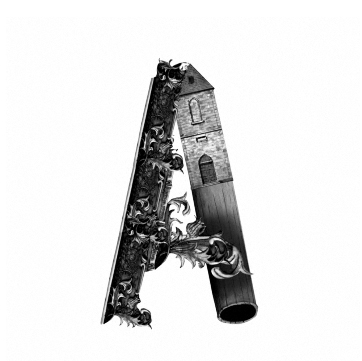
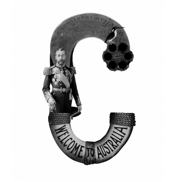
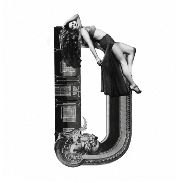
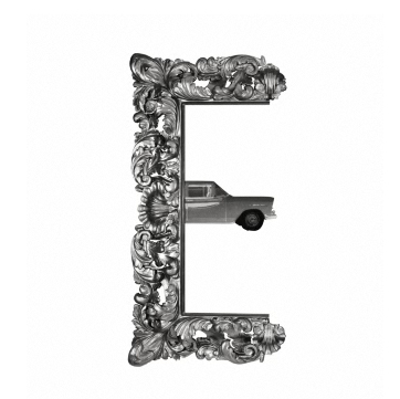
According to the “One Hundred” website (celebrating 100 years of Australia’s State Library of New South Wales), a Design Agency by the name of Frost collaborated with and utilized the treasures of the collections of the State Library of New South Wales and the Mitchell Library to create an entire alphabet. It’s nothing short of exquisite.

The One Hundred site itself is impressive too, with letters A-H explained in glorious, color detail, showing the elaborate art, history and sheer cleverness that lovingly went into each creation. This is the kind of thing that given the chance I would drool over with eagerly rolled-up sleeves. It’s a pure slice of design heaven, and marvelously executed.

Enough teasing. Here’s a look at the art. (I admit I wish the whole alphabet were available ~ but to see more, it looks like one might have to go to Sydney.)

0

The iPhone and Fun with Type

hugetype

While adding some weblogs to my blogroll,  I came across one called Huge Type.  I was intrigued.  You can’t consider yourself a serious designer without some form of adoration for typography. Clicking on the site, I found it was an experiment / experience kind of thing. Further intrigued me.

Then I saw that this project / experiment incorporated the iPhone. (There again, who doesn’t love the iPhone?) And I thought, what a great, entertaining way to direct people’s attention to the sheer volume of outstanding typography –  and its fantastic craftsmanship – that surrounds us daily, to the point of viewer non-chalance.

We see type so often – on magazines, buses, billboards, our computers, our books – we use it to write with, design with, read with – that typefaces run great risk of being taken for granted.  They’re just “there”, they show up, they look good or bad.

Alot of people aren’t all that aware of the important role played by type.  But it is an amazingly important, critical part of any visual layout.  One word can evoke entirely different feelings based on what font is used to say it.  That’s pretty powerful.

So, while I’m at it, kudos to all the font designers out there, who painstakingly render their works of typographical art.  Thank you to the type design greats of history, and the modern font artists who carry on a strong tradition of skilled mastery.

Well I got off on a bit of a tangent there – but well worth it, if it reminds people of the expressiveness possible through the use of type and a gathers a little appreciation for the unsung heros of typography.  (We all know of Leonardo DaVinci and Frank Lloyd Wright, but how many know Giambattista Bodoni?)

So, take a look at this site if you’re interested in combining the iPhone and a little fun with type.  You may start seeing letters and words in a whole new way.  http://www.hugetype.com/

Share

0