Fairy News!

I’m officially excited ~ because my second book, A Book of Fairies, has virtually sold out and is being reprinted!!

A second edition. Wow, I have to admit that feels great.

My heartfelt thanks to my publisher, Shenanigan Books, for believing in me from the start with The Book of Mermaids, and to anyone and everyone who’s bought A Book of Fairies and helped make it this far. It may not have been discovered by the New York Times yet (ha ha!), but to know it’s being enjoyed by thousands of people truly, truly means the world to me. Thank you!

from A Book of Fairies / © Patricia Saxton

from A Book of Fairies / © Patricia Saxton

from A Book of Fairies / © Patricia Saxton

from A Book of Fairies / © Patricia Saxton

0

Details, Details

Details rule my days, all day, most days. Design details, illustrative details, word details, project details, scheduling, parenting, you name it. (Which is partly why, I suppose, that I love to paint backgrounds with giant sweeping brushstrokes, and why I love big, broad views with never-ending skies.)

When it comes to my art, people often ask “how do you do that shading with a pencil?”, or “how do you create that sense of depth on a 2-dimensional surface?”. Of course I can show them, or I can teach techniques, but the truth is that when you’re in the throes, you’re not really “thinking”, it’s more like feeling your way. (And it should also be said, that one of the key things about details is knowing which ones to leave out.)

In any event, since details play such a big role in my work, I thought it might be interesting to share some “up-close” artwork. Hope you enjoy the closer look!
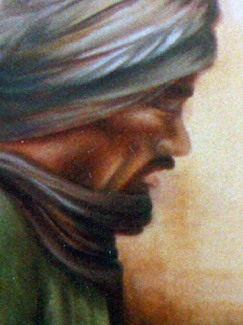
saxton_cairo.market.detail2

Detail of "Cairo Market" / Oil on Canvas / © Patricia Saxton
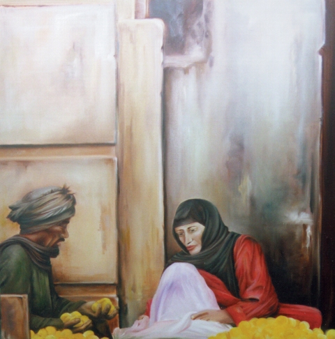
"Cairo Market" / Oil on Canvas / © Patricia Saxton
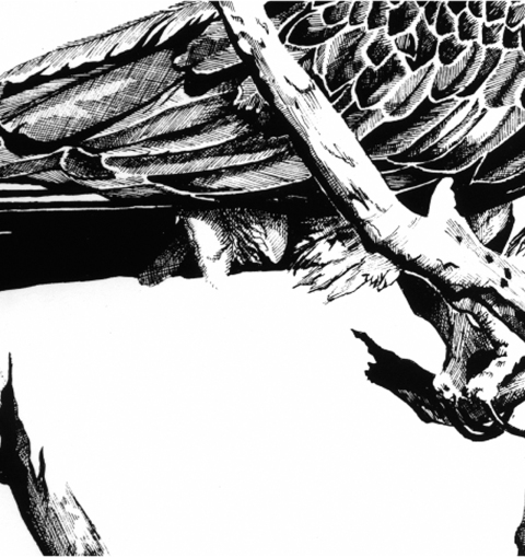
Detail of "Osprey 1" / Pen & Ink / © Patricia Saxton
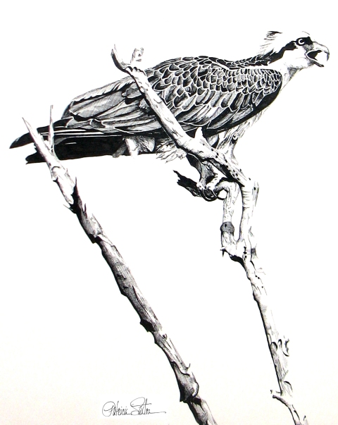
"Osprey 1" / Pen and Ink on Paper / © Patricia Saxton

Detail of "Eagle" / Pencil on Paper / © Patricia Saxton

"Eagle" / Pencil on Paper / © Patricia Saxton
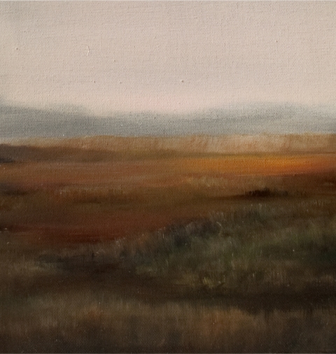
Detail of "Storm II" / Oil on Canvas / © Patricia Saxton
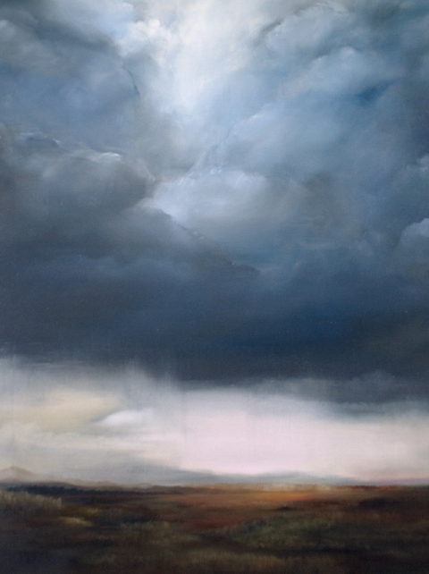
"Storm II" / Oil on Canvas / © Patricia Saxton

0

The iPhone and Fun with Type

hugetype

While adding some weblogs to my blogroll,  I came across one called Huge Type.  I was intrigued.  You can’t consider yourself a serious designer without some form of adoration for typography. Clicking on the site, I found it was an experiment / experience kind of thing. Further intrigued me.

Then I saw that this project / experiment incorporated the iPhone. (There again, who doesn’t love the iPhone?) And I thought, what a great, entertaining way to direct people’s attention to the sheer volume of outstanding typography –  and its fantastic craftsmanship – that surrounds us daily, to the point of viewer non-chalance.

We see type so often – on magazines, buses, billboards, our computers, our books – we use it to write with, design with, read with – that typefaces run great risk of being taken for granted.  They’re just “there”, they show up, they look good or bad.

Alot of people aren’t all that aware of the important role played by type.  But it is an amazingly important, critical part of any visual layout.  One word can evoke entirely different feelings based on what font is used to say it.  That’s pretty powerful.

So, while I’m at it, kudos to all the font designers out there, who painstakingly render their works of typographical art.  Thank you to the type design greats of history, and the modern font artists who carry on a strong tradition of skilled mastery.

Well I got off on a bit of a tangent there – but well worth it, if it reminds people of the expressiveness possible through the use of type and a gathers a little appreciation for the unsung heros of typography.  (We all know of Leonardo DaVinci and Frank Lloyd Wright, but how many know Giambattista Bodoni?)

So, take a look at this site if you’re interested in combining the iPhone and a little fun with type.  You may start seeing letters and words in a whole new way.  http://www.hugetype.com/

Share

0