Much time, and probably a lot more money, was spent making recent logo changes on some big company re-branding efforts.
EXHIBIT A: Tetley Tea. Tom’s of Maine. The GAP. (old on left, new on right)


The question I ask: “Why”? Have sales been down? Was company morale low? Were they experiencing a scandalous attack? Were decision-making-someones simply bored?
Now, don’t get me wrong ~ I’m all about presentation and the power of “look and feel”, and if any one of these companies had asked me to give them a redesign, I would have gladly obliged. But – not to sound immodest, as I believe most designers given the opportunity would say the same thing– I would have handled it quite differently, and I’d like to think, more effectively.
One lesson I would apply: “if it ain’t broke, don’t fix it”. This is the part of “Branding 101” known as consumer recognition.
Brand Connections …
Big Brands elicit a kind of personal connection – for better or worse, we make mental, even emotional, associations with how they look. And that association comes from recognition, which stems from the basic concept of consistency.
For high-profile brands, the success derived from established logo/packaging recognition can seriously outweigh whether or not a look is amazing.
As shown in “Exhibit A”, Tetley’s old package was far from hip or upscale ~ but, as a tea drinker who personally loves the smooth, full-bodied flavor of Tetley’s British Blend, I can vouch that the old package says “rich flavor” much more than the new package, which (I truly hate to say) looks more like packaging for a feminine product.
Tom’s, another brand I enjoy, previously used friendly, round shaped bottles and a graphic treatment that worked well with its natural product, whereas the new look reminds me of a bad Web 2.0 design in an oddly shaped container.
As for GAP, the logo may not have been exciting, but it was solid with really nothing wrong.
Doing it right….
For companies/products with already high recognition, rather than reinvent the wheel, redesigns would best be served by tweaking and updating.
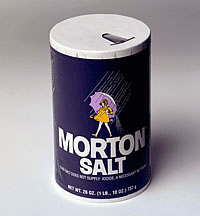
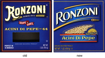
EXHIBIT B: Morton Salt. Ronzoni.


Morton and Ronzoni made changes with the times, without shocking overhauls. They’ve retained their original intent and managed to successfully alter their look by doing it gradually, with key elements maintained and integrity in tact.
The message being, don’t send your customers on a wild goose chase trying to find your *new and improved* packaging, OR throw them into a tizzy because their familiar, trusted product got a makeover and a new doo, like a friend who’s trying to be, or is turning into, someone else.
Beyond the fact that many people don’t like change, there’s something to be said for the comfort of familiarity in a world that moves too fast and holds many a slick deal.
On the other hand, improvements can be refreshing. Kind of like when you’re loathe to part with an old, favorite shetland sweater ~ but that nice new cashmere in a similar style and color might be hard to resist.
Refreshing is good. But different and unfamiliar is not a smart promotional move. Why discombobulate, and possibly alienate, your audience? For what purpose?
To redesign or not to redesign?
Okay, so maybe the Tetley, Tom’s and GAP folks had good reason for the change. Let’s go ahead and assume the most practical reason: lagging sales or market competition.
But let’s also put it out there that the cause of lagging sales or struggle with market competition just might have more to do with things much less glamorous than a logo or fancy packaging ~ things like business plans and marketing structure, advertising strategies or customer awareness issues.
So that usually, and particularly in the case of well-known companies/products, changing the logo is not the remedy.
(Worth noting at this point … if you’re a start-up company, or your business has been around but floundering in a sea of mediocrity, by all means, run to a great designer. Boosting the look of your branding may be just what’s needed to boost momentum and shift the energy.)
Well, what’s done is done (except in the case of the GAP, who apparently quickly reverted to their original logo after public outcry! ) … but the questions remain:
1. Is it worth the shake-up to completely re-brand a good thing? (I think not.)
2. Will re-branding a good thing turn the consumer away? (Again, I think not… although you may whine, as I have. But if you love Tetley tea, you won’t stop buying it because you don’t like the new package.)
3. In the end, was it worth the time and money to do all that dramatic re-doing? (Right … I think not.)
4. Could that time and money have been more wisely used? (Most definitely, yes.)
Conclusion: Sometimes it’s wrong to redeisgn a brand. I rest my case.


