33 Years

The original Saxton mug. Best mug ever.

Thirty-three years. Practically vintage. Possibly even fossil material. (yikes – let’s stick with “it’s a good long time”.) But maybe thirty-three years in business is worth something. A pat on the back. An acknowledgment. A bit of reflection. So here goes.

…………………

January, 1985. Think Madonna, Whitney, Aretha, Sting. Think “Back to The Future”, “The Breakfast Club”, “The Color Purple” and “Out of Africa”. Think Keith Haring and Jean-Michael Basquiat. Think dance clubs. Think big hair and huge earrings and shoulder pads, leggings and high-tops and high-waisted pants.

And a young woman at a drawing table dreaming big dreams. Conjuring. Plotting.

So it was that Saxton Illustration & Design began in a small apartment in Chatham, NJ with a spark of an idea, a sweep of unexpected boldness, a love for freedom and a sack full of creativity (and some clients in her pocket; she wasn’t entirely reckless). It’s traveled far since then.

Countless designs for boatloads of clientele, hundreds of drawings and hundreds of pencils, pens and tubes of paint, miles of paper, an intimacy with tight deadlines and working round the clock, branding and more branding, words and more words, an endless array of pencil points, several Macs and four books later – it’s been quite a ride, full of plot twists, feasts and famines, joys and frustrations; all of it.

There was also the discovery of my love for tea. There was Center Street. Brainstorms with Kevin. Collaborations with Glenn. Magic with Leona. Lunches with Milton. Angie’s with everybody. The Midtown Direct. A brief stint with the mob. Art shows. Paper samples. There was Kenya, Egypt, Scotland, England, Germany, Venice. Jose and Yoko. Mary and Pete. Barnes and Noble. Sabbatical in Sedona. Motherhood. Lasting Friendships. A richer relationship with the Universe.

And while it’s evolved from t-squares and triangles and rubber cement to my first little Mac (then another and another…), from printing presses to screens, fax machines to email, brochures to websites, floppy disks to clouds, postcards to blog posts to facebook and instagram … my rules are the same: : 1.) Listen well. 2.) Stay current. 3.) Be reliable. 4.) Always do your best.

So there you have it. Except for one more thing. Having taken a few more leaps since 1985, I’ve learned that creativity never goes out of style, nor does it stand still – I’ve learned that it’s a restless and demanding master, and I its humble servant.

…………………

January 2018. Think Hip-Hop. Think Netflix. Think Street Art and Online Galleries. Think leggings and high-tops (yes, they’re back – just be thankful the shoulder pads aren’t.)

And the girl at the drawing table? Older, but still dreaming, conjuring and plotting. 😉


The Classics.


0

The iPhone and Fun with Type

hugetype

While adding some weblogs to my blogroll,  I came across one called Huge Type.  I was intrigued.  You can’t consider yourself a serious designer without some form of adoration for typography. Clicking on the site, I found it was an experiment / experience kind of thing. Further intrigued me.

Then I saw that this project / experiment incorporated the iPhone. (There again, who doesn’t love the iPhone?) And I thought, what a great, entertaining way to direct people’s attention to the sheer volume of outstanding typography –  and its fantastic craftsmanship – that surrounds us daily, to the point of viewer non-chalance.

We see type so often – on magazines, buses, billboards, our computers, our books – we use it to write with, design with, read with – that typefaces run great risk of being taken for granted.  They’re just “there”, they show up, they look good or bad.

Alot of people aren’t all that aware of the important role played by type.  But it is an amazingly important, critical part of any visual layout.  One word can evoke entirely different feelings based on what font is used to say it.  That’s pretty powerful.

So, while I’m at it, kudos to all the font designers out there, who painstakingly render their works of typographical art.  Thank you to the type design greats of history, and the modern font artists who carry on a strong tradition of skilled mastery.

Well I got off on a bit of a tangent there – but well worth it, if it reminds people of the expressiveness possible through the use of type and a gathers a little appreciation for the unsung heros of typography.  (We all know of Leonardo DaVinci and Frank Lloyd Wright, but how many know Giambattista Bodoni?)

So, take a look at this site if you’re interested in combining the iPhone and a little fun with type.  You may start seeing letters and words in a whole new way.  http://www.hugetype.com/

Share

0

In Praise of Black and White: Part I

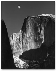
Ansel Adams, Moon and Half Dome

Ansel Adams, Moon and Half Dome

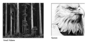
Each year, a new Ansel Adams wall calendar hangs on the door leading to my studio.  His superbly articulated, stunning black and white photography reminds me daily of my love for the natural world as well as the innumerable shades, shapes, shadows and tones that create, change, and emerge from, the world around us.

Yet in a time when everyone wants color, the classic beauty and the powerful visual possibilities of black and white are often neglected.  In the design world, black and white is often completely overlooked or passed by in favor of any use of color.  As if black and white implies something less important, or something dull – even something “cheap”.

But when used well, black and white can be anything but dull, nor without value.  Black and white can be intensely dramatic, elegant and rich.  It can get a strong point across without the distraction of colors.  It can be brilliant or moody, edgy or slick in ways that color cannot.  It can sparkle with cleanliness. Black and white carries undisguised strength, character and integrity … when used well.  Not all photographers have the eye nor skill of an Ansel Adams. Not all designers see in black and white.  Clients rarely consider it.  But it would be nice to see a greater appreciation of the noble duo of black and white.

When people want straight talk, they’ll say “tell me in black and white” – which infers that they’ll get to the truth of the matter.  But more often people speak in shades of gray, or dress it up in garish colors for dramatic effect. So it is with design – a multitude of colors have the potential to become an undifferentiated sea of grays, or gussied up so much the point is lost for the color.

Of course color is beautiful.  As an artist, I can’t help but adore color. Bold, rich fusions of color. Yet color alone will not make a bad design good. And it’s not so much that color is overrated, but that black and white is underrated. You don’t see it alot, which is unfortunate, because the effects of black and white can be pretty spectacular.

It’s a rich experience to see things in black and white; stripped of color, a million shades of gray become a lansdcape of lights and darks that blend and bounce against one another to create a whole. Even if you don’t see things quite like that, a striking black and white image often touches people unexpectedly.  It’s raw and fundamental – and like a good story, it’s satisfying, and it allows your mind to fill in the color that’s left unsaid. Like a well-told story, black and white art can be refreshing, engaging and wonderfully, surprisingly inspiring.

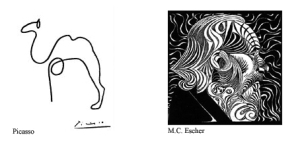
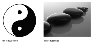
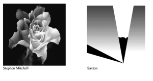
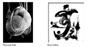
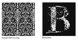
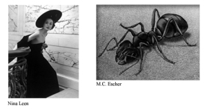
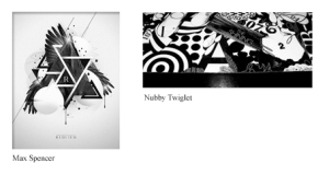
Below is a broad sampling of some pretty nice black & white work. There’s a whole lot more  (though not enough)  than shown here, but it’s a good smattering of styles …

bws3

bw1bws2bws4bws5bws6bws71bws8

Share

3