A Plethora of P’s / #42: Pursuit

proactively punctuating life with the plausible, powerful possibilities of positive thought presented through a plethora of “P’s”.

– ♥ –

Reach high, for stars lie hidden in your soul. Dream deep, for every dream precedes the goal.  ~ Pamela Vaull Starr

Plant the seeds. Climb the hills. Cross the streams. Reach for the moon and stars. Your dreams are worthy of attending.

0

To Logo or Not to Logo…

A client posed the following question: “What’s your perception of logos and are they a cost-effective investment?”

I love this question. It’s not new, nor is the discussion. But considering the unstable climate of our financial times, one worth a revisit. Everyone’s trying to be more careful and make more intelligent decisions about where their dollars go. So, I felt inspired to share my answer:

A logo is the hub of your brand identity. The grand central station. It’s the singular consistent visual that appears everywhere, on everything, carrying your identity into livingrooms and faraway lands and back.

It’s what you put on the packages you send out that says “we’re a real company”. It’s your signature, your great “identifier” ~ so that when people repeatedly see a certain shape or combination of shapes, colors and letters it prompts a psychological association with a company, a person, a quality. You get the idea.

It’s recognition by repetition. And that’s a good thing, because you want to be noticed. And you want it to be strong at-a-glance; something that’s, if not remarkable, at least memorable. Like these classics:

That all said (and I kind of hate to say this since logos are something I do) … you can have a “look and feel” without a logo per se. You can create an “identity” with colors and fonts and use of space.

Case in point: another client wants to establish herself as a voice in the fashion world via writing, and her cash flow is tight. She was convinced she needed a logo and a whole brand identity scheme (all of which can add up to a pretty penny) ~ when in truth, for her needs, she doesn’t “have to have” a logo. What she does have to have is great content and great imagery.

Sure I would have preferred that she need a logo and could pay me to create it, but this is how I advised her because in her case it makes sense ~ not only from a monetary perspective but in terms of creating an online presence that can grow as her own voice grows.

A logo can appear very simple. A simple type treatment, or one with a clever twist, or a symbol as its core. The value, aside from it being “just yours”, is in its consistent use across the board, applied to all things “Business X” and serving as a steady, stable ambassador. And that is no small thing.

But a logo is not, as I’ve said in previous conversations, in and of itself, The Brand Identity. It’s a big part of the whole (and not to be fooled with or “just anything” tossed up). There are many factors that make up that whole, and sometimes it’s both necessary and okay to approach it from a different perspective. Worth pondering before jumping in. And if you do jump, understand its value.

0

“where in the world is peace?”… oktoberfest, of course!

We’ve made it overseas! To Stuttgart, Germany’s Oktoberfest.

Wonder if this peace bag got filled with spätzle and weiner schnitzel, some dark chocolate küchen and a nice Riesling. Maybe some dreikornbrot … ah, sehr gut. Danke schön for sending in!

Oktoberfest Peace

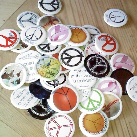
(ps:  all “where in the world is peace?” images are being compiled on a special “where in the world is peace?” page, here. Totes, mugs and things are available here. Send your own pictures to 52weeksofpeace@gmail.com or join our FaceBook page and post them there. Let”s see where peace goes!)

0

A Plethora of P’s / #41: Poise

proactively punctuating life with the plausible, powerful possibilities of positive thought presented through a plethora of “P’s”.

– ♥ –

Poise: the ability to be ill at ease inconspicuously. ~ Earl Wilson

Mr. Wilson is so right. Poise is really about composure, balance and grace under fire. The idea that you can stand calm, keep your wits, speak intelligently ~ when getting rattled might seem the more natural reaction, the easier thing to do!

Poise is self-respect made elegant. So, keep your cool. Smile in the face of adversity. Stand a little taller and don’t let your feathers get too ruffled! It’s usually not worthwhile… but your dignity is.

0

Book Signing at Wittenberg University

My years at Wittenberg University were among life’s best. So I’m psyched to be heading back to my Alma Mater this month for Homecoming Weekend ~ this time to sign books, instead of study them! Here are the details:

Saturday, October 22  /  10:00 – 11:00 am  /  Wittenberg Bookstore

The timing coincides perfectly with my newest release, 52 Weeks of Peace.  They’re also stocking my 2 children’s books, a toy, and a sampling of fun merchandise. (btw, you might want to check out my “where in the world is peace?” campaign, and join in!). And how cool that Dr. Kinnison is scheduled to sign his work from 11-12. I’m certainly in good company.


Ohio people (and Wittenbergers in general) are one of the nicest collective bunches on the planet, and one of the main reasons I chose Wittenberg way back when. So if you can, please stop by and say hello. I’d love to see you!

Patricia Saxton book-signing  /  Saturday, October 22, 2011  /  10:00 – 11:00 am  /  Wittenberg University Bookstore, 734 Woodlawn Ave, Springfield, Ohio  /  (937) 327-7457  

0

Another Legend, Another Lesson

Milton Glaser is Graphic Design and Illustration.

Referred to as the design industry’s “icon”, he truly is the Master, who long ago reached the pinnacles of success. With intelligence, passion and integrity (and amazing talent!) he’s stayed fresh and irrevocably admired well into his 80’s.

Talk about longevity, he’s it. His work inspires millions, his discipline influences countless students. He’s done it all, exceptionally well.

And just the other day, he posted this picture on his Facebook page, which I thought was pretty neat. I looked through the comments, remarks of honest admiration. What do you say to this, after all?

1976 concept sketch for I ♥ NY / © Milton Glaser

But this simplest of “sketches” is more than a cool memento. It serves as a reminder of the raw power of an idea. And what we do or don’t do with it.

Ideas can come in an instant, we all know that. The key seems to be whether we acknowledge or dismiss that instant. And in the next breath, whether we grab a pen and the nearest scrap of paper, napkin, gum wrapper, and jot it down.

What happens after that has a lot to do with the validity of the concept, the practicalities, the applications, the creative development. And lots of those “sudden insights” end up in our own sort of slush pile.

But sometimes…. it’s golden.

So thank you Milton for this humbling image, reminding us to give ideas the light of day, the freedom to breathe, roam, and define themselves.

Draw it, write it, sketch it, record it. … do it!

0

Steve Jobs: A Genius in Heaven

“We don’t get a chance to do that many things, and every one should be really excellent. Because this is our life. Life is brief, and then you die, you know? And we’ve all chosen to do this with our lives. So it better be damn good. It better be worth it.” ~ Steve Jobs

Today, the world mourns the loss of Steve Jobs. He was an incredible innovator. He was an original. He was absolutely brilliant.

A chorus of voices sings his praises this day, and rightly so. He changed the way we live. He did what many think is pure pipe-dream: he actually DID change the world ~ and as many of us believe, for the better.

So what can I add to the barrage of conversation? Probably nothing new. Except to say that I was truly moved when I learned of his passing, and part of me thinks none mourns his loss more than the design community.

Sure, his products have exploded around the globe. Every 5-year-old knows what iPods and iPhones are, as previous boundaries of Mac-users vs. PC-users were swept away like beach pebbles with the wave of all things “i”.

But the design community has been there every step of the way. We were there at the beginning with our little Apple SE’s, practically dancing in the streets when released from the shackles of rubber cement and color separations prepared by hand and lines of type precisely cut by t-squares, triangles and exacto blades. Our world shifted dramatically as Macs created this amazing bridge between creativity and productivity.

We’ve been excited by each new development and loyal to a fault. Thrilled with the simple joy, the “fun”, of using our Macs over the years. We’ve loved their cleverness, their cleanliness, their friendliness, their aesthetics and their power. We, in all honesty, don’t understand how anyone couldn’t love a Mac.

And we watched the young man behind the machines grow, fall, rise again and become a giant. We’ve admired his style, his creativity, his leadership, his greatness. We liked him as a person. He had that unusual quality of someone who is inaccessible yet feels like an old friend.

It’s hard to fathom the difference made through this one man’s vision, and the number of lives touched. Steve Jobs was a genius in our midst, and I, one among many, am awed and exceptionally grateful for his incredible mind, his perseverance and his authenticity. His legacy is great, his gifts lasting. What a blessing, taken too soon. But there’s no easy explanation for magic.

0

Breast Cancer Awareness Month

All of us probably know someone ~ many of us know several ~ stricken with breast cancer. It’s high time we put a stop to it. I know it can be done (I truly believe that), and continue to hope those cures will quickly become front and center news on a healing stage.

My own small effort towards heightening awareness is part of my 52 Weeks of Peace series. Week #22 to be exact, which I will repost here, as it holds as true today as when created.

…………………………………..

Week #22: “Debbie’s Peace”

This week’s peace sign was designed in particular tribute to a friend of mine whose positive, effervescent spirit shines everywhere she goes. It’s the rare individual who radiates her kind of light and blatant enthusiasm for life ~ the kind of person who unwittingly causes you to pause and embrace life right along with her. And because she recently came through a second cancer surgery – with flying colors and a good report  – she’ll be able to keep on shinin’.

For my friend, this piece is a celebration of life.

In her honor, “Debbie’s Peace” is dedicated to all the courageous survivors – as well as to the memory of those who have battled and lost. And hopefully this small offering will serve as another reminder for all of us to give our support and fervent hope towards finding a cure.

If you wish to participate in the fight there are several dedicated organizations to support. You might want to do your own research or ask a friend how you can best help. If you want to carry your support around for all to see, I’ve created a totebag, button, magnet and mug with Week #22’s art.

Blessings to all you strong, sensitive, and brave women out there.

0

A Plethora of P’s / #40: Persistence

proactively punctuating life with the plausible, powerful possibilities of positive thought presented through a plethora of “P’s”.

– ♥ –

Persistence is to the character of man as carbon is to steel.  ~ Napoleon Hill

You just can’t beat the person who never gives up. ~Babe Ruth

In the confrontation between the stream and the rock, the stream always wins – not through strength, but through persistence. ~ Buddha

Persistence is a determined state of mind; a driving force with an out-and-out refusal to give up. Yes, it can be used for the wrong reasons, or lead down a darker road if the persistent thought revolves around negative expectations. But it’s also what we do to combat adversity or deafen the naysayers… we persist; and that positive persistence holds an amazing ability to shift outcomes for the better, to breed courage and to drown out disappointment.

Persistence urges you on to finish a race, gives you the adrenaline to win a match, pushes you to climb higher and reach farther. It says, “I can do this, I can learn that, I can grow this, I can develop that … and I’m gonna put one foot in front of the other, over and over, to make it so”.

It’s all about how you think. Then you act, then things happen. So, it’s a good idea to check the nature of your thoughts… because the dominant thoughts become the persistent attitude that will set your course and lead the way.

0

“The Big Three” in Website Building

Designers, programmers, end-users ~ what’s your favorite web platform? WordPress? Joomla? Drupal?

This topic may make some of your eyes glaze over, but for those of you interested in the new, ever-changing, made-easier and more-manageable world of website building (as opposed to the old, more static world of straight html, java script, etc.), I found this nifty chart back in July, and thought it might be useful/interesting for the visual learners out there who haven’t yet stumbled upon it. (That was quite the long opening sentence, eh?  Sorry if I lost you…)

If you’ve read this far, you probably already know that it’s pretty much an absolute must that any modern website be prepared in a CMS platform. (CMS = Content Management System… which provides user access to the content of your site, in human terms, instead of learning the dreaded code yourself or going back to your programmer for every word change.) The question is, which one?


Personally, I’m a huge fan of WordPress (yup, it’s not just for blogging), but Joomla and Drupal are respected giants in the field.

As a designer, not a programmer (see “Why I Don’t Paint Trucks, etc…”), I can maneuver my way nicely around WordPress. For seriously heavy-duty customization all 3 are viable options though, so I often leave the “which one” decision to my gifted web programming partners.

If you (as designer, programmer, or user) use these platforms, we’d love to hear about your experience… thumbs up, thumbs down, and maybe a little bit of why. For the rest of you, maybe this chart (courtesy Devious Media) will spur movement on that new or upgraded website you’ve been putting off.

0

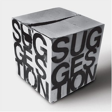
The Suggestion Box

I love this idea. I wish I’d thought of it, but credit goes to Grace, one of the great gals I share lanes with at the pool.

The local facility we use was renovated over the summer. New entrance way, new locker rooms, new weight room ~ pretty much the whole shebang. It’s not a fancy place like some of the more glorified gyms around, but it serves its purpose well.

This morning was the first time I’d been back since the renovation. Of course we girls were mostly interested in the locker rooms ~ and we weren’t let down. They did a bang-up job. Roomy lockers, private showers with a nice built-in ledge for shampoos, and easy to use water turner-onners (right, so I made up a new word, okay?) with hot, hot water. Great little cubbies to hold your towel, too. Nice job.

Grace, Marlene and I were happy campers. But apparently there were complainers. No hair dryers, lockers too tall, or too short or too wide. Luckily I missed all that. However, Grace had the best idea ….

In the “Suggestion Box”, instead of putting what’s wrong, we’re going to slip in some notes about what’s right. Instead of what we don’t like, we’ll write down what we DO like.

I thought that was brilliant. Doesn’t mean you never mention areas for improvement ~ when there’s an actual suggestion box you assume it really is meant for suggestions. But I imagine how nice it’ll be for someone to come across a few notes of unsolicited “thanks” in there.

Appreciation in unexpected places. Makes me smile just thinking about it.

0

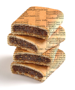
Why I Don’t Paint Trucks, Write Computer Code or Eat Fig Newtons

Back when I was fresh out of college and not yet sure what I was going to do with my life, my eldest brother had a serious jeep-racing hobby. He had a bright yellow jeep, and asked me to paint Disney’s Pluto on the back end, along with the words “Old Yeller”. I thought that was a fun idea and it made for a great conversation piece at the races. Everybody loved that old jeep with Pluto-on-wheels emblazoned on the back.

But that exercise taught me that I wasn’t a truck painter. I didn’t have the right tools, it probably took me a lot longer than necessary, and I didn’t want to invest in tools for something that most likely would not be part of my artistic future. (Sometimes you just know these things.)

So, some years later when I was well into my graphic design business and designed a logo for a Rose company, I made sure they had a professional car/truck painter paint it on their truck. (and it looked fantastic, I must say ~ wish I had a picture of that.)

As for computer code … sure they get kids out of school designing web code AND cool posters, but it’s a very different set of tools used, and I’m not convinced it makes for excellence in either arena.

Not saying one can’t be both right and left brained, but I guarantee that most programmers will admit their design skills leave much to be desired. And I know for a fact that a good designer’s time is much better spent on what they do best. That’s why I don’t do code.

In a moment of madness some time ago, I did contemplate the idea of learning how to code, but, thankfully, came to my senses. Why not leave that to the pro’s, right there along with truck painting? Same goes for adding electrical engineering and brain surgery to my repertoire.

Which leads us to Fig Newtons. Truth of the matter is, I like them about as much as a screen of java script. That’s why I don’t eat them and am quite content to leave them for the figgy-snack professionals.

And the moral of the story is this: It’s intrinsically healthy to expand our skill sets and mental vistas, but at the end of the day, we’re better serving up things we do well, feel passionate about and know we can deliver. Oh, and that life is short, so why waste any of it chewing on Fig Newtons.

0

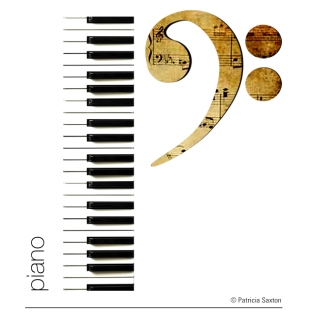
A Plethora of P’s / #39: Piano

proactively punctuating life with the plausible, powerful possibilities of positive thought presented through a plethora of “P’s”.

– ♥ –

“No other acoustic instrument can match the piano’s expressive range, and no electric instrument can match its mystery.” ~ Kenneth Miller

Billy Joel comes to mind. Stevie Wonder. George Winston. Herbie Hancock. Oscar Peterson. Ray Charles. Jerry Lee Lewis. Joni Mitchell. Regina Spektor. Scott Joplin. Bach. Beethoven. Haydn. Mozart. Tchaikovsky.

I admit I’m biased towards the piano. And I know it can probably be said for any musical instrument… but under the right hands (and heart & soul) pianos can be delicate, thunderous, funky, bright, rough, elegant ~ and everything in between.

Like a changing sky, her moods are endless; her range of emotion vast and deep as an ocean. Tickle her, and she sings with delight.

And if we match her up with a guitar and some conga drums… a bit of heaven just might appear.

0

“where in the world is peace?”… on the road

Last week it accompanied guitars, appreciated art, traveled to the airport, made friends with strangers and posed with a sports model (sort of). Thanks peace ambassadors! Where to next…?

on the road again ...

"Aesop's Fables" sculpture at MIT

9/11 art exhibit, jersey city

us airways baggage check

sharing a moment of peace with strangers (strangers no more!)

from the city of brotherly love


(All “where in the world is peace?” images are being compiled on a special “where in the world is peace?” page, here. Totes, mugs and things are available here. Send your own pictures to 52weeksofpeace@gmail.com or join our FaceBook page and post them there. Let”s see where peace goes!)

0

9/11 Exhibit: An evening of community

Thanks to all the photographers at the opening reception of “Afterwards & Forwards: A Ten-year 9/11 Reflective Art Exhibit”, I’ve gathered a sampling to share. The event was indeed very special, with a lively, eclectic crowd ~ and a lot of heart.

Artists are a sensitive lot, who generally pour their more serious selves into their work…. so there’s a great sense of camaraderie when they find themselves in the same room; an invigorating coming together happens.

And over time, I’m getting to know some of them better. Charming Raul, effervescent Duda, gentle Midori. And of course, the incomparable Jose, interjecting his marvelous intellect right and left and showering magnanimous support upon others. And conversational, thoughtful Nick who has thoroughly convinced himself that my daughter is going to go to FIT. And the contagious energy of people-loving Robert…

They’re a vibrant, smart and fun mesh of talent and brains and backgrounds that’s absolutely refreshing. No pretense. Just an appreciation for art, and history, and humanity.

The NJCU 9/11 opening reception as a whole shared that essence of appreciation ~ as the artists, their work, the guests, the press, the professors, the town officials (heck, even the caterers) unconsciously formed an impromptu, cohesive community.

All were honoring a horrific event, yet paying tribute in the most uplifting, thoughtful manner. There was no somberness to the occasion; hope itself was present in the room.  And I’m truly proud to have shared those walls.

Although next time, it was decided … we would serve pumpkin pie.

0