Creative Duet: The Prolific William Morris

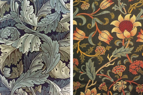
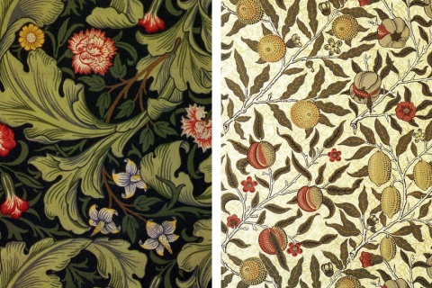
Perhaps the grand lord of the decorative arts, one could think of William Morris as the craftsman’s craftsman. His uncompromising  belief that the best things in life were hand-made using natural materials combined with his exquisite drawing and watercolor skills to produce a vast collection of wallpaper and fabric design still widely used today.

Early on he was dedicated to creating beautiful, hand-crafted furnishings, which led to fabric printing and then to excelling in the arts of carving, dying, embroidery, stained glass and weaving.  A prolific individual, to be sure.

But ~ yes  ~ there was more to this inspired man than textile design. Throughout his life he wrote and published poetry, fiction, and translations of ancient and medieval texts. As author, illustrator and medievalist, he helped establish the fantasy genre, and was a direct influence on authors such as J. R. R. Tolkien.

Morris was born into a well-to-do family on March 24, 1834 in Essex, England, educated at Exeter College in Oxford, and was married to Jane Burden until his death in October, 1896.

0

A Plethora of P’s / #64: Paisley

proactively punctuating life with the plausible, powerful possibilities of positive thought presented through a plethora of “P’s”.

– ♥ –

According to Wikipedia, paisley is a droplet-shaped vegetable motif of Persian origin, but its western name derives from the town of Paisley, in central Scotland.

Well, you learn something new every day.

What I’d already known was that paisley seems to have an almost immortal popularity that’s been used heavily by the likes of the equally immortal designer William Morris and fashion giants Gucci and D&G (Dolce & Gabbana).

I think of it as a happy print; happiest when used sparingly and elegantly. Of course, for those who like to shout it out more boldly, that works too. Either way, wear it in good cheer. There’s quite a bit of history in a piece of paisley print!

(see our growing, ongoing Plethora of P’s here)

0

Tuesdays with Chris: “Can You Teach Creativity?”

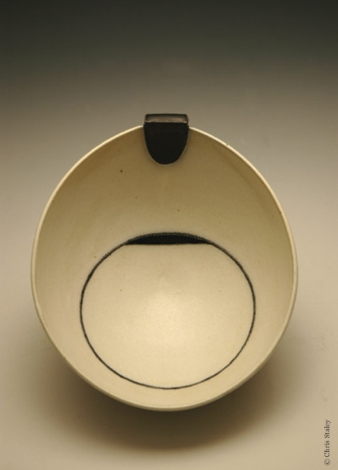
Chris Staley

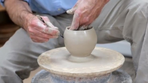
Continuing with our Tuesday video share from Chris Staley, master potter, educator and Penn State Laureate 2012-2013, in this video Chris tackles the often asked question “Can You Teach Creativity?”. Thought-provoking, well done ~ and you get to see a bit of the potter at the wheel.  (If you missed my introduction about Chris, you can read that here.)  Enjoy!

0

Craft, Music, Mythology and Beauty

Inspired by myth, but entirely real, these handmade guitars may be the most exquisitely beautiful musical instruments I’ve ever seen.

Music and mythology have a long, rich history together. Sculptor William Jeffrey Jones has taken that tradition to a whole new level by creating a marriage of craftsmanship and design to mythology and music in the form of high-end professional grade guitars. I’m in awe.

Wouldn’t you just love to hear these played by a master…? They’re so special you can almost hear an Irish ballad playing itself ~ but in the hands of a musician like my brother, or Clapton or Santana or Kottke, oh, what musical beauty would roll.

You can explore Jones’ website to learn more about how he made these pieces of art, as well as the philosophy and heart behind them.

0

Art and Life: Perspectives from Chris Staley, Penn State Laureate 2012-2013

For the next 7 Tuesdays (maybe more), I’ll be sharing some superb videos created by Chris Staley, master potter, educator and Penn State Laureate 2012-2013.

In these intelligent, thoughtful sessions, Chris explores the relationships between art, life, humanity and, in the video below, technology. Maybe we’ll call them “Tuesdays with Chris.”

After earning his masters degree from Alfred University, Chris began an illustrious career of teaching, lecturing, showing in countless one-person and select group exhibits, and has been the recipient of numerous grants and honors. His resume speaks for itself, as does his extraordinary craftsmanship.

On a personal note, Chris also happens to be a fellow grad and old friend from my college days at Wittenberg University. It’s been inspiring to reacquaint with his work and see where his talent and gentle perseverance has taken him. His insights are wise and genuine ~ I think when you watch this collection of videos, you’ll get the sense that you’re talking with an old friend yourself.

Note: This is actually the 7th in the series, but (as I sometimes do) I’m going out of order because I think this is particularly relevant to our modern culture. Enjoy!

0

“where in the world is peace?” … pigeon roost farm

Pigeon Roost Farm. The name alone makes you smile; the pictures are priceless. Thank you for bringing “52 Weeks of Peace” to the fair, and sharing it with us from the friendly state of Ohio.

Peace fun at Pigeon Roost Farm, Ohio

Peace and a Snack at Pigeon Roost Farm Pumpkin Fest

“Pumpkin Peace Still Life”, Pigeon Roost Farm, Ohio

Where to next?

(ps:  you can see all “where in the world is peace?” images on our “where in the world is peace?” page. Our book is on Amazon, our totes, mugs and things are available here. Please email your own pictures to 52weeksofpeace@gmail.com or post them on our FaceBook page. Let’s see where peace goes!)

0

Facebook Is Like a Chair. Okay.

I’d love to hear your thoughts on this facebook ad. First ever for them, so it’s making news.

http://www.youtube.com/watch?feature=player_embedded&v=c7SjvLceXgU

Okay, my thoughts too, I guess it’s only fair.

1.) I think it’s well done. Artsy, hip, maybe a little too profound (music selection added unnecessary weight there).  2.) I’m not sure why they needed to make this ad.  3.) Oh, right, to get more advertisers. (how silly of me)  4.) Facebook does connect people, and when you think about it, it’s pretty incredible.  5.) I’d “like” to be sharing life in one of their scenes. The scenes were great, showing that there’s no substitute for human interaction.

Your turn…!

0

A Plethora of P’s / #63: Pink Flamingo

proactively punctuating life with the plausible, powerful possibilities of positive thought presented through a plethora of “P’s”.

– ♥ –

I’ve always been enchanted by flamingos. I think most people are. Maybe it’s their color we find so stunning ~ their sheer pink-ness! ~ ranging from pale and soft to deep corals and brilliant pink-tinged scarlets.

Then you see them standing on those incredibly skinny legs that go every which way (often standing on just one leg; go figure…), making them both awkward and fluid, beautiful and strange, and there’s a sense of awe at their very design.

I like the “awe” of flamingos. I like the way their form almost contradicts itself. I like their grace and their gentleness, and how they hang out in groups like one big happy family and don’t cause any trouble. They eat, swim, and fly (sounds good to me). They mate for life.  And they’ve got that amazing plumage.

You know, just thinking about them has brightened my day. Heck, I hope it’s brightened yours too.

(see our growing, ongoing Plethora of P’s here)

0

Girl Scout Cookie Conundrum

Girl Scouts are many worthy things, but they should probably stick to being positive citizens of the universe and not mess with their cookie box design!

I should apologize, as it seems the Girl Scout organization is very pleased with their new design. But, you who know me, know that if I think something is good, I’ll be the first to applaud. If not, I’ll find some nice way to speak the truth, and look for the positive, but honesty prevails. (This is probably a good Girl Scout trait, this being true to your word business. It earns trust, I believe.)

In any event, to the point, which is: “Why change the box”?

Yes, I understand it’s a 100th anniversary of the Girl Scout organization, and as we all know, everyone (except me) loves Girl Scout cookies. So that’s a sensible enough reason to re-design the box ~ to celebrate the milestone.

Maybe the question then isn’t so much “why”, as “why this design”? It accomplishes its goal of honoring the girls themselves, but the cookies (the beloved cookies, and the main reason for the box) feel lost. The prior box, in my opinion, did a better job of honoring both girl and cookie. They could have infused something celebratory into the existing design, rather than re-invent. In my opinion. Which wasn’t asked for. So there you go, for what it’s worth.

What I really don’t “get” is why some companies feel a need to fix things that aren’t broken. That’s time and money spent for an overhaul that in the end, doesn’t necessarily justify the means. Some businesses really DO need brand makeovers, and I’m all for those upgrades. But if it’s just because you can, then it really ought to be fairly spectacular.

Bottom line, I wanted to care and applaud their venture, but I’m unmoved. The good news though, for all you Girl Scout cookie lovers, is that they haven’t changed the number of cookies per box.

old box

new box

0

A Month of Pink: “Peace is Finding a Cure”

We’ll be making this an almost-everything-pink month, reminding us all to support our sisters. ♥

Blessings and love ~ Patricia

Week #22 / 52 Weeks of Peace / “Debbie’s Peace” / © Patricia Saxton

Excerpt from 52 Weeks of Peace / Week #22:

This piece is a celebration of life.

In a friend’s honor, “Debbie’s Peace” is dedicated to all the courageous survivors – as well as to the memory of those who battled and lost. And hopefully this small offering will serve as another reminder for all of us to give our support and fervent hope towards finding a cure.

……..

During October, we will donate proceeds from the purchase of our postcard book “52 Weeks of Peace” to the National Breast Cancer Foundation.

0

Evolution of a Serial Designer

“What’s Your Point?” Pencil Point Series / © Patricia Saxton

It started with a college art class assignment~ one of the few assignments I adored ~ where we had to draw one crazy shape (or some such thing), then interpret in a myriad of ways.

I remember my shape was squiggly with random loops ~ kind of Miro-esque now that I think of it ~ and that I went nuts. I could barely keep up with all the ways I could keep the same design but make it look completely different. Colors, lines; the possibilities were endless! This was better than a drawer full of chocolate, or at the time, maybe more like a keg of beer and a bunch of great friends.

Eventually I had to stop, probably needing to put in some study time for other classes. Besides, it was a meaningless shape, so there was no impetus to keep going beyond the “oh cool” factor.  I do think though, that because it was meaningless, my mind opened up to explore freely.

And so it was that this freeing exercise came in handy later on, when I started my business’ first promotional campaign. The memory of “many designs from one” prompted what became a signature series ~ those of you who’ve known me for a long time know exactly what I mean when I say “pencil points”.

Every 2-3 months for several years I’d send out a new Pencil Point Postcard (the pencil point also being my logo, giving it “meaning”), and the response was fabulous. Everyone had a favorite, people really looked forward to getting the next one, and I had fun creating them. And when pitching my design wares, pulling out a stack of pencil point cards almost always sealed the deal. Even if clients weren’t going to need something quite so creative, I think they liked knowing there was that kind of original thinking behind the scenes.

When business turned electronic, I decided to start a new series, online. “52 Weeks of Peacepostcard book was born, and the subsequent “Plethora of P’s” series. There will probably be something new in the future, but neither the peace signs or the positive P’s have run their gamut yet. (There are still more pencil points, too; I just have to draw the line somewhere … no pun intended!)

Sometimes I think it might be some kind of mental affliction. Maybe I am a little nuts. But really, “oh well”. We all have our quirks.

“A Plethora of P’s” / © Patricia Saxton

8

Blomkvist, Lisbeth and other Fictional Distractions

I did it in all the wrong order, but was riveted just the same.

First I broke form and saw the movie before reading the book. (The Girl With the Dragon Tattoo) “Wow”, I thought. Disturbing but mesmerizing and intelligent. Then while on vacation, the place I stayed had a copy of book 3. (The Girl Who Kicked the Hornet’s Nest). Couldn’t put it down (and got to picture Daniel Craig throughout the book, which wasn’t a bad thing). I was so enthralled that I bought book 2 (The Girl Who Played With Fire) at the airport bookstore on the way home.

In order or not, these books are distractingly good, and I have Stieg Larsson to thank for my to-do’s taking a back seat to my most recent obsessive reading spree. What a marvelous storyteller. I don’t know that there’s ever been a main character quite as fascinating as Lisbeth Salander. Sadly, Larsson passed away before they were published, which means there’ll be no book four or five or six.

I applaud you many times over Mr. Larsson, and I hope you see how far and wide your work has been appreciated from where you sit in heaven.

This has happened a few times in recent years ~ finding a series I can’t get enough of. Ariana Franklin’s Mistress of the Art of Death series was another (she also passed away, leaving a void). And there’s Mary Doria Russell, whose The Sparrow and Children of God are spectacular. Each writer’s style is different – I would call Larsson’s contemporary spy/intrigue, Franklin’s are historical murder mysteries, and Russell’s a rich brand of science fiction I never knew existed, whose characters come to life within moments of being introduced, as if they’ve long been good friends.

There are far, far too many outstanding books (and their authors) to mention right here and now; these are three (with series’) that happened to come to mind. All I can say is, thank goodness for them. Not only inspiring writers, their fictional works have made “real life” that much more delicious.

0

Two Autumns

Two styles. Two quotes. Two Autumns.

Autumn Leaf / © Patricia Saxton (colored pencil on paper)

“Autumn is a second spring when every leaf’s a flower.” ~ Albert Camus

Autumn Mosaic / © Patricia Saxton (acrylic and watercolor on paper)

“Winter is an etching, spring a watercolor, summer an oil painting and autumn a mosaic of them all.” ~ Stanley Horowitz

7

Unity, Peace & Autumn Equinox

“We are each other’s harvest; we are each other’s business; we are each other’s magnitude and bond.” ~ Gwendolyn Brooks

Tomorrow (September 21st) is the officially designated International Day of Peace. Events coordinated by the United Nations, various peace organizations and interested local groups are intended to create a wave of peace around the globe, or at least to put some hefty, prayerful weight behind that intention.

For one day, concentrated collections of humanity will unite with one hope: peace.

But that’s not all. It’s also the Fall Equinox ~ one of two times a year when day and night are of equal length. Where spring’s equinox ushers in longer days and more light, the autumn equinox provides a period of balance before the darker, more introspective days of winter. It’s a time to appreciate the reaping of harvest; a time of giving thanks.

For whatever reason, no doubt influenced by my father’s rural roots, I’ve always found the cycles of the natural world both intriguing and instructive … and I’m kind of giddy that the International Day of Peace coincides with the day on nature’s calendar that exemplifies balance and fruition. Makes me smile. As if there just might be some divine order amid the madness.

And as promised in my prior post on Unity, my artwork (shown above) was created in honor of this unified effort ~ the inspired energies focusing on peace across our beautiful planet, on this most balanced day of the year.

………

I don’t usually explain my art, but I’ll break form for this one. The colors of fall blend to represent all people, all colors, all walks of life. The bird – a symbol of hope, promise and freedom – faces forward with optimism, its swirly feathers joyful. The word “unity” is filled with a world map, signifying (perhaps obviously) global camaraderie. The two lines of vertical text show the word “peace” in a multitude of languages. The stark black and white background represents the balance of light and dark, and the idea that hard-edged barriers can be fluidly crossed and complemented. I tried to show that simplicity that can be distilled from complexity, and that a sense of groundedness can coexist with dreams and maybe even lift us in flight towards the possibility of peace.

………

 Here’s to dreams ~  Patricia

3