In Praise of Black and White: Part III

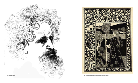
Almost like clockwork, my mind turns to black & white imagery… as it did last January, and the January before that. I hadn’t realized that! In truth of course, it’s not just a once a year thing ~ I’ve always been drawn to the power and beauty of black & white art, probably from the first time I picked up that favorite tool of mine (the #2 pencil), and sensed that magic was held within its lead.
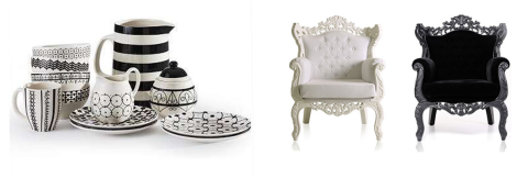
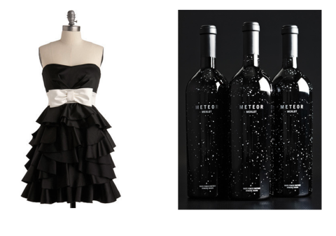
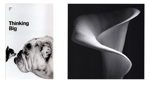
So, once again I’ll post the original text (which remains meaningful to me), and share some choice imagery. (If you want to skip to the pictures, I won’t be offended!)
……………
Each year, a new Ansel Adams wall calendar hangs on the door leading to my studio. His superbly articulated, stunning black and white photography reminds me daily of my love for the natural world and the innumerable shades, shapes, shadows and tones that create, change, and emerge from, our world.
Yet the classic beauty and the powerful visual possibilities of black and white are often neglected. Straight black and white design is often passed by in favor of any use of color. As if black and white implied something dull or less important. Which is far from the truth!
When used well, black and white is intensely dramatic, vigorous, elegant and rich. It can make a powerful point without the distraction of colors. It plays on bright or moody, or edgy or slick in ways that color cannot. It can sparkle with cleanliness, and shimmer with subtlety. When used well, it expresses itself with undisguised strength, character and integrity.
Of course, not all photographers have the eye nor skill of an Ansel Adams. Not all designers *see* in black and white. Clients rarely consider it. But it would be nice to see a greater appreciation of the noble duo of black and white.
When people want straight talk, when they want the truth, they’ll say “tell me in black and white”. But people often speak in shades of gray, or dress their language in garish colors for dramatic effect. And so it can be with design – a multitude of colors may become too competitive, potentially drowning in an undifferentiated sea of tones or gussied up so much the point is lost for the color, like shouting for attention in a crowd.
Color, in and of itself, is naturally beautiful. Bold, rich fusions of color. Earthy color, otherworldy color. Pale, cool, warm or dense. It’s vibrant and alive and emotional. But color alone will not make a bad design good. And it’s not so much that color is overrated, but that black and white is underrated. The effects of black and white can be pretty spectacular.
Stripped of color, a million shades become a lansdcape of lights and darks that blend and weave and bounce against one another to create a very rich whole. A striking black and white image often touches us unexpectedly … refreshing, engaging, and wonderfully inspiring. It’s raw and fundamental – and like a good story, it’s satisfying. Like a good story, it allows your mind to add its own color by filling in the parts left unsaid.
Enough said. Enjoy.


Discover more from saxtonstudio blog
Subscribe to get the latest posts sent to your email.


Indigene
January 18, 2012 at 12:42 pmI love black and white, too! It’s often why I do my portraits in graphite, and the surrounding part in color, to make the B/W stand out! But then again, my favorite movie is the Wizard of Oz and the moment it comes from B/W to color has amazed me, since the age of 5! 🙂 It was great reading this! 🙂
saxtonstudio
January 18, 2012 at 1:47 pmThanks! Some of us just have an extra affection for black & white – happy to meet another one!