Creative Holiday Gifts!
The holidays are kicking into gear, and our shop is always open! Please feel free to share with friends interested in something special, good for mind and soul, priced under $25 and created from the heart. ♥
The holidays are kicking into gear, and our shop is always open! Please feel free to share with friends interested in something special, good for mind and soul, priced under $25 and created from the heart. ♥
EBay got a new doo.

It’s always interesting when ia big name company decides to revamp their look, which most noticeably translates to changing their logo.
Sometimes it’s well worth it, sometimes a pointless gesture. Either way, it can be a tricky line to cross, because for good, bad or ugly, there’s a great amount of already established brand recognition involved ~ which means that over time, people, being emotional creatures, have an ingrained response invested, and there’s a risk of upsetting that apple cart. Generally speaking, people don’t like change. They like familiar.
So the trick becomes creating a design that’s new, fresh and inviting while maintaining the “we’re still you’re old friend” feeling that often takes years, sometimes decades, to instill.
So how does eBay’s change measure up? Personally, I think they did a good job. Executionally there’s a glitch or two (noting in particular the imprecise overlap of the e/b), but overall, even without the original quirkiness, it still feels ebay-ish ~ just more representative of their larger prowess (they aren’t the crazy little start-up they once were) and definitely more contemporary.
I saw a thread where a lot of designers (one assumes) commented negatively about the re-design, citing “boring” and “safe” among other complaints. I dunno ~ maybe, like me, they think “I could have done that, and I could have done it better”, so there could be a hint of competitive resentment ~ but for whatever reason, I think they were too critical (this from someone who’s VERY critical!). And, in the end, as I’ve said in other posts, this kind of change won’t leave loyal followers hitching a ride elsewhere.
It’s a nice change, refreshing. In my many years of experience I’ve learned that solid, effective creativity doesn’t necessarily mean over the top “wowing” them with how clever you are.
Could this have been more “creative”? Sure. Did they lose the “fun factor”? Maybe a little. But I like the simplicity. I also like that it’s more sophisticated than it was before ~ after all, the company itself certainly is ~ yet it still feels friendly.
Now it’s up to the business and its’ services to do the rest of the talking.
I hear a bunch of exasperation out there about social media.
Bottom line, we have to make choices about our time ~ these days, almost on an hour-to-hour basis. In any given period we may ask, is this a good use of my time? Is this what I want to be doing, is this what I HAVE to be doing, is this just what happened when one thing ran into the next and here’s where I landed?
Those of us who are self-employed need to insert structure into our day, or we’d not be at all productive ~ and that requires a hefty dose of self-discipline.
This may work beautifully if you work with tasks that have clear beginnings and endings (not to say there aren’t snags and challenges that could send potentially simple project into galactic proportions), but far less controlled if you’re in the concepting stage of a design project where you’re, let’s say, trying to break the rules in imaginative, but still effective ways. You can’t set a timer for that. But you can set a timer that says it’s time to shift gears, have dinner, take a walk.
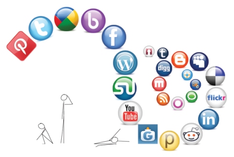
So what then do you do with the onslaught of social media demands on top of all the rest? Do you skip the walk to check your twitter feed? Post facebook quotes while you eat dinner? Pin on Pinterest early in the day, while checking email and planning calls … and yea … you see, things can start to overlap and then maybe your grip starts to slip, the ride is moving and your hat is flying… and you’re saying, “wait!, whoa, slow down!” Yet the world out there is saying, “ha! right! time waits for no one, better hop on!”
So you sigh and shrug and try to keep up.
Or you decide not to.

Here’s the thing: there’s no rule book that says you have to leap into every social media outlet that comes along. That said, I’d be leading you down the wrong road if I said you shouldn’t participate in at least a few of your choice. But by all means, unless you’ve got a budget and a staff whose sole job is to handle every social media site, be choosy.
When all those invites come in to join this group or that network, don’t impulsively jump. Let it sit. Check it out. If it feels right, you may want to climb aboard. If it feels a lot like “ugh, do I have to?”… then don’t.
Either way, don’t miss that walk in the park in order to get a front seat on the next social media wave. If it really sings to you, you can join in after your walk.

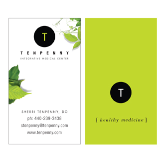
Using the same businesses from “Six Businesses, Six Logos” (with one substitution), here’s how their identities start to play themselves out in a practical format.
Although limited by fitting the amount of information any given client feels is necessary into a relatively small space, you can have a lot of fun with business cards, especially if you’ve designed a logo that allows you to pull from various elements. The key here is to not only support the brand identity through consistent logo use, but to expand upon it by appropriately enhancing the look and the feel. The canvas is small, but the impact doesn’t have to be.


Someone recently asked me, “How do you create a logo? Where do you start?”
I didn’t have a ready answer, except that it just sort of happens ~ ideas, concepts, visuals come to mind, which then evolve, and then get tweaked into a finished product. And while this is the truth of it, I’m sure it was highly useless to the person asking the question, especially the part where it “just sort of happens”.
If I were to try again, I’d say that the “just happening” probably comes from many years of what I’ll call research. It’s being in a business where you’re constantly aware of branding, you’re using different fonts and font combinations on a daily basis, working with shapes and colors and sizes and revolving trends. So that when you sit down to “create”, there’s all this history at your disposal. A muscle that’s been exercised regularly. You know where you can bend and stretch the limits, and you know ~ both intuitively and figuratively ~ what won’t work.
With that in mind, I have 4 rules I’ve always followed when creating a logo:
1.) Clear the head.
2.) Listen.
3.) Find emotional touchpoints and discern the personality of the business.
4.) Distill to its simplest form.
Of course within the process there’s the wonderfully muddy area where creativity swirls. Marrying concepts and tastes, the play of fonts, and the interweaving of symbols and shapes to give a visual voice to the intent of the logo: which is to be distinctive, memorable and clean, ready to leave a solid, ever-present, impression.
Here are 6 recent logos from 6 different businesses: A Non-Profit Foundation for Special Forces families, Landscaping, Real Estate Staging, E-Learning, Speech & Presentation Coaching, and Osteopathy. (I might mention that most of these presented the additional challenge of being particularly long names, which can be trickier when it comes to applying them… more on that next.)

You need to bite the bullet and create a website. Or your old site is in dire need of an update. No big deal, right?
Maybe, maybe not. There are easy ways and harder ways, less expensive ways and more expensive ways. But whichever way you choose, you have to understand that there are moving parts involved.
It’s a virtual symphony of information and imagery, with varying degrees of interconnected elements that create the whole song. And as with song, the parts can be arranged well or not so well ~ and the audience can tell the difference.
So before you begin, do your homework. Know what your site is about, and organize your content ~ at the very least a simple outline. Figure out who your audience is, and speak to them ~ try to put yourself in their shoes. Look at what your competitors are presenting … discover what makes you/your business unique. Play to your strong points while being as authentic as you possibly can.
Consider what your main topics will be, your sub-topics, what you want to say and how you want to say it. Whether you want a blog, a website or both. Whether you’ll tie in to social media, use videos, slide shows, shopping carts. Whether you’re enamored by bells and whistles or truly need them to boost your message. Whether a template, a modified template or fully custom is best. Whether you need a very simple web presence, or a full-fledged living website.
When you’re ready to make the plunge and toot your horn, there’s help out there to get you started and/or take you through the whole orchestration. We’re one of those places. Talk to a few; find the match that suits your needs. And whoever you choose, make sure communication is clear and open in both camps so that the flute solo comes in on cue and the trombones don’t drown out the violins.
Beer, Chocolate and the Web … for some reason makes me think of “The Lion, the Witch and the Wardrobe” ~ maybe not with such an intricate storyline, and I’m not sure C.S. Lewis would like the comparison, unless perhaps, he was a beer and chocolate person… but either way he would certainly appreciate the imaginative quality.
So, thanks to my good friend and fellow designer Jim for knowing that I would love this. Sagres, Portugal’s leading beer brand, launched a new product this year: Sagres Preta Chocolate, a chocolate flavoured stout beer.
I can’t attest to the beer itself, but their decision to launch the product with a website crafted entirely from chocolate gets a big thumbs up from this corner.
Personally, I’m not convinced of the “rightness” of beer and chocolate co-mingling in one drink, but I definitely give these guys credit for ingenuity. And (for possible future reference) I’d have gladly been on the team that made all the chocolate pieces!
Here’s how they did it:
And here’s the final website for Sagres Preta Chocolate. Enjoy!
Branding. No, not the hot iron kind on an animal’s behind (ouch! ~ do they still do that?), but marketing’s buzz-word of buzz-words.
As with many notions that take the spotlight ~ often becoming overused, diffused and diluted ~ one has to question it at some point. It’s never wise to take popular culture at face value, or hear a fancy phrase and automatically buy in. To borrow from the now old-fashioned new-age-speak, first it has to “resonate”. If it resonates, I’ll pay attention.
So, what IS the big deal about branding?
First of all, your brand is what I like to call your visual voice. It’s what you bring to market over and over and over. It’s how you’re identified, and yes, judged. It can, in effect, be the life or death of your business.
If you read “What’s the Big Deal About Branding? (part one)”, you got some of my thoughts on why it’s important. Namely, the pull and power of consistency and integrity ~ two key qualities that provide a valuable backdrop, a kind of moral yardstick for your business, while serving as a clear window for your audience to understand what you’re about.
Take a red target image for example. “Target” stores easily come to mind. It’s a consistent, steady symbol – exhibiting visual integrity. And that’s very good.
But take it a step further. If your experience at Target is repeatedly a good one, they’ve just about buttoned up the integrity piece, because you, the customer, feels confident, “safe and secure”. Trust has been earned; integrity deepens.
There are hundreds of similar examples. Like Mercedes, Nike, The Morton’s Salt girl. They’re consistent, identifiable, they stand for something, and the customer knows what that something is … and … there is trust.
So here’s the thing: imagery and words alone do not make a brand “work” … Three fundamental things feed into your success: your product, your service and your brand. One without the other will leave things flat (or send them spinning out of control) ~ but in tandem, goals are attainable. Basically:
But when all three elements come together, singing the same song, in harmony, you’ve got strong branding and a heck of a better chance at success.
The wrapping on the package is that all three ~ product, service and “brand” (your visual voice) ~ are your branding, and any business, marketer or designer worth their weight should consider all three in brand development. Ask the questions to find the commonality. Keep those 3 elements consistent, and integrity follows. And where integrity lives, people want to hang around.
Next up: Authenticity. Stay tuned.

Note: Weekly peace images are displayed (as a unit) under the “52 Weeks of Peace” tab above, where there is also a more detailed description of the series.


