“52 Weeks of Peace” ~ The Book!

Two years ago to the day, I launched a creative series called “52 Weeks of Peace”, posting a new design on my blog each week for a year.

Today, I am so pleased to announce that thanks to my publisher Lightbox Books (a division of Shenanigan Books), the entire collection is now in gorgeous postcard book format, available for sending, framing, or just enjoying. You can order copies here, or by clicking anywhere on the announcement below.

A side note ~ you might find it interesting (I did!) that the book’s release coincides with the 50th anniversary year of the Peace Corps ~ and that a selection from the series is part of an upcoming 9/11 tenth anniversary exhibit. It’s really something how that all lined up ~ maybe the universe had a hand in it!

I thank you all for your support and encouragement, your appreciation of the art, and helping to spread the idea that “peace starts here”, with each individual, in every day ways.

0

A Plethora of P's / #31: Ping Pong

proactively punctuating life with the plausible, powerful possibilities of positive thought presented through a plethora of “P’s”.

– ♥ –

Few games are more fun than a battle of ping pong. It’s blood-pumping, spirit-lifting, good old-fashioned fun. And that’s really about all there is to to say ~ except maybe to suggest you find a friend, a table and go play!

0

Vector Dreams

Computers are magical. Young designers don’t know how good they have it. Back when the earth’s crust was cooling and dinosaurs roamed freely, there existed the most horrendous, antiquated processes for creating a finished design project.

I worshipped computers the minute they eliminated rubber cement and laborious hand-cut color separations. T-squares and triangles and type galleys. It was a downright primitive experience. The production aspect was neither fun nor a walk in the park, although you did acquire a fairly intimate relationship with the inner workings of color and tone and bandaids (for the exacto blade cuts).

With computers you can take a piece of handmade art and ~ *presto!* ~ it becomes digital, ready for use in a multitude of ways on a multitude of products.

Of course, there are varying levels of *presto!*, so that what looks clean and effortlessly polished is very often laboriously and painstakingly rendered behind the scenes.

I’ve recently been working with a great client on a project that falls precisely into this category. The end result is a pretty picture, but getting to that point is literally a matter of connecting hundreds of little dots, like these:

And a strange thing happens when you get into a groove like that ~ it starts to take over your subconscious mind. It’s kind of like when I draw a lot, I see things in shapes and shadows, lights and darks … except in this case I start seeing things as if they were pieces of vector art**.

Just the other day while driving a winding stretch of road, my mind decided to imagine the curves as they would be drawn on the computer. It was a pretty weird sensation. I wonder if dreaming in vector is next.

Dreams or no dreams, the laborious elements of yesteryear’s graphic design have really only changed in terms of the tools used. Personally, I still adore illustrating classically with a pencil or paintbrush ~ but for design, I remain ever grateful that paste-ups hit the dust long ago.

**in brief, for those who may not know, vector art is the use of computerized lines and anchor points to create shapes that in the dark ages would have been done by hand.

7

A More "Refined" Jack Daniel's… But Why?

Brand makeovers are all the rage. And as a designer, I often see the value. But honestly, in this case I’m missing the point.

You wonder sometimes what drives a change like this,” when it ain’t broke”… unless it is. Or somebody with clout says it needs to happen, and it becomes more about what’s on the cover than what’s inside. Hmmm.

Not that the new label isn’t a good one. Thankfully it doesn’t kill the brand by overly modernizing, and I admit the cleaner look is attractive.  I just don’t know why they bothered. The old label was just … so … Jack Daniels. Classic JD, forever, the way it was…. until now. Cleaned up and  more refined. (Only Jack Daniel’s isn’t supposed to be refined, as I recall?)
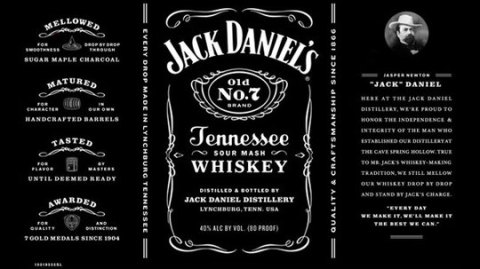
new
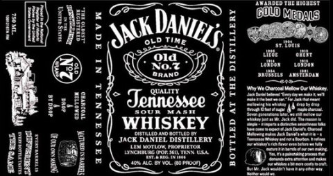
old

I have to admit though, that reading some of the articles about it were pretty interesting. For example, I never knew that Jack is brewed in a dry county. That’s a little crazy.

As for the label, they got rid of a lot of the text, including fun details like the population count of 361 (so what if it wasn’t accurate? ~ it was an interesting historical tidbit). Gone is the folksy description of how they achieve the rich flavor. They’ve also removed the claim that Jack Daniel’s is America’s oldest distillery, and they took off the name of Lem Motlow.

Now as I’ve learned, Motlow inherited the distillery when his Uncle Jack died in 1911. Motlow promptly put his name on the bottle and kept the company alive throughout the dark days of prohibition and through the controversy arising after he drunkenly shot a man dead while riding aboard a train in 1924.

This is great stuff. But maybe legends are passe’ now.

Even Jack Daniel’s portrait boasts a new name: apparently his real name was Jasper Newton. Okay, that’s cool to know, but since he’s been called Jack since 1866, I wonder what he’d have to say about that.

Oh well, the deed is done, but the vote is out. The label is still very black, and I assume the whiskey is still quality Tennessee sour mash, and at the end of the day, no one will really care that the label got a facelift. Of course, they wouldn’t have cared if it hadn’t, either.

…………………….

Afterthought: If no one cares either way, and the company isn’t suffering, maybe they did it … under the guise of updating and being more “honest” (ie, population, possibility that JD might not be the oldest distillery, etc.)…  but really and simply, just for the heck of it? 

0

A Plethora of P's / #22: Pasta

proactively punctuating life with the plausible, powerful possibilities of positive thought presented through a plethora of “P’s”.

– ♥ –

Here’s an easy one to get your noodle around. Because, seriously, doesn’t everyone in the world like pasta? When you think about it (though it actually doesn’t take much thought…), a steaming bowl of spaghetti with sauce and parmesan, a green garden salad and some fresh, piping hot garlic bread has to be one of the best meals ever invented.

The thing about pasta is that it’s simple. There’s nothing convoluted about it, and there’s nothing “bad” about it. It’s easy, yummy and comes in all kinds of clever shapes. Which is really the hardest part: choosing between fettuccine, vermicelli, linguini, cappellini, cavatini, farfalle, fusilli, gemelli, manicotti, rigatoni, penne, ziti, rotelle, lasagne, tortellini, macaroni, etc. (Of course, I’ve learned from Italian friends that all pastas are called macaroni.)

In the end, it doesn’t matter which you pick. They’re all tasty, all satisfying, and they’re all in the “comfort food” department … which in my book is all positive.

Buon appetito!

ps: for the fact-minded, scientific health benefits of pasta can be found here and here.

4

A Plethora of P's / #19: Praise

A sincere compliment, a recognition of good deeds, admiration, applause… “a gold star for good behavior”, a high-five.

Praise knows no boundaries, no judgments. It can be as quiet as one appreciative word, or a thunderous, symphonic tribute. And there’s no one amongst us – saints to sinners, paupers to kings– who doesn’t benefit from receiving, or giving, a genuine expression of praise.

Praise lifts us up. Sprinkle it around your world, and high-five generously.

4

Ouch.

And they paid (one wonders how much) for this?

I was in Denver last week. Went to a Rockies game. It was fun. (It was also cold. I like the Rockies, but I don’t like cold.)  Anyway, we’re sitting in our seats, donning our new (and very spiffy) Rockies caps, wrapped in blankets, waiting to be wowed by Ubaldo, the newly returning post-injury star pitcher, when my vision is distracted by a bright, bigger-than-life banner across the stands. The banner is advertising something about Qwest and Century Link. That’s fine, whatever ~ I don’t really care, and I focus back on the game.

But wait.

My eyes flit back to the bigger-than-life sign. Somehow it’s demanding my attention… and I find that I do care. In fact, I care so much I’m appalled. Because there it is, a gaping grammatical error in full baseball-stadium-sized color for all the world to see.

And I think, “they paid for this”. They actually paid, big bucks, for this. Do they think it’s right? Do they not speak the language? (Oh, and by the way, these are communication companies…) Are they kidding me? Is our increasingly short attention-spanned society and the need for sound bites and quick one-two punch lines really more valuable than saying it right? Are we overriding “well spoken” for the “grab ’em fast” mentality?

Now I’ll admit that in the scheme of life, this is not a deal breaker. It’s not a catastrophe. It’s not “important”. But it definitely offends my inner nerd, my sense of language and yes, my professionalism! It’s not okay.

Note to Qwest and Century Link: Call me. (saxton studio) I can do it better, correctly, AND probably for a quite a few less dollars than your ad agency charged. :  )

4

A Plethora of P's / #15: "Plaid"

proactively punctuating life with the plausible, powerful possibilities of positive thought presented through a plethora of “P’s”.

– ♥ –

Once again, the positive P-word I’d planned for this week was preempted by a sudden inspiration. This one thanks to an old college friend who unwittingly mentioned that it’s National Tartan Week!

Scotland runs thick in my blood; the plaid used for this “P” is, in fact, from my maternal family line, the MacNaughton clan. Something I’m rather proud of.

And what’s the positive message? I’ll tell you this ~ it’s not the wearing of plaid pants, plaid skirts, or men in kilts. It’s not about saving a penny, or drinking Scotch Whiskey (although both notions have their place). It’s not about the uniquely moving sound of a well-played bagpipe. And it’s definitely, most definitely, not about haggis.

It’s about being proud of who you are and where you come from. It’s about appreciating those who came before you, and it’s about confidently showing your colors, inside and out.

So this one’s dedicated to all of us with Scottish ancestry ~ but meant for everyone. Honor the stepping stones of history, respect your heritage, and let the best of who you’ve become shine like a bold plaid.

“Be happy while you’re living, for you’re a long time dead.” ~  Scottish proverb

(All P words to date are shown under the “A Plethora of P’s” menu item to the left)


4

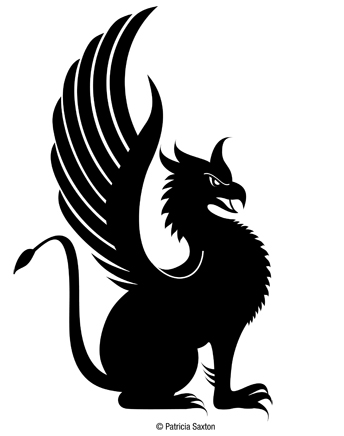
Warrior Gryphon

Gryphons are nobody’s fool.

A winged monster with an eagle-like head and the body of a lion, gryphons make fierce warriors and noble guardians. I created this particular gryphon for The Silent Warrior Fund, a non-profit foundation that assists US Army Special Operations Command (USASOC) soldiers and their families.

A strong symbol for a worthy cause. I’m proud to take part, and grateful to be able to use my talents freely because of their dedication and incredible courage.

My client chose several treatments ~ for website, letterhead, gear, etc. ~ but the gryphon will be the steady mascot on all. I’ll share the final logos later, and provide links again for those who’d like to learn more / support the cause.

0