52 Weeks of Peace [squared] / Week #66
“Aim for the moon. If you miss, you may hit a star.”
~ W. Clement Stone
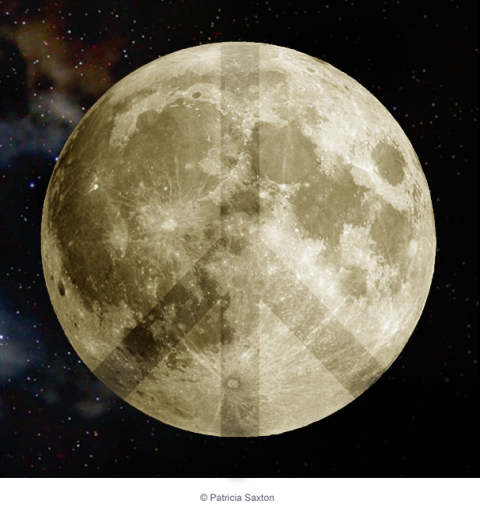
“Peace Moon” / 52 Weeks of Peace [squared]: Week #66 / © Patricia Saxton
“Aim for the moon. If you miss, you may hit a star.”
~ W. Clement Stone

“Peace Moon” / 52 Weeks of Peace [squared]: Week #66 / © Patricia Saxton
proactively punctuating life with the plausible, powerful possibilities of positive thought presented through a plethora of “P’s”.
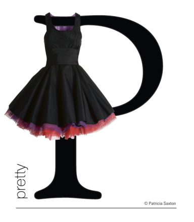
Pretty is a sweet word. Something light and graceful and attractive, maybe even delicate. Pretty is pleasing to the eye, to the ear, to the mind.
We think of “pretty” as feminine, but it’s not for girls only. Sure, we girls like to feel pretty, and I won’t deny that make-up or the right shoes (and definitely the right little black dress!) can give our spirits a lift ~ but one look at a soft pink sunset or a peacock’s feathers, or hearing the sweet song of a flute, or feeling the rhythm of a flowing dance … and I know that we all enjoy the pleasure of pretty.
After all, “pretty” makes the dusty bits of life a little brighter.
proactively punctuating life with the plausible, powerful possibilities of positive thought presented through a plethora of “P’s”.

A perfect rose. A flawless chord. Pure white snow. The softness of a baby’s skin. A child’s laugh. A cherry tomato plucked from the vine. Mountain air.
We all love purity. I think on some level we crave it. And it’s not just a nice concept for optimists, it’s something real and raw, basic and primitive. It’s untouched and genuine. It’s unsullied, honest-to-goodness simplicity.
Even in this increasingly technological world, this world of mayhem, madness and convoluted this and that, a world where a drink may say “organic” because one of ten ingredients may have actually been organic, a world that sometimes seems almost tragically impaired by impurities of all kinds ~ purity can still be found.
We find it in the new seed planted in the garden, in the bear hug from a loved one, in the sunrise. The just right cup of tea. The sparrow’s song. The rhythm of a drum. Wit. Wonder. Wisdom. In so many ways, it’s all around us.
Go get some ~ however small, however large ~ and give it your attention, and let purity wash over your spirit like cleansing waves.
proactively punctuating life with the plausible, powerful possibilities of positive thought presented through a plethora of “P’s”.
Some of us, especially when we’re young adults, think we need to follow a set path. Line it up, stay on course. If you falter, get up, brush yourself off and carry on. And there is much truth in that ~ because if we try to follow too many paths at one time, we can become a.) overwhelmed and b.) lost. One path allows us to define a direction, set goals, see progress, maybe even see down the road a bit.
But life teaches us that a clear path isn’t necessarily what it seems. We learn that “things happen”, causing us to change course. There are detours, and there’s debris along the way. Not all the stones are smooth and flat, or angled just so. They might suddenly veer off, dip, crack or overlap. You might have to go through some muddy parts.
And besides all that, how do you know if you’re on the right path? And what happens when you stumble upon a different path? One that looks more inviting? Ah… that can really mess you up, if you’re humming along, thinking you’ve got this all nailed down pat. Are we really on track, or just kidding ourselves?
Maybe though, we could see many of those dips and swerves as opportunities. Adventure. Choices. After all, who’s to say what path is right for any one individual? Who decides? Who really knows?
Except that when it’s right, it feels right. Right there in your gut. You feel stronger, with more clarity, more determination, more light. Your dreams kick in. Obstacles? Surpassable. Detours? Hey, maybe they’re enhancements.
So go ahead and follow your path, your calling, your dream, even if it you don’t know for sure that it’s “the one”. With a plan in your pocket and an open mind, follow what lights you up, because in taking action, taking steps, you might even stumble upon something better.
“Too often we underestimate the power of a touch, a smile, a kind word, a listening ear, an honest compliment, or the smallest act of caring, all of which have the potential to turn a life around.” ~ Leo Buscaglia
…………
Sometimes – well, more than people know about ~ many of us designers lend our services because we feel it’s the right thing to. Talents are shared so that they may in some way help a person or worthy cause along. We do it because we’re able. Obviously we wouldn’t be putting food on our own tables if this was our mantra for everything that crossed our desks, but it sure feels good when you can do something just for good.
Sometimes though, it takes more than a touch, a smile, a kind word, a listening ear ~ certainly more than a helping of design – to turn a life around, as in the case of my nephew’s beautiful 7-year-old son, who needs neurological surgery for his autism.
Parents, grandparents, aunts and uncles are still in the planning stages for a fund-raising event (as is this poster), but I’m so glad to be a part of it, by giving “what I’m able” to give. And I figured it might be cool to share some “behind the scenes” for this hopeful event.
Bless his little heart, and his loving, attentive parents.

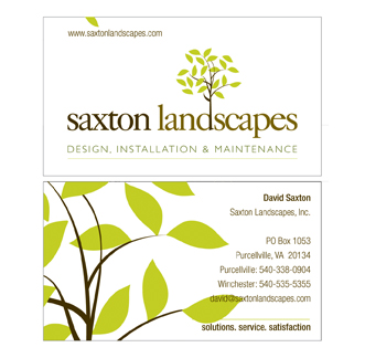
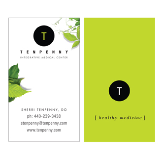
Using the same businesses from “Six Businesses, Six Logos” (with one substitution), here’s how their identities start to play themselves out in a practical format.
Although limited by fitting the amount of information any given client feels is necessary into a relatively small space, you can have a lot of fun with business cards, especially if you’ve designed a logo that allows you to pull from various elements. The key here is to not only support the brand identity through consistent logo use, but to expand upon it by appropriately enhancing the look and the feel. The canvas is small, but the impact doesn’t have to be.




Someone recently asked me, “How do you create a logo? Where do you start?”
I didn’t have a ready answer, except that it just sort of happens ~ ideas, concepts, visuals come to mind, which then evolve, and then get tweaked into a finished product. And while this is the truth of it, I’m sure it was highly useless to the person asking the question, especially the part where it “just sort of happens”.
If I were to try again, I’d say that the “just happening” probably comes from many years of what I’ll call research. It’s being in a business where you’re constantly aware of branding, you’re using different fonts and font combinations on a daily basis, working with shapes and colors and sizes and revolving trends. So that when you sit down to “create”, there’s all this history at your disposal. A muscle that’s been exercised regularly. You know where you can bend and stretch the limits, and you know ~ both intuitively and figuratively ~ what won’t work.
With that in mind, I have 4 rules I’ve always followed when creating a logo:
1.) Clear the head.
2.) Listen.
3.) Find emotional touchpoints and discern the personality of the business.
4.) Distill to its simplest form.
Of course within the process there’s the wonderfully muddy area where creativity swirls. Marrying concepts and tastes, the play of fonts, and the interweaving of symbols and shapes to give a visual voice to the intent of the logo: which is to be distinctive, memorable and clean, ready to leave a solid, ever-present, impression.
Here are 6 recent logos from 6 different businesses: A Non-Profit Foundation for Special Forces families, Landscaping, Real Estate Staging, E-Learning, Speech & Presentation Coaching, and Osteopathy. (I might mention that most of these presented the additional challenge of being particularly long names, which can be trickier when it comes to applying them… more on that next.)

You need to bite the bullet and create a website. Or your old site is in dire need of an update. No big deal, right?
Maybe, maybe not. There are easy ways and harder ways, less expensive ways and more expensive ways. But whichever way you choose, you have to understand that there are moving parts involved.
It’s a virtual symphony of information and imagery, with varying degrees of interconnected elements that create the whole song. And as with song, the parts can be arranged well or not so well ~ and the audience can tell the difference.
So before you begin, do your homework. Know what your site is about, and organize your content ~ at the very least a simple outline. Figure out who your audience is, and speak to them ~ try to put yourself in their shoes. Look at what your competitors are presenting … discover what makes you/your business unique. Play to your strong points while being as authentic as you possibly can.
Consider what your main topics will be, your sub-topics, what you want to say and how you want to say it. Whether you want a blog, a website or both. Whether you’ll tie in to social media, use videos, slide shows, shopping carts. Whether you’re enamored by bells and whistles or truly need them to boost your message. Whether a template, a modified template or fully custom is best. Whether you need a very simple web presence, or a full-fledged living website.
When you’re ready to make the plunge and toot your horn, there’s help out there to get you started and/or take you through the whole orchestration. We’re one of those places. Talk to a few; find the match that suits your needs. And whoever you choose, make sure communication is clear and open in both camps so that the flute solo comes in on cue and the trombones don’t drown out the violins.
A client posed the following question: “What’s your perception of logos and are they a cost-effective investment?”
I love this question. It’s not new, nor is the discussion. But considering the unstable climate of our financial times, one worth a revisit. Everyone’s trying to be more careful and make more intelligent decisions about where their dollars go. So, I felt inspired to share my answer:
A logo is the hub of your brand identity. The grand central station. It’s the singular consistent visual that appears everywhere, on everything, carrying your identity into livingrooms and faraway lands and back.
It’s what you put on the packages you send out that says “we’re a real company”. It’s your signature, your great “identifier” ~ so that when people repeatedly see a certain shape or combination of shapes, colors and letters it prompts a psychological association with a company, a person, a quality. You get the idea.
It’s recognition by repetition. And that’s a good thing, because you want to be noticed. And you want it to be strong at-a-glance; something that’s, if not remarkable, at least memorable. Like these classics:
That all said (and I kind of hate to say this since logos are something I do) … you can have a “look and feel” without a logo per se. You can create an “identity” with colors and fonts and use of space.
Case in point: another client wants to establish herself as a voice in the fashion world via writing, and her cash flow is tight. She was convinced she needed a logo and a whole brand identity scheme (all of which can add up to a pretty penny) ~ when in truth, for her needs, she doesn’t “have to have” a logo. What she does have to have is great content and great imagery.
Sure I would have preferred that she need a logo and could pay me to create it, but this is how I advised her because in her case it makes sense ~ not only from a monetary perspective but in terms of creating an online presence that can grow as her own voice grows.
A logo can appear very simple. A simple type treatment, or one with a clever twist, or a symbol as its core. The value, aside from it being “just yours”, is in its consistent use across the board, applied to all things “Business X” and serving as a steady, stable ambassador. And that is no small thing.
But a logo is not, as I’ve said in previous conversations, in and of itself, The Brand Identity. It’s a big part of the whole (and not to be fooled with or “just anything” tossed up). There are many factors that make up that whole, and sometimes it’s both necessary and okay to approach it from a different perspective. Worth pondering before jumping in. And if you do jump, understand its value.
Milton Glaser is Graphic Design and Illustration.
Referred to as the design industry’s “icon”, he truly is the Master, who long ago reached the pinnacles of success. With intelligence, passion and integrity (and amazing talent!) he’s stayed fresh and irrevocably admired well into his 80’s.
Talk about longevity, he’s it. His work inspires millions, his discipline influences countless students. He’s done it all, exceptionally well.
And just the other day, he posted this picture on his Facebook page, which I thought was pretty neat. I looked through the comments, remarks of honest admiration. What do you say to this, after all?
But this simplest of “sketches” is more than a cool memento. It serves as a reminder of the raw power of an idea. And what we do or don’t do with it.
Ideas can come in an instant, we all know that. The key seems to be whether we acknowledge or dismiss that instant. And in the next breath, whether we grab a pen and the nearest scrap of paper, napkin, gum wrapper, and jot it down.
What happens after that has a lot to do with the validity of the concept, the practicalities, the applications, the creative development. And lots of those “sudden insights” end up in our own sort of slush pile.
But sometimes…. it’s golden.
So thank you Milton for this humbling image, reminding us to give ideas the light of day, the freedom to breathe, roam, and define themselves.
Draw it, write it, sketch it, record it. … do it!


