Afterthought to “Beautiful Paintings in an Unexpected Place”

I woke this morning wondering why I’d been so surprised by the artwork at the Air Force chapel.

Art ~ some of the most beautiful art, in fact ~ has been intertwined with faith and patronized by religions for centuries. Stories have been painted for eons. Some quite famously.

And then I reflected that many church structures are architectural works of art themselves, often filled with exquisite artifacts and outstanding craftsmanship.

And then, of course, I was forgetting that so much of art is spiritually inspired to begin with. Not necessarily a religious inspiration, but artists are often moved by spirit. And by that I mean that there is something that happens during the artistic process that transcends the every day “here and now” reality.

Whether the subject matter is divinely inspired, or the physical act of creating a work of art feels almost like an out-of-body experience, there’s always a point (and who knows how long before one becomes aware of it) where you realize it’s not your conscious mind guiding your hand, but more a partnership of heart and spirit. Call it what you will, there is something else going on besides you, the paint and the canvas.

Considering all that, I don’t know why I felt “surprised”. Maybe I expected something less grand because it was a military-based chapel ~ you know, as if it should be sparse, regimented, orderly, practical ~ until I realized that faith and war have also gone hand in hand. Soldiers need a sanctuary, perhaps more than anyone. A God to call upon, an angel or two on their shoulders ~ a way to feel there is something greater, larger, more knowing and filled with light to look to when their own feels dim.

And now that I have this all worked out, I think my reaction was more about the art itself. While biblically based, the art wasn’t what one might think of as typically “churchy”. And maybe the fact that the paintings were framed, much like they might be in a livingroom, made them feel accessible as opposed to otherworldly. Or maybe I just really liked their contemporary style, and their presence in a chapel simply set their reverence apart.

So I guess there really shouldn’t have been any surprise. But there was an unexpected appreciation.

0

Beautiful Paintings in an Unexpected Place

I expected to see fighter jets and smartly clad cadets during a recent visit to the US Air Force Academy in Colorado Springs.

I didn’t expect an intriguing, architecturally and symbolically impressive chapel, and I definitely didn’t expect art ~ especially the kind that’s inspiring. What a delightful surprise I was in for!

The works below are 7 of the 9 paintings created by Polish born artist Shlomo Katz permanently displayed in the Jewish synagogue area of the Academy’s chapel. (There are individual Protestant, Catholic,  Jewish and Buddhist chapels, all self-contained under one amazing roof of the chapel building).

Katz painted all nine pieces in a 9-month period, which is pretty incredible in and of itself. Each piece tells a biblical story, created with oils over a gold-leaf base. The effect is truly beautiful ~ enhanced by a marvelously rich color palette, wonderful artistic styling and a terrific sense of design.

I guess the only thing that wasn’t a surprise was learning, after the fact, that these pieces of art are considered a national treasure. They really are stunning.

0

Weird Theatre of The Contemporary Art World

Clearly, I’m doing something really wrong.

According to cutting edge L.A. gallery owner Tim Blum (interviewed on 60 Minutes at Miami’s Art Basel, one of the biggest, most lucrative art fairs in the country), the contemporary art world has become the ‘wild wild west’ of our time, a place with no rules and a multi-billion dollar economy.

As 60 Minutes’ Morley Safer said (I paraphrase), art fairs like the Art Basel are not necessarily the places you’ll find art that stirs the soul or shows you beauty, gives you a sense of peace or upliftment. No, here it seems the more bizarre, the better. With outrageous price tags.

Artist: Sam Durant

So I’ll admit that a small little part of my brain is saying, hey, maybe I could do some crazy s#%t and get on the bandwagon here! Because apparently art buyers want avant-garde, controversy, angst, and things projecting off walls that leave you feeling bafflingly unsettled.

But I can’t go there. It wouldn’t be authentic. And art, if nothing else, should come authentically from the artist’s heart.

There are many amazingly talented artists going without notice who have something quite real to share. Very different from a more theatrical art-speak world developed by god-knows-who-who-pulls-the-strings about what should “be worth” millions of dollars. But then maybe I’m just jealous that I didn’t think of creating a piece of art consisting of faucet fixtures placed on a wall.

Artist: Haegue Yang

I’m also guessing this post won’t win me any calls from highfalutin art dealers or earn me a show at the MOMA. Mind you, I have nothing against unusual interpretations, those who might feel, say, that a blue toilet seat is a deeply profound statement on some important aspect of life that I’m not enlightened enough to understand ~   but I am blown away by what brings the highest bidders.

There’s room in this world for all kinds of expression, and I applaud artists’ works being received and financially rewarded. I just don’t “get” the phenomenon of this particular, and kind of peculiar, corner of the marketplace. The jaw-dropping checks written for works that are at best “intriguing” for a moment or two. (But that’s just my opinion. Obviously some folks find them intriguing for longer than that; and those same people would most likely find my work incredibly boring.)

I suppose it all boils down, at some level, to the old unanswerable question “what is art”? And what will the market bear…?

Makes you wonder though. Where are the Michelangelo’s and DaVinci’s of our time? Where would Van Gogh, Homer, Innes, Benton and O’Keefe fit in all this? Where is the quiet but lasting emotional response as opposed to an immediate surface “shock”? Or will time, the great tester, find us nostalgic for dangling lightbulb art? I guess it could happen. And those who had the vision to see what so many of us don’t, will be hailed.

What a strange world we live in. Maybe I’ll just go out back and grab a banana from my van.

Artist: Paulo Nazareth

The full 60 Minutes segment can be read here

0

“We Are You Project” Art Exhibition

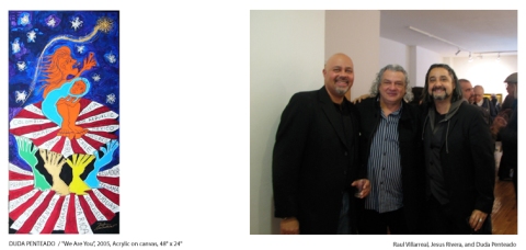
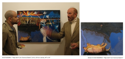
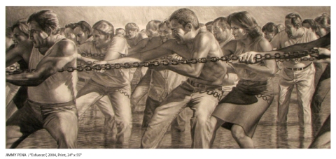
Last weekend a new exhibit opened in Manhattan’s lower east side Wilmer Jennings Gallery at Kenkeleba.

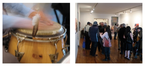
In recent years I’ve gotten to know and respect several of the participating artists, on occasion sharing gallery space with them, and wanted to show my support. I was also intrigued by the show’s theme: “We Are You”. A simple phrase, but deceptively potent and full. I like how it causes the mind to bend a bit.

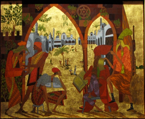
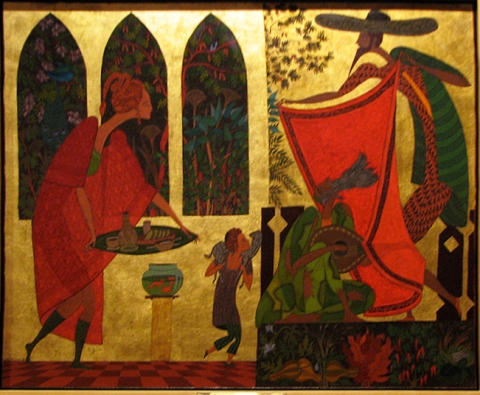
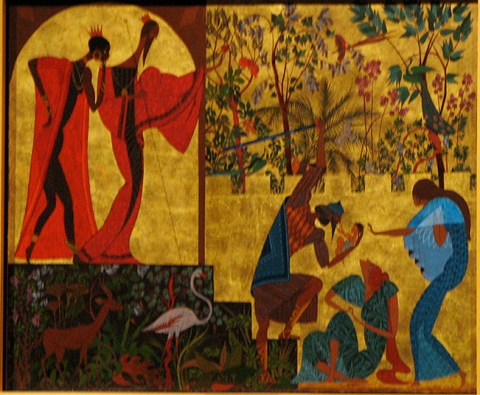
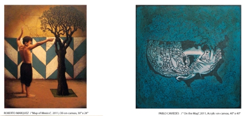
As a body of work, the exhibit is described as “an artistic overview of the current state of Latino socio-cultural, political, and economic conditions in the 21st Century  …   reflected in paintings and prints by thirty-three prominent, contemporary Hispanic artists whose trans-cultural and pan-Latino-heritage can be traced to many and diverse Ibero-American traditions, including Mexico, Puerto-Rico, Cuba, Colombia, Ecuador, Peru, Uruguay, Brazil, Argentina, the Dominican Republic, and Spain and Portugal.  Most importantly, each artist or their families have experienced the perspective of being an immigrant, refugee, a migrant, expatriate, or nomad, who gratefully found a new home in the United States, and where over the course of years, they have attained professional success by expressing both their vision and unique personal story.”

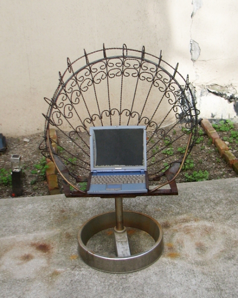
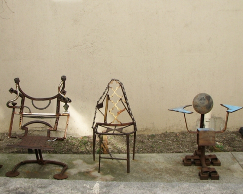
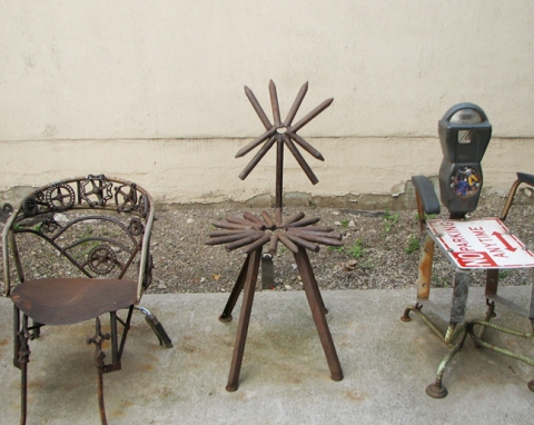
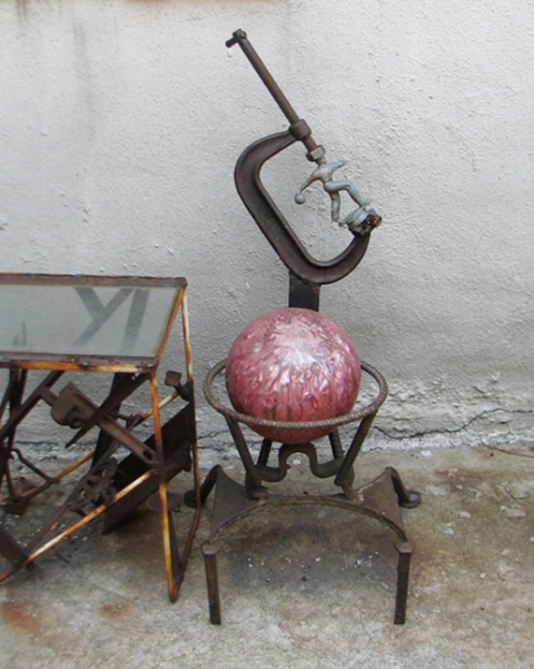
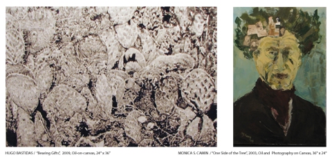
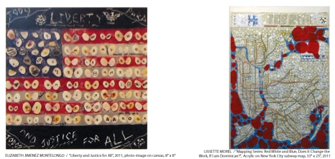
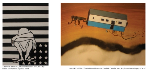
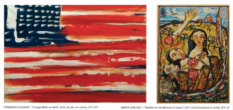
They’re an impassioned crowd, friendly and welcoming, and the art was fantastic, with wonderfully varied expressions of what was so eloquently stated in the above press release. Here’s a sampling of what’s on display. If you’re in the area, it’s well worth a visit.

Full listing of “We Are You” exhibiting artists:

José Acosta, Efren Alvárez, Nelson Alvárez, Willie Báez, Josephine Barreiro, Hugo X. Bastidas,, Monica S. Camin, Priscila De Carvalho, Jacqui Casale, Gerardo Castro, Pablo Caviedes, Carlos Chavez, William Coronado, Maritza Dávila, Rosario D’Rivera, Fernando Goldoni, Elizabeth Jiménez Montelongo, Roberto Marquez, Raphael Montañez Ortíz, Hugo Morales, Lisette Morel, Gabriel Navar, Julio Nazario, Jimmy Peña, Joe Peňa, Duda Penteado,  Mel Ramos, Rolando Reyna, Jesús Rivera, José Rodeiro, Marta Sanchez, Sergio Villamizar and Raúl Villarreal.

Gallery Hours: Wednesday to Saturday, 11am to 6 pm or by appointment
Gallery Location: 219 East 2nd Street at Avenue B

The exhibit runs through May 5, 2012.

For further information about the show and related events please contact Kenkeleba Gallery Director at (212) 674-3939 and/or visit the project’s website at:  http://www.weareyouproject.org

0

Have a Seat!

I’m not sure I’d want to sit for long, but discovering these creatively recycled chairs by New York sculpture artist Linus Corraggio sure made me smile. Great craftsmanship with marvelous personality.

These pieces can be seen at the Wilmer Jennings Gallery at Kenkeleba, 219 E. 2nd Street, New York, NY. They’re a fairly permanent exhibit, although I understand Mr. Corraggio comes in and switches them around now and then, swapping one piece for another.

According to the lower east side gallery owner, Corraggio was part of the original “Rippington Street School” (I hope I have this right) ~ a collective of sculpture artists in the city, who were ousted from their original location when, of all things, the space was turned into a parking lot (Joni Mitchell sings in my ear…). They moved to another space which was also bought a few years later for commercial purposes, causing the group of artists to disband and find their way individually. But I bet they had a grand time while it lasted.

You can see more work at his website, linuscoraggio.com.

0

Mermaid Mardi Gras

While writing “The Book of Mermaids”, I learned that many mermaid celebrations, oddly enough, coincide with our human holidays. So I’m imagining there’s a bit of frolicking good fun going on beneath the ocean waves this last day of Mardi Gras. Bubble-lined parades, dancing in rock caverns, the drinking of rich, salty concoctions, and generally speaking, some swishy, swanky good times under the sea, complete with masks and costumes. (Note: It might feel a bit turbulent if you happen to be on a cruise, depending on how near you are to the festivities.) Happy Mardi Gras!

The Book of Mermaids

0

3 Classic Love Poems

On this day of love, whether you have a sweetheart or not, it seems a perfect day to share some sophisticated literary candy from a few poets whose words have withstood the tests and tides of time… enjoy them well!

Two Tulips (close-up) / © Patricia Saxton

18th Sonnet, William Shakespeare

Shall I compare thee to a summer’s day?
Thou art more lovely and more temperate:
Rough winds do shake the darling buds of May,
And summer’s lease hath all too short a date:
Sometime too hot the eye of heaven shines,
And often is his gold complexion dimm’d;
And every fair from fair sometime declines,
By chance or nature’s changing course untrimm’d;
But thy eternal summer shall not fade
Nor lose possession of that fair thou owest;
Nor shall Death brag thou wander’st in his shade,
When in eternal lines to time thou growest:
So long as men can breathe or eyes can see,
So long lives this and this gives life to thee.

How Do I Love Thee? (Sonnet 43), Elizabeth Barrett Browning

How do I love thee? Let me count the ways.
I love thee to the depth and breadth and height
My soul can reach, when feeling out of sight
For the ends of Being and ideal Grace.
I love thee to the level of everyday’s
Most quiet need, by sun and candle-light.
I love thee freely, as men strive for Right;
I love thee purely, as they turn from Praise.
I love thee with the passion put to use
In my old griefs, and with my childhood’s faith.
I love thee with a love I seemed to lose
With my lost saints,—I love thee with the breath,
Smiles, tears, of all my life!—and, if God choose,
I shall but love thee better after death.

Love’s Philosophy, Percy Bysshe Shelley

The fountains mingle with the river,
And the rivers with the ocean;
The winds of heaven mix forever
With a sweet emotion;
Nothing in the world is single;
All things by a law divine
In another’s being mingle–
Why not I with thine?

See, the mountains kiss high heaven,
And the waves clasp one another;
No sister flower could be forgiven
If it disdained its brother;
And the sunlight clasps the earth,
And the moonbeams kiss the sea;–
What are all these kissings worth,
If thou kiss not me?

and a virtual treat for you... yes you, reading this post : )

0

Details, Details

Details rule my days, all day, most days. Design details, illustrative details, word details, project details, scheduling, parenting, you name it. (Which is partly why, I suppose, that I love to paint backgrounds with giant sweeping brushstrokes, and why I love big, broad views with never-ending skies.)

When it comes to my art, people often ask “how do you do that shading with a pencil?”, or “how do you create that sense of depth on a 2-dimensional surface?”. Of course I can show them, or I can teach techniques, but the truth is that when you’re in the throes, you’re not really “thinking”, it’s more like feeling your way. (And it should also be said, that one of the key things about details is knowing which ones to leave out.)

In any event, since details play such a big role in my work, I thought it might be interesting to share some “up-close” artwork. Hope you enjoy the closer look!

saxton_cairo.market.detail2

Detail of "Cairo Market" / Oil on Canvas / © Patricia Saxton

"Cairo Market" / Oil on Canvas / © Patricia Saxton

Detail of "Osprey 1" / Pen & Ink / © Patricia Saxton

"Osprey 1" / Pen and Ink on Paper / © Patricia Saxton

Detail of "Eagle" / Pencil on Paper / © Patricia Saxton

"Eagle" / Pencil on Paper / © Patricia Saxton

Detail of "Storm II" / Oil on Canvas / © Patricia Saxton

"Storm II" / Oil on Canvas / © Patricia Saxton

0

In Praise of Black and White: Part III

Almost like clockwork, my mind turns to black & white imagery… as it did last January, and the January before that. I hadn’t realized that! In truth of course, it’s not just a once a year thing ~ I’ve always been drawn to the power and beauty of black & white art, probably from the first time I picked up that favorite tool of mine (the #2 pencil), and sensed that magic was held within its lead.

So, once again I’ll post the original text (which remains meaningful to me), and share some choice imagery. (If you want to skip to the pictures, I won’t be offended!)

……………

Each year, a new Ansel Adams wall calendar hangs on the door leading to my studio. His superbly articulated, stunning black and white photography reminds me daily of my love for the natural world and the innumerable shades, shapes, shadows and tones that create, change, and emerge from, our world.

Yet the classic beauty and the powerful visual possibilities of black and white are often neglected. Straight black and white design is often passed by in favor of any use of color. As if black and white implied something dull or less important. Which is far from the truth!

When used well, black and white is intensely dramatic, vigorous, elegant and rich. It can make a powerful point without the distraction of colors. It plays on bright or moody, or edgy or slick in ways that color cannot. It can sparkle with cleanliness, and shimmer with subtlety. When used well, it expresses itself with undisguised strength, character and integrity.

Of course, not all photographers have the eye nor skill of an Ansel Adams. Not all designers *see* in black and white. Clients rarely consider it. But it would be nice to see a greater appreciation of the noble duo of black and white.

When people want straight talk, when they want the truth, they’ll say “tell me in black and white”. But people often speak in shades of gray, or dress their language in garish colors for dramatic effect. And so it can be with design – a multitude of colors may become too competitive, potentially drowning in an undifferentiated sea of tones or gussied up so much the point is lost for the color, like shouting for attention in a crowd.

Color, in and of itself, is naturally beautiful. Bold, rich fusions of color. Earthy color, otherworldy color. Pale, cool, warm or dense. It’s vibrant and alive and emotional. But color alone will not make a bad design good. And it’s not so much that color is overrated, but that black and white is underrated. The effects of black and white can be pretty spectacular.

Stripped of color, a million shades become a lansdcape of lights and darks that blend and weave and bounce against one another to create a very rich whole. A striking black and white image often touches us unexpectedly …  refreshing, engaging, and wonderfully inspiring. It’s raw and fundamental – and like a good story, it’s satisfying. Like a good story, it allows your mind to add its own color by filling in the parts left unsaid.

Enough said. Enjoy.

0