To Blog or Not To Blog?

A playground for some, good business for others, there are literally hundreds of millions of blogs out here in the blogosphere. So many that I think the counters have probably stopped counting. And with those kinds of odds, one may wonder, should I bother?

For the uninitiated, no doubt these questions (and more) have crossed your mind. But only two of these carry any weight: “What would I write about?” and “Can I keep it up?”. Toss the rest in a pile labeled “ways to hold myself back.”

As for the two that matter, definitely ask them … unless of course you have zero interest in blogging about anything, ever, in which case you can skip this entire essay (or share it with someone who might be interested!).

So ask, “What will I write about?”  Think it over. Most people have something they feel passionate about, are experienced with or excel at…. and most people have a voice, an opinion, a thought process. Those with a business have material in the palm of their hands. The key is that your voice or topic be authentic.

So then the task is twofold: 1.) decide on the gist, or theme/subject matter of the blog, and 2.) share that voice!  If you’re really stumped, ask friends or colleagues for ideas. Sometimes others see things about you that you may not realize people would value.

The second question, “Can I keep up with it?”, is sheer practicality. My feeling is that if you write about something you’re interested in, you’ll enjoy the process. You’ll make the time ~ whether it’s once a month, once a week, once a day. The number of folks blogging suggests that the time invested is worthwhile, but it’s certainly a question you should ask.

And remember, if you’re in business, especially you entrepreneurs, it’s almost a “must”. Just know that that “must” doesn’t have to be a drag, and there’s hardly a better marketing tool these days.

Maybe you have services to promote. Maybe you have a book in the works. Maybe you have a thing for animated films or sinister pets.

(Which reminds me, I should mention that you don’t have to be a writer ~ though, granted, it makes it easier to consider a blog ~ some “blog authors” post historical information, funny quotes or pictures of spaceships. Of course another option, if you have a budget, is to hire a writer to maintain your blog.)

The possibilities are endless, and there’s bound to be someone who was glad you shared what you did. And besides (for those afraid of commitment!), it’s not binding… so why not?

Should you bother? Yes. Because you have something to share. Because you can, and because you’ll benefit from the visibility.

If you want the chance to be heard ~ yes, even amongst the millions of blogs out there ~ I encourage you to jump in.

No budget?  No worries. Free blog formats abound (I happen to be a huge fan of WordPress) with all kinds of cool built-in features. If you want to dress it up, you can hire someone like me. Just keep in mind that blogging has become a powerful and bona fide communications tool allowing people, businesses and organizations to broadly connect with each other in “the world out there” .

One of the things I like best about all this blogging business is that you choose, and you make the rules. And once you get the hang of it and find your groove, you’ll also discover how to make it work for you.

But first things first… ask the questions, and have at it!

4

Ouch.

And they paid (one wonders how much) for this?

I was in Denver last week. Went to a Rockies game. It was fun. (It was also cold. I like the Rockies, but I don’t like cold.)  Anyway, we’re sitting in our seats, donning our new (and very spiffy) Rockies caps, wrapped in blankets, waiting to be wowed by Ubaldo, the newly returning post-injury star pitcher, when my vision is distracted by a bright, bigger-than-life banner across the stands. The banner is advertising something about Qwest and Century Link. That’s fine, whatever ~ I don’t really care, and I focus back on the game.

But wait.

My eyes flit back to the bigger-than-life sign. Somehow it’s demanding my attention… and I find that I do care. In fact, I care so much I’m appalled. Because there it is, a gaping grammatical error in full baseball-stadium-sized color for all the world to see.

And I think, “they paid for this”. They actually paid, big bucks, for this. Do they think it’s right? Do they not speak the language? (Oh, and by the way, these are communication companies…) Are they kidding me? Is our increasingly short attention-spanned society and the need for sound bites and quick one-two punch lines really more valuable than saying it right? Are we overriding “well spoken” for the “grab ’em fast” mentality?

Now I’ll admit that in the scheme of life, this is not a deal breaker. It’s not a catastrophe. It’s not “important”. But it definitely offends my inner nerd, my sense of language and yes, my professionalism! It’s not okay.

Note to Qwest and Century Link: Call me. (saxton studio) I can do it better, correctly, AND probably for a quite a few less dollars than your ad agency charged. :  )

4

"Please Like Me"

It’s the new phrase everyone’s using on Facebook, and every time I hear it I can’t help but think of Sally Fields, accepting her Oscar in 1985 and girlishly exclaiming, “You like me, you really like me!”

It’s something everyone wants. From hoping you don’t get chosen last for the 2nd grade baseball team, to full-fledged grown-up-dom hoping for a fist full of friends you can count on … I guess it’s just human nature to want to be liked.

But now it’s taken on new meaning. In addition to the classic human desire, there’s now the business desire to rack up “likes” on your Facebook Page.

It’s not so much about ego though ~ it’s about getting noticed in the sea of stuff vying for everyone’s attention. It’s about visibility. Those search engines like “likes”. So with more “likes”, the search engines take note and help remove the cloak of invisibility by sharing more fervently. And while surprisingly easy to do (and completely painless, I might add), it can go some distance for helping out the little guy (or gal). It’s a kind of marketing currency, except it’s free.

So let me go ahead and unabashedly ask ~ if you’re already part of Facebook, and you like my work, please go over to my new FB Artist Page and “like” me. I’d be grateful! I might even feel like Sally Fields.

And please remember that everyone wants to be liked. So, this isn’t just about me (although, now that I think of it … have you gone and “liked” my page yet? 8) … ).  Seriously, if you want to show your support for someone out here in cyberspace – an artist, a musician, a small business, and sure, even the big ones… take the two seconds to hit the like button. It’s a vote of confidence that they’ll appreciate!


0

101 Women Bloggers to Watch

Who knew? I certainly didn’t. But I’m honored to be part of this terrific list of women bloggers culled by WE magazine for women.

I don’t know anyone at WE magazine. I didn’t get an engraved invitation. (And I didn’t have to buy a directory!)  I was, in fact, unaware that such a list existed. But looking through the other blogs selected, I’m very pleased to be among them. Go ahead and check them out for yourself.

It’s kind of interesting, really. You’re out there in cyberspace, sharing what feels right to share. Hoping someone may read it. Hoping it might make a difference. Not knowing, really, really for sure knowing. And then one day there’s some validation, and you think, wow, okay, this is nice. You noticed!

WE magazine’s mission is to showcase women, their talents, treasures and expertise. …. Thank you, WE magazine.

1

Work That Gives

My parents always told me there was great satisfaction in a job well done. May seem corny, but it’s true. And it’s one of the things I like best about my work …  it’s satisfying to interpret and conceptualize a broad range of messages. I like to call it giving things a “visual voice”.

No two voices are the same; each has something distinctly their own ~ and to hear, discover and express that in its most dynamic way is really kinda neat.

Naturally, it’s also satisfying when the work is appreciated. (Who doesn’t like a kind word?) Clients are happy, you’re happy. It’s good for their business, it’s good for you. A “job well done.”

Sometimes though, the work achieves more measurable, tangible benefits ~ and when that happens, it’s that much more meaningful all around. The small piece of art below is one of those.

Commissioned specifically as a fund-raising effort for my alma mater, Wittenberg University, I was pleased to learn that this hymnal bookplate raised more than double the intended financial goal, attracted a high percentage of new donors and brought valuable support to other campus needs above and beyond the original effort.

This is truly “work that gives”.  And somehow that’s doubly satisfying.


5

When It's Wrong to Redesign a Brand

Much time, and probably a lot more money, was spent making recent logo changes on some big company re-branding efforts.

EXHIBIT A:  Tetley Tea.  Tom’s of Maine.  The GAP. (old on left, new on right)

The question I ask: “Why”? Have sales been down? Was company morale low? Were they experiencing a scandalous attack? Were decision-making-someones simply bored?

Now, don’t get me wrong ~ I’m all about  presentation and the power of “look and feel”, and if any one of these companies had asked me to give them a redesign, I would have gladly obliged. But – not to sound immodest, as I believe most designers given the opportunity would say the same thing– I would have handled it quite differently, and I’d like to think, more effectively.

One lesson I would apply: “if it ain’t broke, don’t fix it”. This is the part of “Branding 101” known as consumer recognition.

Brand Connections …

Big Brands elicit a kind of personal connection – for better or worse, we make mental, even emotional, associations with how they look. And that association comes from recognition, which stems from the basic concept of consistency.

For high-profile brands, the success derived from established logo/packaging recognition can seriously outweigh whether or not a look is amazing.

As shown in “Exhibit A”, Tetley’s old package was far from hip or upscale ~ but, as a tea drinker who personally loves the smooth, full-bodied flavor of Tetley’s British Blend, I can vouch that the old package says “rich flavor” much more than the new package, which (I truly hate to say) looks more like packaging for a feminine product.

Tom’s, another brand I enjoy, previously used friendly, round shaped bottles and a graphic treatment that worked well with its natural product, whereas the new look reminds me of a bad Web 2.0 design in an oddly shaped container.

As for GAP, the logo may not have been exciting, but it was solid with really nothing wrong.

Doing it right….

For companies/products with already high recognition, rather than reinvent the wheel, redesigns would best be served by tweaking and updating.

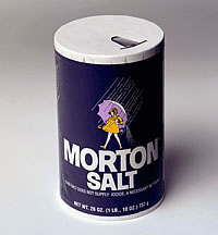
EXHIBIT B:  Morton Salt.  Ronzoni.

Morton and Ronzoni made changes with the times, without shocking overhauls. They’ve retained their original intent and managed to successfully alter their look by doing it gradually, with key elements maintained and integrity in tact.

The message being, don’t send your customers on a wild goose chase trying to find your *new and improved* packaging, OR throw them into a tizzy because their familiar, trusted product got a makeover and a new doo, like a friend who’s trying to be, or is turning into, someone else.

Beyond the fact that many people don’t like change, there’s something to be said for the comfort of familiarity in a world that moves too fast and holds many a slick deal.

On the other hand, improvements can be refreshing. Kind of like when you’re loathe to part with an old, favorite shetland sweater ~ but that nice new cashmere in a similar style and color might be hard to resist.

Refreshing is good. But different and unfamiliar is not a smart promotional move. Why discombobulate, and possibly alienate, your audience? For what purpose?

To redesign or not to redesign?

Okay, so maybe the Tetley, Tom’s and GAP folks had good reason for the change. Let’s go ahead and assume the most practical reason: lagging sales or market competition.

But let’s also put it out there that the cause of lagging sales or struggle with market competition just might have more to do with things much less glamorous than a logo or fancy packaging ~ things like business plans and marketing structure, advertising strategies or customer awareness issues.

So that usually, and particularly in the case of well-known companies/products, changing the logo is not the remedy.

(Worth noting at this point … if you’re a start-up company, or your business has been around but floundering in a sea of mediocrity, by all means, run to a great designer. Boosting the look of your branding may be just what’s needed to boost momentum and shift the energy.)

Well, what’s done is done (except in the case of the GAP, who apparently quickly reverted to their original logo after public outcry! ) … but the questions remain:

1. Is it worth the shake-up to completely re-brand a good thing? (I think not.)

2. Will re-branding a good thing turn the consumer away? (Again, I think not… although you may whine, as I have. But if you love Tetley tea, you won’t stop buying it because you don’t like the new package.)

3. In the end, was it worth the time and money to do all that dramatic re-doing?  (Right … I think not.)

4. Could that time and money have been more wisely used? (Most definitely, yes.)

Conclusion: Sometimes it’s wrong to redeisgn a brand. I rest my case.

1

Stefan Sagmeister: The power of time off

Every seven years, designer Stefan Sagmeister closes his New York studio for a year-long sabbatical to refresh their creative outlook. He explains the often overlooked value of time off and shows the innovative projects inspired by his time in Bali.

His talk is insightful, enjoyable and worth watching – though for some reason the video wouldn’t embed, so here’s the link:

ssagmeister

Now, my thoughts:  In theory, it makes sense. But there’s that pesky element of economic feasibility and other practicalities / responsibilities.

I did take my own sabbatical at one time – 6 months in a beautiful place, devoted to pursuing other aspects of my creativity. It was a time when I felt I could do it, based on a relatively lesser amount of responsibility – ie;, no children yet. It was a fantastic gift, a treasured, productive time.

As downright appealing as it is, a sabbatical like this would be much more difficult to orchestrate now. And as such – for those who can’t up and go to Bali – it’s important to be able to find and nurture places of growth and inspiration right from where you are.

Share

0

Apples and Oranges

In 100 BC, Latin writer Pubilius Syrus is quoted as saying “You Should Go To A Pear Tree For Pears, Not To An Elm.”

I’ve always thought that made perfect, logical sense.

In a similar vein, if you want an apple, you’d go to an apple tree, and to an orange tree for an orange, right?  Or would you ask the apple to behave like an orange, because you’re really hungry for both…

apple-orange

Lately I’ve become increasingly aware of this very kind of attitude (wanting an apple to behave like an orange) infiltrating the professional design field. It’s the idea that creative excellence resides side by side with mathematical expertise and technological wizardry.

It’s not exactly a right brain/left brain comparison, as there are many creatives who are very technologically adept, who can and do operate with both sides of the brain. It’s more the apparent expectation of both aspects to excel with equal brilliance within one individual. And it’s demanding that individuals be not only jacks-of-all-trades, but masters-of-all. (Oh, and by the way, for bottom dollar – an unfortunate side effect that’s been showing up across many professions in the current economic climate.)

It’s a disturbing trend. Because, generally speaking, in the end the expectations don’t seem sustainable, with results that may be less than desirable unless overall quality is of little consequence.

Some may think this expectation just a natural adaptation to changing times, as in fact designers have typically worn many hats. Conceptualist, craftsman, communicator, consultant, coordinator, business negotiator, marketer, developer and keeper of budgets, manager, director, teacher; some of us have multi-medium talents – and we know how to use the tools to make it all happen.

And it’s also true that every profession faces unique challenges almost continually as life, technology and opportunity rapidly evolve. So we all must grow, learn and evolve right along, perhaps even re-invent, which might frustrate some and invigorate others, but is true, nonetheless.

Yet I still feel there is a point of departure in the orchard.

Ask most programmers how they stack up beside designers and vice-versa. They know enough about each other to work effectively together, but aren’t necessarily sufficiently skilled in both to be considered masters of each realm. It’s apples and oranges all over again. Both nutritious fruits, but not derived from the same seed.

If you want an apple, the apple tree is your best bet.

Share

0

Seth Godin's Talk on Standing Out

To stand out in today’s marketplace, you need to be remarkable…

Seth Godin gives us a wonderful, insightful talk on the importance of  – and what ‘s required for – being remarkable. And while the video says the taping of this presentation took place a few years back, the message is as fresh and valid as ever.

Share

0

It's All About Relationships

A recurring theme has been emerging in my world quite a lot lately. In talks over the past several months with colleagues, in twitter posts directed to Seth Godin’s blog, and most recently in a conversation over lunch this week with Milton Glaser who has unarguably seen and done it all, combining art and business with unparalleled success.

The theme? It’s all about relationships. Here’s my quick take on it, with regard to the graphic design business (or any business, for that matter):

………………………….

In this day and age of computer savvy, a glutton of designers and a climate of economic strife, it’s no wonder many artist’s and agencies are having a hard go of it lately. It could be there’s too much talent and not enough demand, as everyone – from individuals to families to small businesses and large corporations – is holding tight to their purse strings.

But in any business climate – whether it’s booming or equilaterally depressed – three key elements always reign supreme: creativity, quality, and relationship.

An unfortunate side effect of a distressed economic environment such as the one we’re experiencing now, is that some media-buying decision-makers may opt for mediocrity, somehow aligning their efforts with the mood of the times – the sense of “lack” or “needing to do without”  – by shopping around for the lowest price, regardless of creativity, quality or relationship. It’s easy enough to do nowadays; just google graphic design and hundreds upon hundreds will come up.

What can also happen in this kind of situation though, is that while it’s still possible to find creativity, and still possible to find certain levels of quality, relationship may well be left out of the equation. And that particular absence can kill a project, or make people wish it did.

Despite all the wonders of online connecting, the enormous choices and competitive pricing available, if you don’t like the people you work with, it can be a miserable experience. It boils down to the old adage of being a pleasure to work with.

You can be as creative as DaVinci, with the quality and craftsmanship of a Frank Lloyd Wright; and likewise, you can be a brilliant business mind with a world-changing product. But regardless of whether wallets are open or whether they’re closed, at some point human nature always plays its card – and wins.

Share

2