52 Weeks of Peace [squared] / Week #77
“As with most fine things, chocolate has its season….any month whose name contains the letter a,e, or u is the proper time for chocolate.” ~ Sandra Boynton
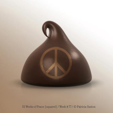
“As with most fine things, chocolate has its season….any month whose name contains the letter a,e, or u is the proper time for chocolate.” ~ Sandra Boynton

We love Ohio people! Many, many thanks for this awesome “peace shoot” ~ we wish YOU much love and peace.

Where to next?
(ps: you can see all “where in the world is peace?” images on our “where in the world is peace?” page. Our book is on Amazon, our totes, mugs and things are available here. Please email your own pictures to 52weeksofpeace@gmail.com or post them on our FaceBook page. Let’s see where peace goes!)
Happy Halloween! / Week 9 / 52 Weeks of Peace

“Shadows of a thousand years rise again unseen,
Voices whisper in the trees, “Tonight is Halloween!”
~ Dexter Kozen
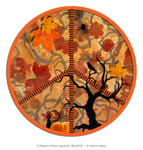
A little peace for the season…. a time with magic in the air!
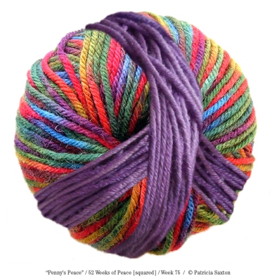
The intertwining of colors and textures. The weaving of comfort and protection, warmth, pleasure, practicality and play into numberless long-lasting things made with love… So much goodness in one ball of yarn. So much peace it can bring.

Pigeon Roost Farm. The name alone makes you smile; the pictures are priceless. Thank you for bringing “52 Weeks of Peace” to the fair, and sharing it with us from the friendly state of Ohio.
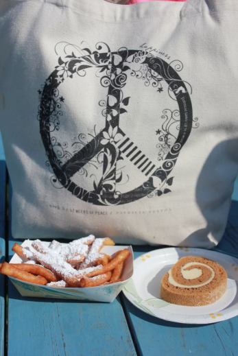
Peace and a Snack at Pigeon Roost Farm Pumpkin Fest
Where to next?
(ps: you can see all “where in the world is peace?” images on our “where in the world is peace?” page. Our book is on Amazon, our totes, mugs and things are available here. Please email your own pictures to 52weeksofpeace@gmail.com or post them on our FaceBook page. Let’s see where peace goes!)
Girl Scouts are many worthy things, but they should probably stick to being positive citizens of the universe and not mess with their cookie box design!
I should apologize, as it seems the Girl Scout organization is very pleased with their new design. But, you who know me, know that if I think something is good, I’ll be the first to applaud. If not, I’ll find some nice way to speak the truth, and look for the positive, but honesty prevails. (This is probably a good Girl Scout trait, this being true to your word business. It earns trust, I believe.)
In any event, to the point, which is: “Why change the box”?
Yes, I understand it’s a 100th anniversary of the Girl Scout organization, and as we all know, everyone (except me) loves Girl Scout cookies. So that’s a sensible enough reason to re-design the box ~ to celebrate the milestone.
Maybe the question then isn’t so much “why”, as “why this design”? It accomplishes its goal of honoring the girls themselves, but the cookies (the beloved cookies, and the main reason for the box) feel lost. The prior box, in my opinion, did a better job of honoring both girl and cookie. They could have infused something celebratory into the existing design, rather than re-invent. In my opinion. Which wasn’t asked for. So there you go, for what it’s worth.
What I really don’t “get” is why some companies feel a need to fix things that aren’t broken. That’s time and money spent for an overhaul that in the end, doesn’t necessarily justify the means. Some businesses really DO need brand makeovers, and I’m all for those upgrades. But if it’s just because you can, then it really ought to be fairly spectacular.
Bottom line, I wanted to care and applaud their venture, but I’m unmoved. The good news though, for all you Girl Scout cookie lovers, is that they haven’t changed the number of cookies per box.
It started with a college art class assignment~ one of the few assignments I adored ~ where we had to draw one crazy shape (or some such thing), then interpret in a myriad of ways.
I remember my shape was squiggly with random loops ~ kind of Miro-esque now that I think of it ~ and that I went nuts. I could barely keep up with all the ways I could keep the same design but make it look completely different. Colors, lines; the possibilities were endless! This was better than a drawer full of chocolate, or at the time, maybe more like a keg of beer and a bunch of great friends.
Eventually I had to stop, probably needing to put in some study time for other classes. Besides, it was a meaningless shape, so there was no impetus to keep going beyond the “oh cool” factor. I do think though, that because it was meaningless, my mind opened up to explore freely.
And so it was that this freeing exercise came in handy later on, when I started my business’ first promotional campaign. The memory of “many designs from one” prompted what became a signature series ~ those of you who’ve known me for a long time know exactly what I mean when I say “pencil points”.
Every 2-3 months for several years I’d send out a new Pencil Point Postcard (the pencil point also being my logo, giving it “meaning”), and the response was fabulous. Everyone had a favorite, people really looked forward to getting the next one, and I had fun creating them. And when pitching my design wares, pulling out a stack of pencil point cards almost always sealed the deal. Even if clients weren’t going to need something quite so creative, I think they liked knowing there was that kind of original thinking behind the scenes.
When business turned electronic, I decided to start a new series, online. “52 Weeks of Peace” postcard book was born, and the subsequent “Plethora of P’s” series. There will probably be something new in the future, but neither the peace signs or the positive P’s have run their gamut yet. (There are still more pencil points, too; I just have to draw the line somewhere … no pun intended!)
Sometimes I think it might be some kind of mental affliction. Maybe I am a little nuts. But really, “oh well”. We all have our quirks.
EBay got a new doo.

It’s always interesting when ia big name company decides to revamp their look, which most noticeably translates to changing their logo.
Sometimes it’s well worth it, sometimes a pointless gesture. Either way, it can be a tricky line to cross, because for good, bad or ugly, there’s a great amount of already established brand recognition involved ~ which means that over time, people, being emotional creatures, have an ingrained response invested, and there’s a risk of upsetting that apple cart. Generally speaking, people don’t like change. They like familiar.
So the trick becomes creating a design that’s new, fresh and inviting while maintaining the “we’re still you’re old friend” feeling that often takes years, sometimes decades, to instill.
So how does eBay’s change measure up? Personally, I think they did a good job. Executionally there’s a glitch or two (noting in particular the imprecise overlap of the e/b), but overall, even without the original quirkiness, it still feels ebay-ish ~ just more representative of their larger prowess (they aren’t the crazy little start-up they once were) and definitely more contemporary.
I saw a thread where a lot of designers (one assumes) commented negatively about the re-design, citing “boring” and “safe” among other complaints. I dunno ~ maybe, like me, they think “I could have done that, and I could have done it better”, so there could be a hint of competitive resentment ~ but for whatever reason, I think they were too critical (this from someone who’s VERY critical!). And, in the end, as I’ve said in other posts, this kind of change won’t leave loyal followers hitching a ride elsewhere.
It’s a nice change, refreshing. In my many years of experience I’ve learned that solid, effective creativity doesn’t necessarily mean over the top “wowing” them with how clever you are.
Could this have been more “creative”? Sure. Did they lose the “fun factor”? Maybe a little. But I like the simplicity. I also like that it’s more sophisticated than it was before ~ after all, the company itself certainly is ~ yet it still feels friendly.
Now it’s up to the business and its’ services to do the rest of the talking.
“nobody can be uncheered with a balloon”
~ Winnie the Pooh

Remember to send peace! ~ The 52 Weeks of Peace postcard book is available at Amazon. “This book is a treasure – beautiful and inspirational artwork with thoughtful verbiage. Patricia Saxton has hit a home run.”


