Author Margaret Atwood's Keynote: "The Publisher's Pie"

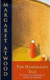
Admittedly, I’ve only read one of MARGARET Atwood’s novels ~ but that one book (The Handmaid’s Tale) earned my lasting respect and admiration.

So when I learned that she’d given a keynote talk at New York City’s TOC conference (Tools of Change for Publishing), I was all ears.

Invigorated with her hand-drawings and delightful wit, it’s a rather insightful listen for all writers, authors and publishers (or those contemplating the same) during these curious, unsettled times in the world of books.

PS: And now I’ll be adding more of her books to my future reading list!

2

Evolution of a Book Cover

It starts with a story. An idea, words on a page.

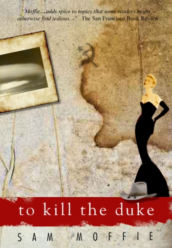
The words unfold, revealing characters, settings, moods. And then, a bit like being put to music, the words get put to pictures. Different styles are explored, and certain elements are established that will express the essence of an entire book. A few renditions later, author and artist in sync, a cover is made.

This is Sam Moffie’s fifth novel; publish date forthcoming. Book cover designs @Patricia Saxton.

0

Googling Jules Verne

Every once in a while Google has some fun with its logo treatment. Today’s marine scene caught my eye (were there Mermaids swimming inside the double “o”‘s?), so I did a little deeper-sea exploration.

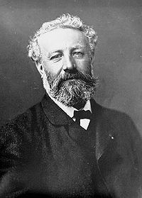
The design ~ which is interactive, by the way (the “joystick” lets you move the sea and its creatures around … such power!) ~ honors the birthday of prolific French author Jules Verne (February 8, 1828 – March 24, 1905). Verne is best known for “Twenty Thousand Leagues Under the Sea (1870), A Journey to the Center of the Earth (1864), and Around the World in Eighty Days (1873).

A click on their logo takes you to a Google search page all about Jules Verne. A very clever way to say Happy Birthday to one of the literary greats.

0

#1 in "Books About Fairies"

Just when I thought I couldn’t be more thrilled, the news got better!

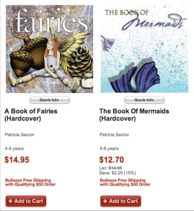
The holiday season was very kind to my books (A Book of Fairies and The Book of Mermaids), and I hope everyone who received them as gifts is finding much enjoyment within the pages.

Naturally, post-holiday sales have slowed, so I was both surprised and truly thrilled to see that as of today A Book of Fairies has reached the  #1 listing on Amazon’s 3,429 “books about fairies”!

Earlier today I’d been wowed to see that it held the #8 spot on Amazon’s entire listing of 60,556 fairy books! Holy fairy wings! That’s a lot of books about fairies. I feel very honored to be so high among them.

And … I’m feeling immense appreciation for the many good people who have helped make my book flutter towards the top.

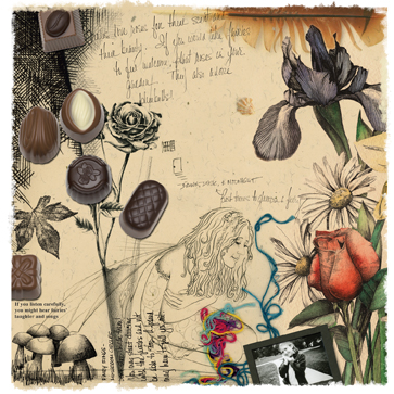
from "A Book of Fairies"

Maybe I should ask my numerology friends… but whatever they’d say, I’m thinking #’s 1 and 8 are pretty good numbers for me today. :  )

2

Gifts of Peace, Magic & Creativity (under $20!)

Can it be last-minute holiday gift idea time already? Hmmm. I just might have some ideas. How about the gift of reading and imagination..? A Book of Fairies, and  The Book of Mermaids are great for school-age kids! The Magnetic Mermaid Dress-up is ideal for 3 and up. All are available at Amazon.

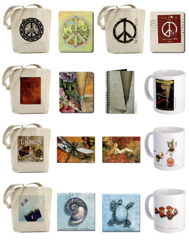
Then there’s a whole bunch of cool stuff over at my *boutique* at CafePress.  Totebags, mugs, coasters, mousepads, journals and magnets, grouped by my signature pieces of “peace”, “pencil points”, fairies” and “mermaids”. Lots to choose from. Fun, unique, and practical!

Happy holidays ~ and may peace, magic and creativity fill your hearts!

0

Book Trailer for "13 Words" by Lemony Snicket

An altogether fun and delightful book promotion video (reminding me how much I would like to find time to make my own…)  from bestselling author of A Series of Unfortunate Events, Lemony Snicket and esteemed illustrator and New York Times columnist Maria Kalman…. Enjoy!

Thanks to Brain Pickings (a great site for curious things!) for this find!

0

Brooklyn Book Festival: Sunday, Sept. 12

This Sunday will be a great big day for book lovers. Along with top literary stars, a rich conglomeration of authors and publishers gathers together each year at one of the east coast’s most visited book festivals: The Brooklyn Book Festival.

The Festival runs from 10am – 6pm on September 12, outside Brooklyn Borough Hall: 209 Joralemon Street, Brooklyn, NY.

And there, nestled in Booth #70 will be some of the most beautiful children’s books at the fair… So if you make it to this cool event, be sure to stop and see my publisher, Shenanigan Books ~ you guessed it, at Booth #70!

2

Tea and a Great Piece of Writing

A bit of a book review for my more literary friends…

Time has had its foot on the accelerator of late, driving us forward much too quickly, compressing what might normally be summer’s leisure into streaks and blurs of heat and humidity, flowers, bees and drying lawns.

But I’ve found a perfect book for the time-snippets I’ve been able to carve out to maintain my reading habit.

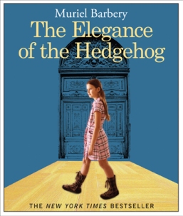
The Elegance of The Hedgehog, by Muriel Barbery is a story told in the voices of two main characters: a brilliant, cynical young girl and a brilliant, middle-aged woman trapped by societal expectation in a low-class existence. I haven’t gotten terribly far, but it’s the kind of book that doesn’t require obsessive reading (which is why it’s just right for a summer season that’s squashed with to-do’s and squeezed between the schedule-laden seasons of spring and fall).

One of the things I’m most appreciating about The Elegance of The Hedgehog is the abundance of fabulous lines that tempt me to create the book’s very own list of quotes ~ which I haven’t done and won’t do, but the thought is testament enough to the author’s  wordsmithing.

In any event, those of you who know me, know I enjoy my tea. So finding the topic of this particular entry appealing will be no surprise ~ but it’s the larger essence, the rise and fall of the thought process, the meditation, the skilled expanding and condensing of a moment speaking to life and power and subtlety that I found truly delightful .. and worthy of sharing.

So here it is:

I pour the tea and we sip in silence. We have never had our tea together in the morning, and this break with our usual protocol imbues the ritual with a strange flavor.

Yes, this sudden transmutation in the order of things seems to enhance our pleasure, as if consecrating the unchanging nature of ritual established over our afternoons together, a ritual that has ripened into a solid and meaningful reality. Today, because it has been transgressed, our ritual suddenly acquires all its power; we are tasting the splendid gift of this unexpected morning as if it were some precious nectar; ordinary gestures have an extraordinary resonance, as we breathe in the fragrance of the tea, savor it, lower our cups, serve more, and sip again; every gesture has the bright aura of rebirth. At moments like this the web of life is revealed by the power of the ritual, and each time we renew our ceremony, the pleasure will be all the greater for our having violated one of its principles. Moments like this act as magical interludes, placing our hearts at the edge of our souls: fleetingly, yet intensely, a fragment of eternity has come to enrich time. Elsewhere the world may be blustering or sleeping, wars are fought, people live and die, some nations disintegrate, while others are born, soon to be swallowed up in turn – and in all this sound and fury, amidst eruptions and undertows, while the world goes it merry way, bursts into flames, tears itself apart and is reborn; human life continues to throb.

So, let us drink a cup of tea.

(From  pg. 91 of The Elegance of The Hedgehog by Muriel Barbery)

……………………………………………………………………………….

ps: Other great reads this summer that I’d recommend have been “The Help” (Kathryn Stockett), and “The Art of Racing in The Rain” (Garth Stein). A comprehensive list of my favorite books can be found at patriciasaxton.wordpress.com

0

Great Book Covers: Part II

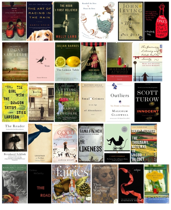
It could just be me, but I think bookstores are like candy shops. Maybe it’s the difference between a sweet tooth and a sweet eye …  okay, I made that up (not a bad analogy though, if you think about it!)  … but whatever it is, I get a feeling of yummy anticipation when opening the door to a well-stocked, nicely laid out bookstore.

I really, truly, love books. I love to hold them, turn the pages, get lost in great story-telling. I love to see all the different covers, and pass judgment (c’mon ~ we all do).

And when great cover art matches up with a great story, it’s almost as good as really good chocolate. (apparently I’m still on the *sweet* reference) It’s like the marriage of ice cream and hot fudge. You could get by with one or the other, but together they make perfection.

Trouble is, sometimes they don’t match up. You might have an outstanding story housed inside a mediocre cover, in which case you could pass it by and miss out on something real special. Or, a stellar cover might disguise a less than stellar reading experience. Talk about disappointment.

One aspect of my job as a designer is to make book cover art that weaves its best magic for the author. The goal is to get folks to pick up your book. So regardless of reviews (or lack of), accolades from Oprah (most likely lack of) or best-seller lists ~ when it comes down to considering a book as a potential read or possible purchase, the cover can make or break that first opportunity to grab someone’s attention.

And it’s important that that attention is both dynamic and pleasing. It’s a tease of something good to come. It’s welcoming. And of course, it has to speak to what the book is about, which very briefly answers the reader’s question “is this something I might be interested in?”

If a book has made the first cut where people have taken notice, reached out and picked it up ~ congratulations! But remember, then they’re going to look at the back cover. Then they’ll look at the inside flaps. Personally, I also like to read the first page of a book before making a decision ~ to see if it’s gonna “grab me”.  If all these elements find favor ~ cover, back, flaps (and maybe the first page)~ you’ve got a win.

So, while we all judge books by their covers, it still holds true that the cover alone will not sell a book. What it will do is determine whether it warrants a closer look. It’s a critical first step.

So what makes a great cover? What makes it jump from the shelf onto your personal radar?  Something like this:

  1. It looks professional.
  2. It reflects the nature of the story.
  3. It respects the audience.
  4. It’s visually appealing.

Sounds easy, but there can be a fine line between what works and doesn’t work. And that fine line can create a huge gaping difference. If it looks unprofessional or lackluster, the perception is set that that’s what’s inside as well.

Making it work is, very literally, in the details.

Fonts. Not always, but generally speaking, conservative/traditional fonts work best. And whatever the fonts, it’s all about size, color and placement. Even hints of difference in those treatments can change the look dramatically. There’s no one-size fits all plan, unless you have a published series with an established look.

Art: Art speaks to the soul of the book. Is photography best? Illustration? Both? Neither? (Believe it or not, there are occasions when no art is good art. Coming from an artist, you might think that sounds crazy. But [excluding children’s books] type alone has a place if used exceptionally well and manages to convey the book’s essence.) Bottom line, the style of art (or type) used is a huge deal, because not only does it suggest the story, it suggests the feeling of the story. This is the emotional grab.

Trends: What’s out there, what looks good (or bad), what’s selling well? These will serve as style guides… but the best covers will bend “the rules”. In fact, they’ll break a few. Because there really are no rules, just guides. Visual justice should be given to the uniqueness of the each book.

Over-design: Aside from being next to impossible, attempting to put everything about the story on the cover, or trying to capture all the nuances, is not a good idea and will scream “unprofessional”. Cover art should simply portray a sense of what’s inside. It’s a tantalizing piece of candy from the jar, not the whole store.

…………

I positively adore a great book find. I get excited. I chomp at the bit to find that moment in a day when I can get comfy, make the light right, and sink my over-thinking brain into another place and time and cavort with all sorts of fascinating characters.

But just as much, I savor the look and feel of a book. It’s also one of the fondest parts of my work ~ designing covers that can make that magical first connection between book and reader.
2