Facebook Is Like a Chair. Okay.

I’d love to hear your thoughts on this facebook ad. First ever for them, so it’s making news.

http://www.youtube.com/watch?feature=player_embedded&v=c7SjvLceXgU

Okay, my thoughts too, I guess it’s only fair.

1.) I think it’s well done. Artsy, hip, maybe a little too profound (music selection added unnecessary weight there).  2.) I’m not sure why they needed to make this ad.  3.) Oh, right, to get more advertisers. (how silly of me)  4.) Facebook does connect people, and when you think about it, it’s pretty incredible.  5.) I’d “like” to be sharing life in one of their scenes. The scenes were great, showing that there’s no substitute for human interaction.

Your turn…!

0

Six Businesses, Six Business Cards

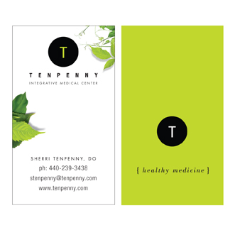
Using the same businesses from “Six Businesses, Six Logos” (with one substitution), here’s how their identities start to play themselves out in a practical format.

Although limited by fitting the amount of information any given client feels is necessary into a relatively small space, you can have a lot of fun with business cards, especially if you’ve designed a logo that allows you to pull from various elements. The key here is to not only support the brand identity through consistent logo use, but to expand upon it by appropriately enhancing the look and the feel. The canvas is small, but the impact doesn’t have to be.

0

Six Businesses, Six Logos

Someone recently asked me, “How do you create a logo? Where do you start?”

I didn’t have a ready answer, except that it just sort of happens ~ ideas, concepts, visuals come to mind, which then evolve, and then get tweaked into a finished product. And while this is the truth of it, I’m sure it was highly useless to the person asking the question, especially the part where it “just sort of happens”.

If I were to try again, I’d say that the “just happening” probably comes from many years of what I’ll call research. It’s being in a business where you’re constantly aware of branding, you’re using different fonts and font combinations on a daily basis, working with shapes and colors and sizes and revolving trends. So that when you sit down to “create”, there’s all this history at your disposal. A muscle that’s been exercised regularly. You know where you can bend and stretch the limits, and you know ~ both intuitively and figuratively ~ what won’t work.

With that in mind, I have 4 rules I’ve always followed when creating a logo:

1.) Clear the head.

2.) Listen.

3.) Find emotional touchpoints and discern the personality of the business.

4.) Distill to its simplest form.

Of course within the process there’s the wonderfully muddy area where creativity swirls. Marrying concepts and tastes, the play of fonts, and the interweaving of symbols and shapes to give a visual voice to the intent of the logo: which is to be distinctive, memorable and clean, ready to leave a solid, ever-present, impression.

Here are 6 recent logos from 6 different businesses: A Non-Profit Foundation for Special Forces families, Landscaping, Real Estate Staging, E-Learning, Speech & Presentation Coaching, and Osteopathy. (I might mention that most of these presented the additional challenge of being particularly long names, which can be trickier when it comes to applying them… more on that next.)

0

Super Bowl Ads / Part II: The Forgettable and The Unforgettable

If you’ve read my last post, I stand corrected, thanks to my friend Mary.

There was one more really good, memorable ad besides the Chrysler/Clint Eastwood piece. (I hadn’t seen this one ~ must have been firing up the hot fudge sauce when it aired…) This one’s just a happy hoot! ~ and every bit as good for wit and creativity as the Chrysler ad was for class and message.

http://www.youtube.com/watch?v=Fe1cJPD_ZbA&feature=player_embedded

0

Super Bowl Ads: The Forgettable and The Unforgettable

“Ads are the cave art of the twentieth century.”
~ Marshall McLuhan

If this statement is true, and if we consider the majority of this year’s Super Bowl ads, we’re becoming pretty forgettable.

Super Bowl advertising is eagerly anticipated by millions, almost as much as watching the game. (Some would argue that the ads are the main event). It’s a huge opportunity to hawk wares to a captive audience, and highly regarded as a showcase for some of the best & brightest commercials made.

So, I watched to see what cream would rise to the top, and was incredibly disappointed. Have I just become jaded and old-fashioned? As a reality check, I asked my teenage daughter if she found them entertaining. Her answer: “No.”

She was out of the room for the only one that I found powerfully memorable and worthwhile. It happened to be a serious ad, and featured Clint Eastwood (I’ll let that fact speak for itself). In case you missed it, here it is:

Aside from this one, I thought: “they just don’t make them like they used to!’ Okay, I’ll admit that the “we go” Budweiser dog ad was sort of cute, and I liked the one about entrepreneurs. So there, I found two more. But by and large there were too many ads and too little substance.

Of course, they don’t have to make them like they “used to”, except for maybe having some more class, more wit, more depth, more intelligent ingenuity.

Am I asking too much? I don’t think so. If the idea is to make a big impression, and get the most bang for the probably obscene amount of monies spent, they might take some tips from some great ads of Super Bowl’s past…

With the wealth of talent and creative energy in the world today, you’d think the 2012 Super Bowl ads could’ve been a little bit spectacular. In my opinion, it just goes to show that technology doesn’t equate with creativity, and bells and whistles don’t make the message.

0

What's The Big Deal About Branding (part 3)

Since it’s National Ice Cream Month, I thought I’d use a famous ice cream company for Part 3 of my branding chatter … after all, “it’s only fair…”

What’s so good about this is that the video not only shows the integrity and consistency of Ben & Jerry’s folksy branding in action, it’s also a great example of authenticity.

Just to clarify, authenticity means that the message (the visual voice) rings true. And there’s very little that can replace, go above or beyond being genuine.

In this particular case, the element of authenticity underscores a product that’s been proven worthy and continues to breed the important ingredient of trust, therefore keeping ~ and gaining ~ a loyal following.

I really like how Ben & Jerry’s found a way to keep their classically down-home look, feel and messaging steady, vital and relevant in a technological environment. From the start they’ve been about extra good ice cream with an organic bent and a social conscience, and they haven’t skipped a beat.

(Makes you want a quart or two …!)

0

Beer, Chocolate and The Web

Beer, Chocolate and the Web … for some reason makes me think of “The Lion, the Witch and the Wardrobe” ~ maybe not with such an intricate storyline, and I’m not sure C.S. Lewis would like the comparison, unless perhaps, he was a beer and chocolate person… but either way he would certainly appreciate the imaginative quality.

So, thanks to my good friend and fellow designer Jim for knowing that I would love this. Sagres, Portugal’s leading beer brand, launched a new product this year: Sagres Preta Chocolate, a chocolate flavoured stout beer.

I can’t attest to the beer itself, but their decision to launch the product with a website crafted entirely from chocolate gets a big thumbs up from this corner.

Personally, I’m not convinced of the “rightness” of beer and chocolate co-mingling in one drink, but I definitely give these guys credit for ingenuity. And (for possible future reference) I’d have gladly been on the team that made all the chocolate pieces!

Here’s how they did it:

And here’s the final website for Sagres Preta Chocolate. Enjoy!

0