First I should say that despite the title of this article, PowerPoint is clearly not an art form. It is a handy, easy-to-use presentation tool that has gained enormous popularity over the last several years – to the point of becoming standard practice, and unfortunately, to the point of almost mass disregard for the audience.
If you don’t want to alienate your audience, it’s smart to remember that while PowerPoint itself isn’t an art form, there is an art to presenting. And to that end, PowerPoint presentations can – and should – be appealing, both visually and verbally.
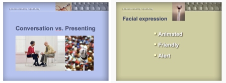

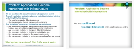
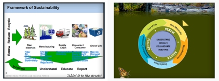
The two PowerPoint samples we created above show how color, imagery and text can have a successful impact when used well. The main points are clear and precise, and there is room for discussion and spontaneity.
All too often folks are simply intent on filling the pages with information …. lots of it. Just about everything they have to say goes into the PowerPoint document – heaven forbid something is left out. This leaves very little space for personal anecdotes (which aren’t the meat, but are the heart of any presentation) not to mention breathing room for all those poor little words – not to mention the audience needing a visit to the eye doctor following the presentation – not to mention room for a dash of artistic visual interest to keep viewers from snoozing.
Our three “before and after” samples below show how over-worked, complex slides can be simplified and designed more attractively for much greater clarity. Now, instead of feeling bombarded with data, the audience can more easily comprehend the general message – and the speaker has a focused reference point from which to present. (“before’s” are on left, “after’s” on the right)

When preparing your PowerPoint presentation, please try to remember that PowerPoint is not the presenter. You are the presenter. PowerPoint is the tool.
Assuming the intention is for your presentation to be well-received, it’s important to do more than pick a template, plunk down some text and add a bunch of special effects. Believe it or not, even given the creative limitations of the program, there is an art form to creating an effective PowerPoint presentation, and it can make a huge difference it’s received.
For professional help with the look and content of your presentation, or the skills to present it, there are professionals like me who make it their business to make you look good. If you’d rather make a stab at it yourself first, here are some tips for getting the most mileage from your PowerPoint presentation.
1. Cut it Out: Get rid of extraneous text, busy graphs and focus on your core content. Eliminate clutter. When in doubt, cut it out.
2. Minimalism, or Less Really is More: Limit the amount of information on each page. Condense sentences to as few words as possible. If you really, really, really feel that your audience needs more detailed written information, consider bringing along a separate hand-out, printed out ahead of time.
3. Distance Matters: Know the size of the room and how near or far viewers will be from the screen. Adjust your text size accordingly.
4. Color Blind?Avoid harsh or severely bright colors, except for minimal, special emphasis – and please don’t put pastel colors on a pastel background or dark colors on a dark background. And do find out if the room will be bright or dark. If it’s dark, don’t blind the audience with stark white backgrounds.
5. Let a Picture Tell the Story: Not only does this add visual interest, pictures can sometimes make your point better than words. Of course, the image has to make sense or you’ve lost the point.
6. Keep it Consistent: Unless you’re making a special point that screams for unadulterated creativity, keep fonts and text sizes consistent throughout, and work within one color scheme.
7. Break it Up: Add a humorous image; use a few different background colors; move pictures from left to right, top to bottom; keep it fresh and avoid repetition.
8. Don’t Go Crazy with Effects: A little can go a very long way. A lot can leave your audience dizzy. Don’t let special effects upstage your message.
9. Remember Those Hour-Long School Lectures? Of course not, you were writing notes to your friend about the game after class. Resist all temptation to simply read those PowerPoint bullet points aloud (assuming your audience can read). You are there to add value to what they can already see. So…
10. Know Your Stuff: Know your material and practice your presentation. Know and practice, practice and know. If you don’t know your stuff, it’ll show.
11. Like it: Would you enjoy being on the receiving end of your presentation? If you don’t find it interesting, your audience may very well feel the same way. But if you feel good about it, chances are that your audience will too.
12. Talk: Well of course you’re talking, but to avoid #9, share insights and experiences using your own words.
There is an art to presenting, and there is an art to making PowerPoint both dynamic and more productive. Just keep in mind, that while the PowerPoint screen is a great tool for initiating your talking points, it isn’t the talk.
Patricia Saxton, designer, illustrator, author, and owner of Saxton Studio
If you’d like Saxton Studio’s design help with your next presentation, we’d be happy to work our magic for you. To view a full design and illustration portfolio, visit www.saxtonstudio.com
For excellence in speech and communication coaching, visit www.professionallyspeaking.net
© Copyright Patricia Saxton. All rights reserved.