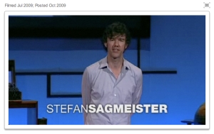
Stefan Sagmeister: The power of time off

Every seven years, designer Stefan Sagmeister closes his New York studio for a year-long sabbatical to refresh their creative outlook. He explains the often overlooked value of time off and shows the innovative projects inspired by his time in Bali.

His talk is insightful, enjoyable and worth watching – though for some reason the video wouldn’t embed, so here’s the link:

ssagmeister

Now, my thoughts:  In theory, it makes sense. But there’s that pesky element of economic feasibility and other practicalities / responsibilities.

I did take my own sabbatical at one time – 6 months in a beautiful place, devoted to pursuing other aspects of my creativity. It was a time when I felt I could do it, based on a relatively lesser amount of responsibility – ie;, no children yet. It was a fantastic gift, a treasured, productive time.

As downright appealing as it is, a sabbatical like this would be much more difficult to orchestrate now. And as such – for those who can’t up and go to Bali – it’s important to be able to find and nurture places of growth and inspiration right from where you are.

Share

0

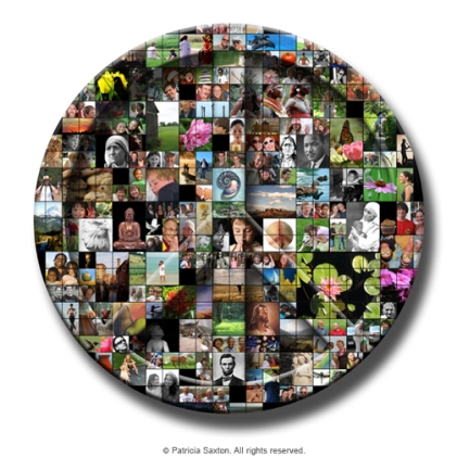
Week 5: "52 Weeks of Peace"

peace_pictures

Note: Weekly peace images are displayed (as a unit) under the “52 Weeks of Peace” tab above, where there is also a more detailed description of the series.

Share

2

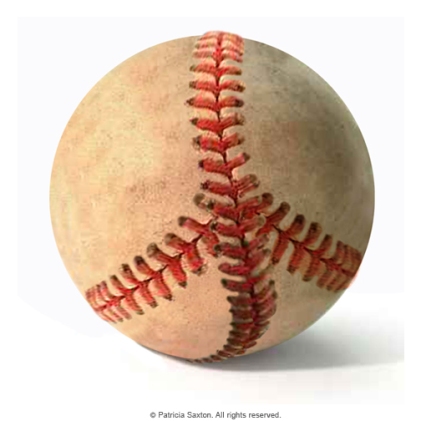
Week 4: "52 Weeks of Peace"

peace_baseball

Note: Weekly peace images are displayed (as a unit) under the “52 Weeks of Peace” tab above, where there is also a more detailed description of the series.

Share

2

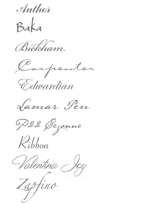
10 Nice Script Fonts

Generally speaking, I’ve always found italic fonts a bit frustrating … the fluid nature one expects from “script” doesn’t always translate well as type  – the letters carry too much “sameness”, which has a tendency to then smother the feeling of a natural script, losing vibrancy and becoming dully predictable. This is certainly why there’s been an onslaught of “handwritten” script fonts in recent years – but I’ll get into those later.

For the time being, there remains a time and place for a nice, classic italic font, and while none of these made my  previous “10 Indispendable Fonts” list, they’re definitely worthy of note.

fontsamples_script

Share

1

Week 3: "52 Weeks of Peace"

peace_blackswirls

peace_whiteswirls

Note: Weekly peace images are displayed (as a unit) under the “52 Weeks of Peace” tab above, where there is also a more detailed description of the series.

Share

0

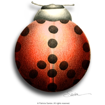
Week 2: "52 Weeks of Peace"

Week 2: September 7  .  2009

peace_ladybug

Note: Weekly peace images are also displayed (as a unit) under the “52 Weeks of Peace” tab above, where there is also a more detailed description of the series.

Share

0

Page Readers talks with Patricia Saxton, author of “A Book of Fairies”

Here is a link to a recent interview given by host Nanci Arvizu of PageReaders.

Nanci is a delight, by the way – and she provides a genuinely positive service by helping to promote authors via her blog talk radio program. I was pleased to take part in our talk about books, art & design.

Click here: Page Readers talks with Patricia Saxton, author of “A Book of Fairies”

Share

0

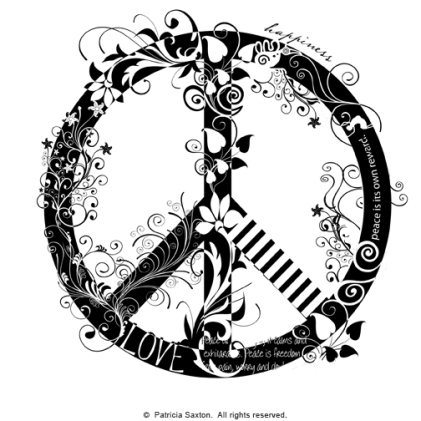
"52 Weeks of Peace"

September 1 .  2009

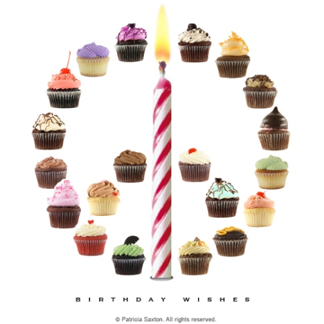
Today is my birthday and I’m making my wishes.  Lots of them!  But among them is a wish that I’m going to explore and illustrate all year long in the form of a personal project, which I’m calling “52 Weeks of Peace”.

Now when I use the word peace, I mean it in a broad, sweeping way .. from the kind of peace that permeates an individual’s soul with a sense of well-being, with love and with joy – to the kind that can move whole groups of humanity into harmony.

Peace is generally considered a quiet thing, like a particularly beautiful sunset – but it can also be loud, like a chorus that lets go and sings boldly to high heaven. Peace can be a meditative, sit-on-the-mountaintop feeling, or the heady, centering adrenaline rush that comes after good, hard athletics. Peace can be a sleeping cat, curled up in a sunny spot, the picture of complete contentment. Peace can be the joyful peels of a child’s laughter. Peace can be a bubbling creek, a cup of tea, the mending of a friendship – or the letting go. It can be found in a kind word, a job well done, a stranger’s smile. Peace graces a spring garden, and kicks up its heels in a snowstorm or a boisterous, pounding waterfall.

Peace doesn’t fight; it calms and exhilarates. Peace is freedom from pain, worry and doubt. Peace reaches over and takes your hand; it delights your heart. Peace feels right from our head to our toes.

And my wish is not just for me, but for you – and for all of us – to see more and experience more of whatever brings more peace, more often, into our lives. (This is one instance where less is not more!)

I’m also going to have a little fun with the designs I’ll be sharing over the next year, and I’ll hope some of that rubs off on whoever may be checking in.  And in the end there should be a wide range of feeling and unexpected expression represented.

Some of you may be familiar with my pencil point series. For those of you who aren’t, the pencil point is my logo, and over several years I’ve celebrated that wonderful, marvelous little tool by creating nearly 100 design variations. If you’ve not seen them, and if you’re interested, you can see some of them here: saxtonstudio.com.

I’ll be taking a similar approach with this venture – except there will be a lot more pieces in a much shorter time period.  And instead of a pencil point, I’ll be using the universal peace symbol. Each week I’ll post a new creation.

So, without further ado, here is the first – in honor of the first day of September and the first week of “52 Weeks of Peace”. (After this first one, I’ll post them under the “peace” tab above.)

Peace to all  – enjoy!

peace_cupcakes.c

Share

3

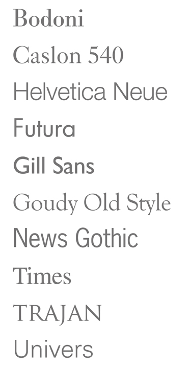
10 Indispensable Fonts

There are literally thousands upon thousands of typefaces, but there are certain classics that will carry with integrity through entire design careers. Although it was somewhat hard to choose. these are the 10 timeless fonts I personally couldn’t do without:

fontsamples_classic

Share

0

Apples and Oranges

In 100 BC, Latin writer Pubilius Syrus is quoted as saying “You Should Go To A Pear Tree For Pears, Not To An Elm.”

I’ve always thought that made perfect, logical sense.

In a similar vein, if you want an apple, you’d go to an apple tree, and to an orange tree for an orange, right?  Or would you ask the apple to behave like an orange, because you’re really hungry for both…
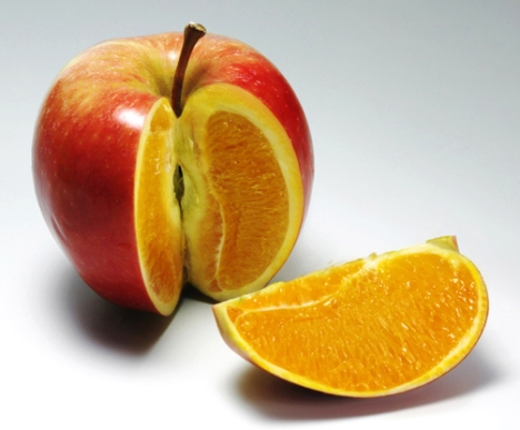
apple-orange

Lately I’ve become increasingly aware of this very kind of attitude (wanting an apple to behave like an orange) infiltrating the professional design field. It’s the idea that creative excellence resides side by side with mathematical expertise and technological wizardry.

It’s not exactly a right brain/left brain comparison, as there are many creatives who are very technologically adept, who can and do operate with both sides of the brain. It’s more the apparent expectation of both aspects to excel with equal brilliance within one individual. And it’s demanding that individuals be not only jacks-of-all-trades, but masters-of-all. (Oh, and by the way, for bottom dollar – an unfortunate side effect that’s been showing up across many professions in the current economic climate.)

It’s a disturbing trend. Because, generally speaking, in the end the expectations don’t seem sustainable, with results that may be less than desirable unless overall quality is of little consequence.

Some may think this expectation just a natural adaptation to changing times, as in fact designers have typically worn many hats. Conceptualist, craftsman, communicator, consultant, coordinator, business negotiator, marketer, developer and keeper of budgets, manager, director, teacher; some of us have multi-medium talents – and we know how to use the tools to make it all happen.

And it’s also true that every profession faces unique challenges almost continually as life, technology and opportunity rapidly evolve. So we all must grow, learn and evolve right along, perhaps even re-invent, which might frustrate some and invigorate others, but is true, nonetheless.

Yet I still feel there is a point of departure in the orchard.

Ask most programmers how they stack up beside designers and vice-versa. They know enough about each other to work effectively together, but aren’t necessarily sufficiently skilled in both to be considered masters of each realm. It’s apples and oranges all over again. Both nutritious fruits, but not derived from the same seed.

If you want an apple, the apple tree is your best bet.

Share

0