Yes, I Love My Planet

saxton_unacceptable

I can see it now: legislation requiring the use of specific fonts. Reason: to save our planet. Repercussions of misuse: a.) fines and b.) scorn.

Why would I have such a thought? Two new articles have popped into my inbox, both having to do with sustainable fonts. Sustainable fonts. (One needs to see it twice to realize it’s not a typo.) The videos below show how changing fonts can save our planet, and how changing fonts can save us money. Interesting. Ish.

Yes, I love my planet, and yes, we should take care of Mother Earth. But I also love some of life’s cool benefits like art and design. Visual delight. Surprise. Beauty. What kind of world would it be if our creative decisions were delegated by font usage? I cringe at the thought. But I’m letting my imagination get the better of me; it won’t happen. (Right?)

In any event, here you go. So that you, too, can be in the know.

1. Change fonts, save the planet. Very hip. But. Hmmm. How about we just print less, waste less?

2. Change fonts, save money. This kid is very bright, there’s no doubt about it. Of course, there are thousands of ways the government could save money (don’t get me started).

Personally, I’ll continue to do my part by not littering, not being wasteful, turning off the lights when leaving a room, tending my garden, driving efficiently, printing less. Etc. But, yea, don’t be judging my Planet Love by how fat or skinny my font choices may be. One has to draw the line somewhere, and creative expression is one of the last great bastions of freedom.

0

Chalk as Design & Typography Tool = Great Stuff

Bright young talent just shines in Dana Tanamachi.

I completely adore what’s she doing ~ by hand, with a practically perfect mixture of head and heart ~ and luckily for her, so do some big name clients. It’s very, very cool. And in this day and age of technology, it’s wonderfully refreshing.

Enjoy the video ~ enjoy the images!

DT TIME Cover

ND-Pinot-Noir-Full

isn’t this superb? my favorite!

You can see some great time-lapsed videos of the artist at work, here: http://tanamachistudio.com/time-lapse/

0

Nifty Wall Art / Signage / Decor / Whatever

If you’ve got the space, use it well!

Love these great big signs in NYC’s Soho district Starbucks. Super high ceilings and giant windows make it spacious, the organic-feel signs make it cozy, the messaging makes it fun. Nice touch!

0

12 Handwriting Fonts

Along with grungy typefaces, “handwriting” fonts are popular these days. They can add just the right spot of personality ~ but they can just as quickly lose their “natural” appeal when over applied. Much like the “12 cool fonts” I posted a while back, handwriting fonts should be used with discretion.

By the way, free downloadable handwritten and grungy fonts are sprouting like weeds, and as we all know, some weeds are just plants nobody else wants. Doesn’t mean they’re bad  ~ in fact, some of them are terrific! Three places I’ve had some luck are dafont.comfontspace.com and urbanfonts.com. Thanks and “nice job!” to those type designers sharing their works.

A word of caution: “Free” doesn’t guarantee they’ll work, and can sometimes bring trouble, too. Not all fonts get along with both Mac and PC, so check compatibility before you download. And, as with any freeware, if your computer starts to squeal shortly after loading something new, it’s wise to get rid of that latest freebie sooner than later.

6

A Plethora of P's / #1: Punch

My newest pet project coincides with a most auspicious day: 1-1-11. (I like that!)

And, as happens every New Year, I feel a surge of renewed hope while the words “THIS is gonna be a great year!” ring in my ears.

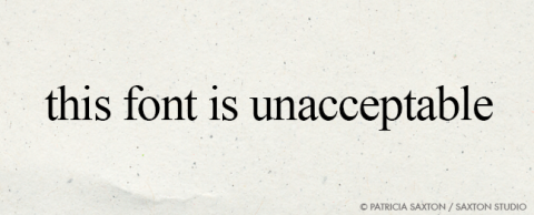
This year though, with the intention to manifest more of that “something great”, to avoid disillusionment and an almost inevitable sense of “okay, maybe next year”… I’m going to work with one of my favorite subjects: the power of thought. It’ll be an ongoing journey of sorts, shared through words and pictures.

………………

The trick with “thought” is deciphering which ones are worthy. Of the millions that zip in and around our minds every day ~ consciously and unconsciously ~ how can we let the cream rise to the top? You could call it “thought training”.

Of course there are lots of ways to “quiet the mind”, and they are invaluable tools. Meditation, yoga, strenuous physical activity. Music, dance and art. Acts of kindness and giving. All highly recommended, and sometimes necessary. But that’s not my focus here…   This project is about focusing on what you think. Because what you think engages you with life’s outcomes more than many people realize.

Thoughts can create a better you or a more troubled you. Thoughts affect those around you. Thoughts precede every action. Thought is energy, and it’s potent.

Though we can’t see them, thought forms are as real, possibly more real, than the keyboard I’m typing on. What you think can have enormous power.

As a kid, I was often told to “think positive thoughts”. At some point, that advice seemed too simplistic. In youthful fashion I’d think, “It’s not that easy. They don’t know what I’m going through. You can’t just do that. You can’t just ‘think positively’ and expect everything to become sunshine, lollipops and rainbows”.

But over time I discovered…  that in a way it really IS that simple. You can choose positive thoughts over negative ones. And it does make a difference. A simple twist of thought can change the direction of the moment, the day, the month, the year…  and they are yours to direct!

This is not to say a negative thought should be hunted down and executed, or that having them is “bad”. Remember all those millions of thoughts? They’re not all going to be feel-good, Pollyanna-like thoughts. But the beauty is that you can change them. You can learn from them. You can release them. You can use them to get to a better place, even if it’s just one notch up. It‘s worth the effort ~ and I personally believe most of us have only scratched the surface of the potential power held within our thought patterns.

It’s a big concept yet a simple one, and it’s sometimes easy, sometimes hard to train our thinking. And unless one lives on a deserted island, it’s not just our own thoughts; other peoples’ thoughts can filter in and influence our psyche. When you pay attention, the impact of *thought* is undeniable.

I don’t mean a belabored, obsessive kind of thinking, but more the seed of an idea, the whisper of a deed, the affirmation of beliefs. And whether arriving through your conscious or subconscious mind, tending reaps rewards.

I feel blessed for the positive teachings I was shown in childhood. None of us get through life unscathed though, and those lessons became a springboard for learning how to maneuver some of life’s more intense struggles. They’ve helped me weather many a storm; sometimes when all else failed.

So, this idea for creating a series about positive thinking, expressed through my love of words, art and design, came knocking at my mind’s door. I answered, and here we are.

To make it fun, I decided to use my propensity for “P” words (which may turn out to be a practice run for an entire alphabet, also formed in my mind). Besides, it follows a natural pattern … Patricia, Pencil Points, Peace, P’s ….

So, without further preamble, let’s proceed towards proactively punctuating life with the plausible, powerful possibilities of positive thought presented through a plethora of “P’s”.  :  )

2

Do Typefaces Really Matter? (silly question…)

Typefaces

Here’s a confession: I belong to a Facebook group called “Correct Spelling, Punctuation and Apostrophe Use.”  It pleases my inner nerd. Yes, indeed it does. Plus, when you grow up with a literary parent, the whole kit and caboodle of spelling and grammar becomes second nature … so if it’s used wrong, it produces a screeching nails-on-chalkboard feeling. A travesty. A stain.

But I digress.

So … I happened to make a brief detour over to Facebook to check on something or other, and there, to my delight, was a pretty cool article about the impact of typefaces posted by the “Correct Spelling, Punctuation and Apostrophe Use” folks. It’s actually a BBC News Magazine article, and I don’t think it’s okay for me to re-post it, so I’m just going to give you the link. This is only for those of you interested in type and fonts… otherwise you may not care, and can just admire the pretty picture above.

(I sure hope I didn’t make any grammatical errors in this post!)

Do Typefaces Really Matter?

0

Book Covers: Center Stage

Finding this site was “kid in a candy store” material.

First I stumbled onto their Books & Logos page … and knew I’d hit gold when the intro sentence read: “Books and logos. The combination thereof is almost enough to send me into a fit.”

Anyone who’s a book lover will appreciate at least some of this, designers will appreciate the rest, and for those of us who are both, it’s drool-worthy – an inspired virtual thrill, a well-presented and joyful clustering of literary visual candy.

(click on image to go to Book Cover Archive site)

0

What "type" are you?

Just a little something fun – and pretty darn cool – from Pentagram Design. A savvy little piece as well.  So, if you want to know your personal font, take Pentagram’s online test to find out … What type are you?

0

Exquisite!… Type, Art & Design

Thanks to a spontaneous visit and a link on the I Love Typography blog, I stumbled upon one of the most exciting and inspiring pieces of design I’ve seen in a long time. It’s absolutely fantastic. And entirely fun.

According to the “One Hundred” website (celebrating 100 years of Australia’s State Library of New South Wales), a Design Agency by the name of Frost collaborated with and utilized the treasures of the collections of the State Library of New South Wales and the Mitchell Library to create an entire alphabet. It’s nothing short of exquisite.

The One Hundred site itself is impressive too, with letters A-H explained in glorious, color detail, showing the elaborate art, history and sheer cleverness that lovingly went into each creation. This is the kind of thing that given the chance I would drool over with eagerly rolled-up sleeves. It’s a pure slice of design heaven, and marvelously executed.

Enough teasing. Here’s a look at the art. (I admit I wish the whole alphabet were available ~ but to see more, it looks like one might have to go to Sydney.)

0

12 Cool Fonts

In earlier posts I’ve shared “10 indispensable fonts” and “10 nice script fonts”. But now and then you need to add a little “edge” to your content. A sprinkle of sassiness, a dash of funk.

I think of the following 12 fonts as “specialty fonts” because you certainly don’t want to use them to typeset whole documents, but as accents, to insert some typographical “color” and make a special statement. Of course the grungier they are, the less they should be used for long passages. But in measured doses, they definitely add a coolness you don’t get with traditional fonts …and they’re so much fun you’ll find yourself determined to find a perfect place to fit them.

fontsamples.special

Share

1