New & Improved Mermaid Video Debut

Sorry to post this again, but it must be done!

I wasn’t satisfied with the sound quality on my Magnetic Mermaid Toy video. The music itself was excellent, the problem came with the translation inside the video editing software.

Thanks to the collaboration with musician and master whistler (& fellow perfectionist!) David Santucci, a new track was prepared that worked MUCH better in the editing process. Our ears are much more pleased ~ and we think yours will be too. Please enjoy!

3

A Conspiracy of Mermaids, Art, Music and a Toy

If you recall the “sneak peeks” I posted a while back, your wait is over. Here’s a special something I’ve been conjuring up for the holidays!

For those interested, this video was created with hand-drawings, animated in PowerPoint. I wanted to push the boundaries of what most people think PowerPoint can and can’t do. In that sense alone, I feel a mission was accomplished. But I also wanted to have some fun with it…. which I did!

The vision for the video came to me after it was clear that no one wanted their children to be filmed in a piece that would be shown on YouTube. That was disappointing, since kids really engage with this game and it would have been great to capture their enthusiasm. But, as someone, somewhere, once said, “inside every cloud is a silver lining”. This one came in the form of a happy idea.

And so, this is what happened when an idea + illustrations + PowerPoint + some good music became a video!

Special thanks to composer/musician David Santucci for lending his remarkable talent to this piece. A gifted artist and overall nice guy whose work will soon be available in high-def quality on iTunes; it was a delightful collaboration.

Now I hope you’ll go on over to Amazon and buy the Magnetic Mermaid Dress-Up toy and make some kids very happy this holiday! :  )

5

Fun, REALLY Fun, Pumpkins

As if ghouls, goblins and wads of candy weren’t enough, Halloween just got a whole lot more fun.

This is the 15th year of an annual pumpkin carving contest held by Duarte Design, and boy are these carvings great!  What a treat. You can even vote for your favorite. (but hurry, voting ends the afternoon of 10/29.)

These are so much fun, I’m thinking I might start my own contest next year. So, you’ve been fairly warned, with plenty of time to think about what you’d like to do ~ and here’s some fantastic inspiration to whet your creative spirits!

1

When It's Wrong to Redesign a Brand

Much time, and probably a lot more money, was spent making recent logo changes on some big company re-branding efforts.

EXHIBIT A:  Tetley Tea.  Tom’s of Maine.  The GAP. (old on left, new on right)

The question I ask: “Why”? Have sales been down? Was company morale low? Were they experiencing a scandalous attack? Were decision-making-someones simply bored?

Now, don’t get me wrong ~ I’m all about  presentation and the power of “look and feel”, and if any one of these companies had asked me to give them a redesign, I would have gladly obliged. But – not to sound immodest, as I believe most designers given the opportunity would say the same thing– I would have handled it quite differently, and I’d like to think, more effectively.

One lesson I would apply: “if it ain’t broke, don’t fix it”. This is the part of “Branding 101” known as consumer recognition.

Brand Connections …

Big Brands elicit a kind of personal connection – for better or worse, we make mental, even emotional, associations with how they look. And that association comes from recognition, which stems from the basic concept of consistency.

For high-profile brands, the success derived from established logo/packaging recognition can seriously outweigh whether or not a look is amazing.

As shown in “Exhibit A”, Tetley’s old package was far from hip or upscale ~ but, as a tea drinker who personally loves the smooth, full-bodied flavor of Tetley’s British Blend, I can vouch that the old package says “rich flavor” much more than the new package, which (I truly hate to say) looks more like packaging for a feminine product.

Tom’s, another brand I enjoy, previously used friendly, round shaped bottles and a graphic treatment that worked well with its natural product, whereas the new look reminds me of a bad Web 2.0 design in an oddly shaped container.

As for GAP, the logo may not have been exciting, but it was solid with really nothing wrong.

Doing it right….

For companies/products with already high recognition, rather than reinvent the wheel, redesigns would best be served by tweaking and updating.

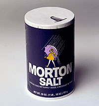
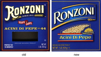
EXHIBIT B:  Morton Salt.  Ronzoni.

Morton and Ronzoni made changes with the times, without shocking overhauls. They’ve retained their original intent and managed to successfully alter their look by doing it gradually, with key elements maintained and integrity in tact.

The message being, don’t send your customers on a wild goose chase trying to find your *new and improved* packaging, OR throw them into a tizzy because their familiar, trusted product got a makeover and a new doo, like a friend who’s trying to be, or is turning into, someone else.

Beyond the fact that many people don’t like change, there’s something to be said for the comfort of familiarity in a world that moves too fast and holds many a slick deal.

On the other hand, improvements can be refreshing. Kind of like when you’re loathe to part with an old, favorite shetland sweater ~ but that nice new cashmere in a similar style and color might be hard to resist.

Refreshing is good. But different and unfamiliar is not a smart promotional move. Why discombobulate, and possibly alienate, your audience? For what purpose?

To redesign or not to redesign?

Okay, so maybe the Tetley, Tom’s and GAP folks had good reason for the change. Let’s go ahead and assume the most practical reason: lagging sales or market competition.

But let’s also put it out there that the cause of lagging sales or struggle with market competition just might have more to do with things much less glamorous than a logo or fancy packaging ~ things like business plans and marketing structure, advertising strategies or customer awareness issues.

So that usually, and particularly in the case of well-known companies/products, changing the logo is not the remedy.

(Worth noting at this point … if you’re a start-up company, or your business has been around but floundering in a sea of mediocrity, by all means, run to a great designer. Boosting the look of your branding may be just what’s needed to boost momentum and shift the energy.)

Well, what’s done is done (except in the case of the GAP, who apparently quickly reverted to their original logo after public outcry! ) … but the questions remain:

1. Is it worth the shake-up to completely re-brand a good thing? (I think not.)

2. Will re-branding a good thing turn the consumer away? (Again, I think not… although you may whine, as I have. But if you love Tetley tea, you won’t stop buying it because you don’t like the new package.)

3. In the end, was it worth the time and money to do all that dramatic re-doing?  (Right … I think not.)

4. Could that time and money have been more wisely used? (Most definitely, yes.)

Conclusion: Sometimes it’s wrong to redeisgn a brand. I rest my case.

1

Great Book Covers: Part I

It’s true: we do judge books by their covers.

This is one of my new favorites. For more scrumptious designs, check out the Book Cover Archive site. It’s filled with yummy, inspiring finds that will thrill designers and possibly even inspire more people to pick up a book and read. :  )

Share

0

Lesson in Leadership … Derek Sivers: How to start a movement

This is not only entertaining, but smart and quick and worth a watch!

Derek Sivers is best known as the founder of CD Baby. A professional musician since 1987, he started CD Baby by accident in 1998 when he was selling his own CD on his website, and friends asked if he could sell theirs, too. CD Baby was the largest seller of independent music on the web, with over $100M in sales for over 150,000 musician clients.

In 2008, Sivers sold CD Baby to focus on his new ventures to benefit musicians, including his new company, MuckWork, where teams of efficient assistants help musicians do their “uncreative dirty work.”

“Derek Sivers is changing the way music is bought and sold. A musicians’ savior. One of the last music-business folk heroes.”        ~  Esquire

0

Press Coverage for March 25th Art Opening of "The Many Faces of Eve"

A Women’s Intuition in Perth Amboy

By Ralph J. Bellantoni
Correspondent

The Perth Amboy Gallery Center for the Arts celebrates Women’s History Month with the group exhibit “The Many Faces of Eve.” The show opened March 8 and the center will host a reception from 5:30 to 8 p.m. on Thursday, March 25.

The show presents work by Jamie Allen, Patricia Banks, Harriet FeBland, Gracelyn Molina, Amy Ortiz, Patricia Saxton, Adrienne Wheeler and curator Laura Cuevas. The artwork addresses issues of morality, sexuality, family, spirituality and self and social identity in an expansive diversity of styles and media. The light of the primal Eve refracts in resplendent display through the particular energy, talent and resourcefulness of each accomplished artist.

Cuevas’ own paintings and oil pastels straddle the abstract and figurative in her
depictions of bodies, fruits and foliages melting and blurring into sensual fields of color and texture. FeBland has been dubbed “the poet of geometry” because of her mathematically precise paintings, transformed through the intuitive prism of her creative imagination. Ortiz explores themes of the intertwined connection of women and nature through surreal compositions.

Wheeler’s work arises from ancestral and spiritual practices drawn from the Bakongo traditions of the Atlantic coast of Africa. She creates “Nkisi” (sacred medicine) — consisting of carefully assembled materials bundled into fetishes of spiritual potency. She created her installation in response to the recent earthquake that devastated Haiti.

In this composition, Wheeler’s Nkisi represent bundles of bodies, belongings, medicines, airlifted supplies and hope. She reminds people that Haiti has actually been in a state of devastation for centuries. She hopes her work can act as a catalyst for change — a plea for vigilance in bringing an end to the vicious cycles of global human suffering.

Saxton has been drawing and painting since early childhood. She has run her Saxton Illustration & Design firm for more than 20 years, and is author and illustrator of the children’s stories “A Book of Fairies’‘ and “The Book of Mermaids.”

“Somewhere around the age of 3, I picked up a pencil and never quite put it back down,” said the artist.

Saxton merges image and text, the real and imagined, in her fine art works in pen and ink, pencil and oils. She accentuates positives over negatives and seeks the nourishment of mind and soul through her art.

“I am particularly delighted to be a part of this unique exhibition and its diverse
collection of women artists honoring the feminine and the “many faces of Eve,”’ said Saxton.

THE MANY FACES OF EVE: GROUP EXHIBIT CELEBRATING WOMEN’S HISTORY MONTH

1 to 6 p.m.
Mondays through Saturdays
through April 30
Opening reception from 5:30 to
8 p.m Thursday, March 25
Perth Amboy Gallery Center for the Arts
399 Reade St., Perth Amboy
Free
732-826-8083 www.perthamboygallery.org

Share

0

What "type" are you?

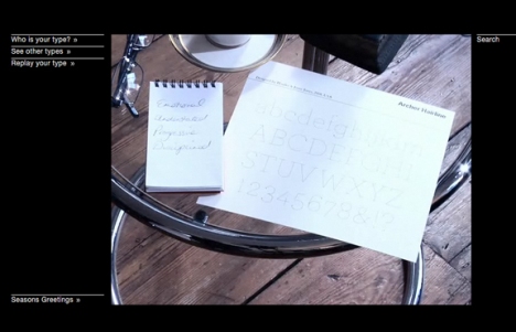
Just a little something fun – and pretty darn cool – from Pentagram Design. A savvy little piece as well.  So, if you want to know your personal font, take Pentagram’s online test to find out … What type are you?

0

A Few Words About The Self-Publishing Buzz

There’s lots of talk out there about the pros and cons of traditional vs. self-publishing. And as long as people are still reading actual books (as opposed reading everything digitally), a conversation on “how to publish” rages on.

It’s a hot topic, and valid for anyone interested in seeing their work in book form. Having published both ways, I’m often asked for my opinion – so thought I’d take the time to elaborate a bit.

Traditional publishing, in my opinion, still wins out in terms of quality, marketing and yes, credibility. For the majority of people, however, it’s very hard to find one. Partly due to the sheer volume of proposals they receive, the big houses won’t so much as blink at your work unless it comes from a respected agent. Finding an agent can be as hard as finding a publisher. And while all this doesn’t make it impossible, there’s no doubt it’s a challenge. Which is why so many people want to self-publish …  and that is a viable path– just be aware that it’s not necessarily “an easy fix” or trouble-free.

Self-Publishing “Pros”:

Probably the biggest “plus” in the self-publishing world is its having opened up a whole new realm of possibility for thousands of people frustrated by the daunting task of finding a publisher. What seemed an insurmountable hurdle is now a skip and a jump away. Instead of wallpapering one’s bathroom with rejection letters, one can hold their very own book in their very own hands and feel an enormous sense of accomplishment.

Self-publishing has also provided an alternative to its older cousin, “vanity publishing”, where books are published entirely at the author’s expense.

That said, it’s important to note that with self-publishing (also called “On-Demand” publishing) the author still puts up their own money – the key difference being that the outlay is usually significantly higher with a vanity press. Vanity presses are also known to seduce would-be authors with wildly compelling, beautifully written, very thoughtful, very flattering commentary about the author’s work which may or may not be true, but can certainly be enticing.

Another positive that several people, myself included, have experienced, is that a self-published piece has the potential to bring your work to the attention of a traditional publisher who can then take the reigns and produce a higher quality product.

Here’s another: Self-publishing is perfect for non-fiction or business writing. A growing number of professionals seem to feel a pressing need to publish something. Having a book or two on their resume somehow makes them more credible. (Perhaps driven by the fact that because self-publishing makes publishing so accessible, “everybody’s doing it” – so that those who haven’t feel that they should.) Regardless, as these kinds of books aren’t necessarily geared towards heavy commercial sale, self-publishing is an excellent fit.

So, yes, self-publishing allows folks to publish their own book using their own brilliant ideas, their own words, their own illustrations, and their own gumption to either work or not work the marketplace.

Self-Publishing “Cons”:

Self-publishing allows folks to publish their own book using their own brilliant ideas, their own words, their own illustrations, and their own gumption to either work or not work the marketplace. Yep, this belongs in both the pro and the con column.

The same “plus” that opens doors of possibility, opens wide enough for all the good, the bad and the ugly. There isn’t a great deal of quality control in place, which means any Tom, Dick or Jane can publish a book that’s basically awful. Blood, sweat, tears and all, your own book might actually be awful, but without any checks and balances in place (unless you pay extra for that), you might not know it.  Your mother will still love it. The ego can be very blind.

Of course, if you’re not concerned about what the public thinks, and you really just want to see your book in print, none of the above matters. That can be just as fulfilling, and that’s perfectly okay. Just as long as you know that’s what it’s about.

If you’re interested in selling your book, be prepared, at least in the current marketplace, for your book to be priced too high. Although self-publishing allows you to print very few at a time, making it relatively easy on your wallet, the price per copy goes up, up, up.

Your book will not find its way to a Barnes & Noble near you. Amazon, yes. Physical bookstores, no. Partly because the cost makes it prohibitive, partly because there’s a system in place. Amazon may be all you need or want. Just be aware.

There’s no real marketing machine behind you. You’re it. Some people find this motivating and learn to be great at tooting their own horn. Some hire marketing guru’s. People find all kinds of creative ways to take their book to market, and selling venues definitely aren’t limited to “a bookstore”.  But it’s not a road made easy just by having a book in your hand, good bad OR ugly.

One caveat: whether self-published or traditionally published, some responsibility for marketing will fall on the author. There’s a great myth that being traditionally published alleviates the need for an author to be involved in promoting their book. Perhaps now more than ever, the author will play a major marketing role. Unless you’re Madonna.

Advice:

If you’re not a highly experienced writer and you think you want to go the self-publishing route, you should probably consider joining a writer’s group, where you can hear unbiased critiques of your work. Be willing to accept brutal honesty … although it’s fair to say that most people there will have compassion and therefore not be cruel – after all, they’re in the same boat. You might also find the camaraderie inspiring, as well as enjoy applauding others’ successes along the way.

If possible, hire an editor who’s smart as a whip and unafraid to tell you the truth. (hint: a family member is not the best choice.)

And whether you can hire an editor or not, be willing and prepared to edit like crazy and then do it again – and again – so that when you do go to press, you’re confident that it’s as close to the very best it can be. Once it’s in print, there’s no going back.

Share

2

12 Cool Fonts

In earlier posts I’ve shared “10 indispensable fonts” and “10 nice script fonts”. But now and then you need to add a little “edge” to your content. A sprinkle of sassiness, a dash of funk.

I think of the following 12 fonts as “specialty fonts” because you certainly don’t want to use them to typeset whole documents, but as accents, to insert some typographical “color” and make a special statement. Of course the grungier they are, the less they should be used for long passages. But in measured doses, they definitely add a coolness you don’t get with traditional fonts …and they’re so much fun you’ll find yourself determined to find a perfect place to fit them.

fontsamples.special

Share

1