A Plethora Of P's / #8: "Passion"

Passion is an uncontainable spark; it’s the fire in your chest, in your belly, or rising from the soles of your feet … that expands up, around and through, spilling out over the edges of reason. It’s unbridled enthusiasm. It’s love. It’s hate. It’s wonder. It’s joy. It’s feeling alive.

Passion is a gift from the Gods that makes your spirit laugh out loud. It writes symphonies, bakes cakes, throws plates. It discovers civilizations, turns ideas electric, moves us to tears, heals hearts, builds dreams.

Happy Valentine’s Day everyone! ~ let your passions shine.


3

Googling Jules Verne

Every once in a while Google has some fun with its logo treatment. Today’s marine scene caught my eye (were there Mermaids swimming inside the double “o”‘s?), so I did a little deeper-sea exploration.

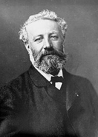
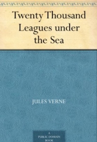
The design ~ which is interactive, by the way (the “joystick” lets you move the sea and its creatures around … such power!) ~ honors the birthday of prolific French author Jules Verne (February 8, 1828 – March 24, 1905). Verne is best known for “Twenty Thousand Leagues Under the Sea (1870), A Journey to the Center of the Earth (1864), and Around the World in Eighty Days (1873).

A click on their logo takes you to a Google search page all about Jules Verne. A very clever way to say Happy Birthday to one of the literary greats.

0

A Plethora of P's / #7: "Patience"

“Rivers know this: there is no hurry. We shall get there some day.” ~ Winnie the Pooh

Time. The great illusionist. Ticks slowly when we want something to happen; the fast-forward button gets pressed when we’ve got someplace to be.

Time seems to move faster and faster; like it’s in a race. (The great rat-race?) The world’s in such a hurry.

I grew up hearing that “Patience is a virtue”, and I think that’s true. But it’s more than a display of fine character. Exercising patience allows things to unfold more gracefully, in their own right time. And it’s a challenge!

Patience is about what we can tolerate before blowing a personal fuse. It tests us in many forms ~ patience towards self, patience towards others, towards listening, towards learning, towards a menial task, towards traffic jams, towards time …  Wouldn’t it feel good if we could toss the accompanying irritation out the window? Have it vanish in thin air and just “go with the flow”? Easier said than done ~ but possible, if we re-calibrate our thoughts.

We come into this world packaged with personality intact, “strengths and weaknesses” already flowing through our veins, inborn traits determining whether we have more or less of this or that characteristic.

That doesn’t mean, though, that someone born with an impatient nature can’t develop greater degrees of patience ~ not necessarily reaching levels of saintliness, but we are ever-growing, learning, changing beings who can and do evolve and enhance our existence by stretching, expanding and nurturing the various aspects of our inherent nature. Patience is one well worth the effort. Think about it …

Feeling impatient can be such a maddening, aggravating, blood-pressure-rising experience, the solution might seem to be to hurry through it, be done with it. But we all know that doesn’t work …  it doesn’t make the traffic light turn green, it doesn’t make the baby stop crying, it doesn’t make the pot boil, it doesn’t make the flower grow, it doesn’t erase a mistake you might have made; it only lets you experience impatience.

So maybe we can’t make grapes ripen faster on the vine… and if we harvest them too soon, we end up with sour grapes. (And I’m pretty sure that creating sour grapes isn’t on anyone’s bucket list.)

But we can, instead, think patient anticipation. We can shift our focus to eagerness. Patience then is not a passive burden but steps that light up the path.

A wonderful thing happens when you take a few deep breaths and mindfully infuse patience: resistance backs off.  You can be present. You can even begin to enjoy and participate in the unfolding.

Maybe we should heed the line from the old Simon & Garfunkel song, “slow down, you move too fast,  you got to make the morning last …”. Because when we don’t, we don’t feel so “groovy”.

The river doesn’t ask “are we there yet?”. Like the river, we’ll all get where we’re going.


2

A Season of Pinks

It’s the month for pink, the color of love, which got me thinking about color.

Which also got me thinking ~ I wish someone would give me the job of naming the new colors that come out each year. You know, all the new lipsticks shades, crayons and interior paint chips. Really, who gets to do that?

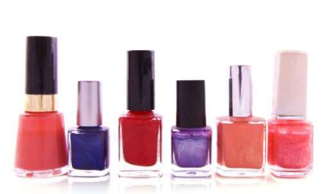
Does the fashion-company-president’s daughter sit around a kitchen table with friends and a couple glasses of wine and decide what trendy words will be uttered when asking for the latest pink nail gloss? Or do they hire a design team to consult with psychologists to scientifically determine what will spark the consumer’s emotionally-driven buying fancy this year?

And who decides ~ excuse me, “forecasts” ~ which colors will be “in” for a coming season. Of course all those colors need new names too. Really, I’d be willing to do that. You could twist my arm, and pay me instead of an entire design team/psychologist duo. But, what if it’s the company president’s daughter and her friends… forgot about that possibility. Can’t argue that one, unless of course, they lack imagination.

Maybe I could ask around at Sherwin Williams, or ask someone like my friend Marty who worked in the cosmetics industry for umpteen years. But I’d rather wonder…

Who comes up with Mermaid’s Tail Green, or Ol’ Swimmin’ Hole Green, Old Pickup Blue, or Blizzard Blue, Kinky Pink, Ballet-Slipper Pink, Curious Yellow (although I kinda like that one… as well as Unmellow Yellow)? Then there’s Really Red Red (particularly clever), Violet Groove, or I’m Not Really a Waitress (yes, an apparently fab-u-lously shimmery nail polish).

Seriously, I could do this.

And from Paris we now have spring’s 2011 fashion color-combo trends: Archaic Garden, Underwater Variation, Tropical Dramaturgy (huh?), Enchanted Picnic, Shadowy Shores.

Be still my heart. What would I wear if not for these tips?

I shouldn’t be sarcastic I guess, it just seems so … presumptuous? pedantic? pedestrian? provincial? (just seeing if you’re still reading, and catching the P words…)  In all honesty, while “unnecessary”, some of the names are plain fun, and surely we could all use a bit more of that these days.

Plus, you see, we graphic designers get Pantone inks– Pantone 133, Pantone 345, Warm Gray 9. Glorious colors, but with useful, practical, “un-fun” names. (Which is for good reason, don’t get me wrong. Keeps things orderly.)

So, all in all, I think it’d be great if I got a chance to name a season of pinks. You probably would too. Just sayin’.

7

Blame it on Cupid

Yesterday I talked about  “presence”… today, “presents”!

But this isn’t one of my “Plethora of P’s” posts (even though presents can be positive too!). This one’s all because of Cupid and his quivering arrow. Or maybe it’s St. Valentine’s doing. Or St. Hallmark’s.

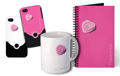
Ah, well, whoever’s responsible, love is always worth celebrating. And since Valentine’s Day is right around the corner, I put together some gifts over at my CafePress shop for gift-givers interested in something a little different.

Of course you can’t go wrong with flowers. But here’s an idea … you could fill the “52 Weeks of Peace” heart mug with chocolate truffles or yummy bath oils…  write a clever, poetic line or two in the love journal … or maybe sweeten up someone’s iPhone. They’ve all got heart … and love … and peace!

And, right ~ flowers would go well with all three. ♥

0

In Praise of Black and White: Part II

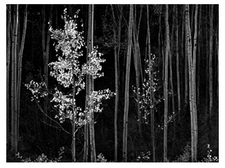
Ansel Adams / Aspens / Northern New Mexico 1958

I wrote this post a year ago. The text (with some edits) remains meaningful to me, but the images are new. (If you want to skip to the pictures, the short version is that I love black and white art and feel it’s under-appreciated…!)

Each year, a new Ansel Adams wall calendar hangs on the door leading to my studio. His superbly articulated, stunning black and white photography reminds me daily of my love for the natural world and the innumerable shades, shapes, shadows and tones that create, change, and emerge from, our world.

Yet the classic beauty and the powerful visual possibilities of black and white are often neglected. Straight black and white design is often passed by in favor of any use of color. As if black and white implied something dull or less important.

But when used well, black and white is intensely dramatic, vigorous, elegant and rich. It can get a powerful point across without the distraction of colors. It can be bright or moody, edgy or slick in ways that color cannot. It can sparkle with cleanliness. Black and white carries undisguised strength, character and integrity … when used well.

Of course, not all photographers have the eye nor skill of an Ansel Adams. Not all designers *see* in black and white. Clients rarely consider it. But it would be nice to see a greater appreciation of the noble duo of black and white.

When people want straight talk, when they want the truth, they’ll say “tell me in black and white”. But people often speak in shades of gray, or dress their language in garish colors for dramatic effect. And so it can be with design – a multitude of colors becomes too competitive, potentially drowning in an undifferentiated sea of tones or gussied up so much the point is lost for the color, like shouting for attention in a crowd.

Color, in and of itself, is naturally beautiful. Bold, rich fusions of color. Subtle, earthy color. Pale, cool, warm or dense. It’s vibrant and alive and emotional. But color alone will not make a bad design good. And it’s not so much that color is overrated, but that black and white is underrated. You don’t see it a lot, which is too bad, because the effects of black and white can be pretty spectacular.

Stripped of color, a million shades become a lansdcape of lights and darks that blend and weave and bounce against one another to create a very rich whole. A striking black and white image often touches us unexpectedly …  refreshing, engaging, and wonderfully inspiring. It’s raw and fundamental – and like a good story, it’s satisfying. Like a good story, it allows your mind to add its own color by filling in the parts left unsaid.

Enough said. Enjoy.

Ansel Adams / Tetons Snake River


“In Praise of Black & White: Part 1” images can be seen here.

3

A Plethora of P's / #5: "Piquant"

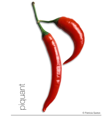
Zest. Spice. Spirit. …Flavorful … Piquant.

Pepper your day with positivity. Sprinkle pleasing, pungent, uplifting thoughts of promise  ~  give your dreams a kick!

0

Work of Art : Restoration of a Rare NYC Map

Maybe it’s my cartographic DNA (ancestor and renowned map-maker Christopher Saxton was commissioned by the 16th century Elizabethan court to survey the whole of England and Wales) that makes this feel so thrilling.

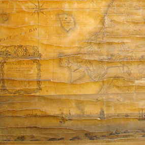
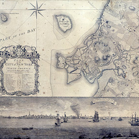
Original "Plan of the City of New York"

Alright, “thrilling” may be over the top. But it’s a juicy find, and stirs my designer/illustrator blood.

The story goes that a frail, crisp, tattered map was discovered last May, tucked in with some other old prints at the Brooklyn Historical Society ~ but this particular map happened to be crafted by master surveyor and draftsman Bernard Ratzer (known, according to the NY Times article, as the “DaVinci of New York cartography”). And there are only 3 existing copies of this map.

The map, “Plan of the City of New York”, dates back to 1770. The restoration process itself was a magnificent feat of skill and patience ~ and no doubt involved a good pinch of love and respect as well. (Click on either picture to see full images that can be magnified onscreen.) It’s quite the gem!

Restored "Plan of the City of New York"

………………………….

Of course, I can’t let this writing end without showing one of Christopher Saxton’s pieces. (… maybe I’ll write a little more on him in another post.)

Christopher Saxton / "Map of Cornwall" / 1579

0

A Plethora of P's / #1: Punch

My newest pet project coincides with a most auspicious day: 1-1-11. (I like that!)

And, as happens every New Year, I feel a surge of renewed hope while the words “THIS is gonna be a great year!” ring in my ears.

This year though, with the intention to manifest more of that “something great”, to avoid disillusionment and an almost inevitable sense of “okay, maybe next year”… I’m going to work with one of my favorite subjects: the power of thought. It’ll be an ongoing journey of sorts, shared through words and pictures.

………………

The trick with “thought” is deciphering which ones are worthy. Of the millions that zip in and around our minds every day ~ consciously and unconsciously ~ how can we let the cream rise to the top? You could call it “thought training”.

Of course there are lots of ways to “quiet the mind”, and they are invaluable tools. Meditation, yoga, strenuous physical activity. Music, dance and art. Acts of kindness and giving. All highly recommended, and sometimes necessary. But that’s not my focus here…   This project is about focusing on what you think. Because what you think engages you with life’s outcomes more than many people realize.

Thoughts can create a better you or a more troubled you. Thoughts affect those around you. Thoughts precede every action. Thought is energy, and it’s potent.

Though we can’t see them, thought forms are as real, possibly more real, than the keyboard I’m typing on. What you think can have enormous power.

As a kid, I was often told to “think positive thoughts”. At some point, that advice seemed too simplistic. In youthful fashion I’d think, “It’s not that easy. They don’t know what I’m going through. You can’t just do that. You can’t just ‘think positively’ and expect everything to become sunshine, lollipops and rainbows”.

But over time I discovered…  that in a way it really IS that simple. You can choose positive thoughts over negative ones. And it does make a difference. A simple twist of thought can change the direction of the moment, the day, the month, the year…  and they are yours to direct!

This is not to say a negative thought should be hunted down and executed, or that having them is “bad”. Remember all those millions of thoughts? They’re not all going to be feel-good, Pollyanna-like thoughts. But the beauty is that you can change them. You can learn from them. You can release them. You can use them to get to a better place, even if it’s just one notch up. It‘s worth the effort ~ and I personally believe most of us have only scratched the surface of the potential power held within our thought patterns.

It’s a big concept yet a simple one, and it’s sometimes easy, sometimes hard to train our thinking. And unless one lives on a deserted island, it’s not just our own thoughts; other peoples’ thoughts can filter in and influence our psyche. When you pay attention, the impact of *thought* is undeniable.

I don’t mean a belabored, obsessive kind of thinking, but more the seed of an idea, the whisper of a deed, the affirmation of beliefs. And whether arriving through your conscious or subconscious mind, tending reaps rewards.

I feel blessed for the positive teachings I was shown in childhood. None of us get through life unscathed though, and those lessons became a springboard for learning how to maneuver some of life’s more intense struggles. They’ve helped me weather many a storm; sometimes when all else failed.

So, this idea for creating a series about positive thinking, expressed through my love of words, art and design, came knocking at my mind’s door. I answered, and here we are.

To make it fun, I decided to use my propensity for “P” words (which may turn out to be a practice run for an entire alphabet, also formed in my mind). Besides, it follows a natural pattern … Patricia, Pencil Points, Peace, P’s ….

So, without further preamble, let’s proceed towards proactively punctuating life with the plausible, powerful possibilities of positive thought presented through a plethora of “P’s”.  :  )

2

10 Years of Tea

One of my favorite holiday traditions revolves around one of my favorite drinks~ tea.

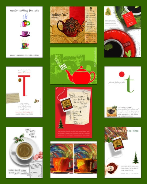
Every year for the past 20 or so I’ve hosted a “holiday tea” ~ and somehow, no matter how busy we are, or how up-to-our-eyeballs in hustle-bustle, the time shared feels just right. The home seems to magically expand in a welcoming embrace, all tension is left at the door and a warm, light sense of companionship takes over. (I’m always a little bit amazed at how well it all falls into place. But some things aren’t worth questioning; just worth enjoying!)

Designing the invitation is part of the fun, so I thought I’d share some. I can’t find them all, but I’ve got ten, so here’s a collection of  “1o years of tea”…

Cheers!

0