Outrageous Happiness #16: Purple Doors and Other Beautiful Things

saxton.outrageous_beauty

As the snow rages on here in the northeast, winter stubbornly insisting on showing its power over mortal beings, my discontent (affectionately called cabin fever) is assuaged by firewood and chocolate and beautiful things.

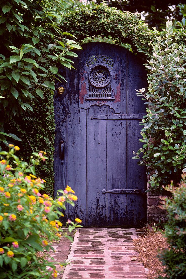
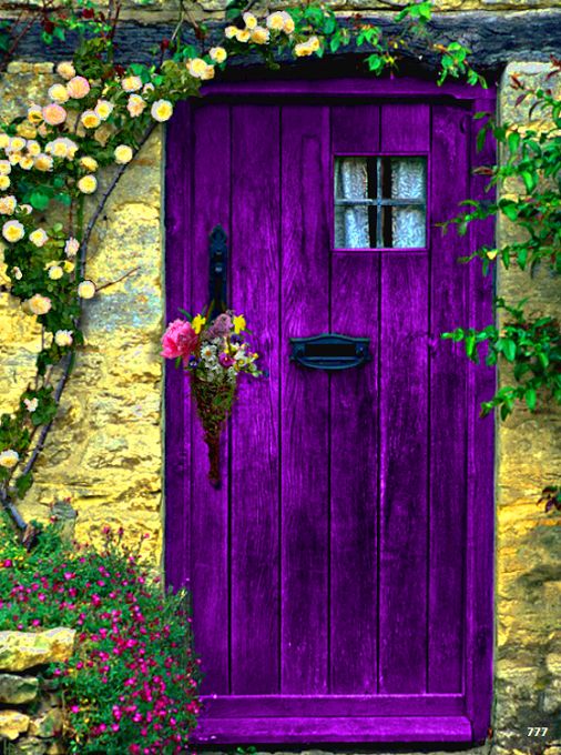
Because beauty, even in the middle of winter, is always within arms reach. The snowfall itself is a thing of beauty; but even then, yes, one gets restless for gardens and seagulls and afternoons on the porch. So I find bits of joy and comfort in things out of reach ~ things I can imagine, or dream of, or plan for. And somehow, just knowing that the purple doors below exist somewhere makes me happy.

Right, right, things, in and of themselves, do not “make us happy”. And what an empty existence it would be if we prized things over love, laughter and companionship. But our hearts can make us happy, and things can touch our hearts. Beautiful things.

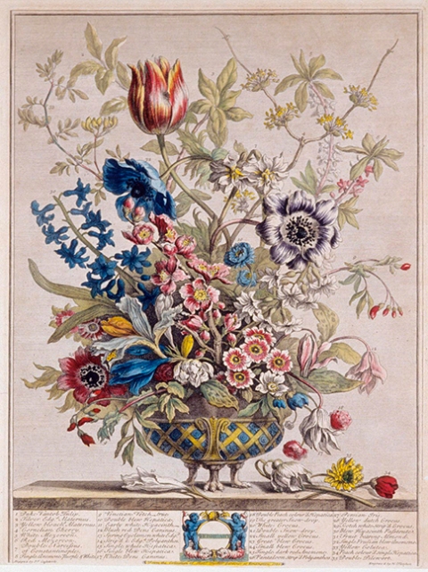
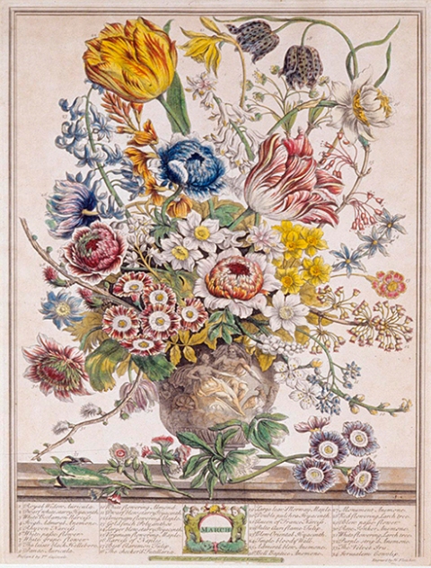
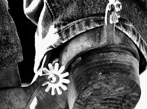
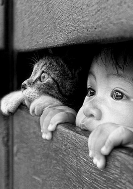
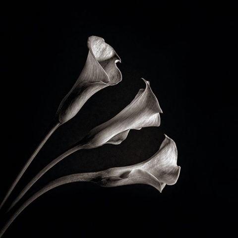
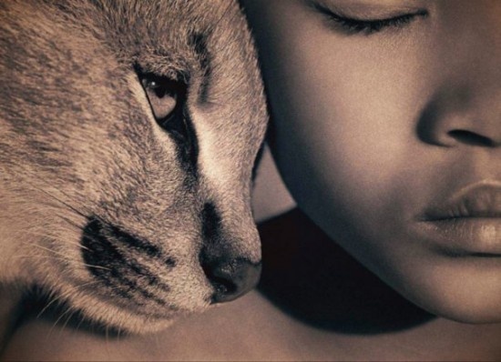
Like a gorgeously purple garden gate, detailed by someone’s skilled hand. Like a well-made chest of drawers, or a child’s painting. An exquisite vase, a red cardinal on a branch, the smell of muffins in the oven, a tulip field, a perfectly comfortable chair with a lovely covering. All things of beauty in their way – expressions of love, a medium for experiencing this life with all the senses; to touch and see and hear and feel the endless multitudes of tastes and textures we have the opportunity to know.

What is life if not for diving in to sample its delicious variety. And what magnitude abounds! Even if we can’t see, hear or touch every bit, we can appreciate God’s – the Universe’s – the Great Creator’s – handiwork at every single turn. And the fruits of our own labors, too – the music, the art, the dance, the carefully crafted violin, the windmill, the garden gate.

We can appreciate the lush carpet beneath our feet, whether made of wool or sand or heather.

And when we do that, when we step out of our daily this-or-that, when we unclench our engagement with what’s wrong or what doesn’t feel good or what hurts or what’s bothersome, we elevate our experience. And what can be faulty with that?

We’re only here for an instant. We can believe it’s to struggle and fight, or we can believe it’s to learn and uplift. We can admire and expand, or we can shut down. We can stay small or we can let our spirits breathe large. We can be held captive by the world’s ills, or we can spread more light.

Beauty, and beautiful things, are a physical gift for our human experience. Seek beauty. Surround yourself. And let purple doors and other beautiful things do what they’re meant to do; nurture and inspire.

garden.gate

purple door

How’s your Outrageous Happiness going?

……………………

PS: I haven’t been able to find the original source for these 2 photos. They are not my own, and I would love to give proper credit if anyone knows.

0

Twelve Months of Flowers

If only it were true. Unless you count holly berries, there’s really not much in the way of floral color during northeastern winter months.

But “Twelve Months of Flowers” can be had via art prints, from the series published in 1730 by renowned British horticulturist and author Robert Furber. Mr. Furber’s name is the one most highly attributed to these exquisite prints, and while I’m grateful that he provided the insight, substantial research and knowledge (and, no doubt, the funds) to produce the collection, I’m mostly interested in the artistry.

Two of these prints hung in our dining room during my growing-up years – one May, one November, the months of my parent’s birthdays. Much admired, they gave a rich, subtle elegance to a modest space (and now that I think of it, may have influenced my own interest in drawing things botanical) ~ but in all those years, strangely, I don’t remember talking about the artist. So I went looking.

I discovered that the meticulously hand-colored engravings were created by English engraver Henry Fletcher, based on the paintings of Flemish-born artist Pieter Casteels, and that Twelve Months of Flowers was originally produced as a gardening guide in catalogue format and sold by subscription. (They also produced an equally stunning second series, Twelve Months of Fruits.) The images were aimed at wealthy landowners interested in growing plants for beauty more than functionality.

Each work is a glorious detail of plants in seasonal bloom, with each plant numbered, and, at the time, a list of the corresponding names. More than 400 plant species were featured. This was no small project. Huge talent. Enormous dedication to both botany and craft.

And so, a few centuries later, I thank them the three of them: Furber, Fletcher and Casteels ~ for their luscious collaboration of study, talent and skill. They are so beautiful, I would even venture to call them a labor of love. But that’s what art is.

TwelveMonths1_sm

TwelveMonths2_sm

TwelveMonths3_sm

TwelveMonths4_sm

TwelveMonths5_sm

TwelveMonths6_sm

TwelveMonths7_sm

TwelveMonths8_sm

TwelveMonths9_sm

TwelveMonths10_sm

TwelveMonths11_sm

TwelveMonths12_sm

0

In Praise of Black and White: Part V

Almost like clockwork, every January I’m reminded of my love for black and white. Maybe it’s the monotones of winter. Maybe it’s the bright white snow against a black sky. Maybe it’s because each year a new Ansel Adams calendar hangs on my studio door.

Whatever it may be, I’ve long been drawn to the beauty of black & white art, going back to the first time I picked up that favorite tool of mine (the #2 pencil) and sensed that magic was held within its lead.

From pencil or pen to the magnificent drama of a fine black & white photograph, I’m captivated by the power and emotional breadth that can be achieved without a spot of color. No distractions. Just character and grace, depth and strength and guts and mood. And like a good story, well done black & white allows your mind to add its own color by filling in what’s left unsaid.

Enjoy!

1d2f5f2d2fa35f176b5f04697a47bca2

Jornal da Fotografia

cowgirl.boot2

Clare Colins

paris.fog2

Michael Rajkovic

amish.field2

Jenő Dulovits, 1935

snowy.field2

Gorazd Kranjc

ocean.wave2

from UltraLinx

eagle.photo2

Yves Schüpbach

baby.wolf2

Jeff M for Short / Lifecreations

cobweb2

Patrick Hübschmann

batman.robin2

Batman and Robin

apple.waterdrops2

by the-definition.deviantart.com

old.woman2

found on The Happy Mango @ pinterest

violin2

Nelson Rietzke

old.camera2

source unknown

254f3753a74f73789254a5f768fec4e5

Joko on 500px

244fb0961cf7fd30105e0d9b06f44700

source unknown

gatsby

source unknown

Andre Kohn

Andre Kohn

Patricia Saxton


Stéphane Berla

Stéphane Berla

Patricia Saxton / Book of Dragons

Patricia Saxton / Book of Dragons

source unknown – possibly claudihexlein?

wedding.cake2

Modwedding

Portrait and wedding photographer East Yorkshire

Ally Byrom

white.cat2

Vishuddha

sea.rocks2

Michel Rajkovic

mlk.blackwhitehands

source unknown


Please note, I’ve tried to find image sources for all of these images, and sometimes failed. I would love to give proper credit where due, so if you know the original source of any of these labeled “source unknown”, please let me know!

0

Vintage Vogue

These fall into the “they don’t make things like they used to” category. Not just because they’re well illustrated, or because of their artistry and creativity, but because of the cleanliness, the sheer un-clutteredness, the freedom from too many headlines and too much text vying for attention. They’re a breath of fresh air, courtesy of the early 1900’s.

Aren’t they wonderful?

april1918

june1915

nov1917

vogue.year

feb1914

2

Book Cover Candy

I’m reading. Not a surprise, I realize, but isn’t that what holiday weekends were made for? Reading, writing, making some art, getting one’s hands full of garden earth, visits with family or friends. Point is: not working. Connecting with that sometimes elusive concept called relaxation.

So while the sun is trying its best to make a solid show and my daughter has gone off socializing, I’ve got a good book, a cup of tea, a pile of new dirt and plants ready for planting. (And yes, hot fudge on the stove for later.)

It’s a really good book so far ~ Sue Monk Kidd’s The Invention of Wings. Again, this isn’t particularly surprising, but what did strike me was the uninteresting cover. The “ordinary-ness” of it.  It feels very safe, very stock-photography-esque. It’s pleasing enough, but nothing that would have grabbed me had I not already been interested in the author.

suemonkkidd

I’ve talked about this before, but I’ll say it again ~ we do judge books by their covers. It’s our first impression. That first impression may or may not inspire us to read the back matter (what’s it about?). The back matter may or may not spur us on to actually open the book and read the first few lines. At this point, if the first few lines read well, you’re more than halfway there and your cover has done its job. If the first few lines read poorly, the cover may have surpassed its content  (one might give it a few pages, even a chapter to decide~ but at least it got you to look.) Reviews, of course, give books some major traction, but if you’re at all picky about how you spend your time, you’ll probably still go through these steps before plunging in. And it all starts with the cover.

Book covers can be fantastic visual candy. And they actually can make or break a sale. As a graphic designer, and as much as I both write and read, creating covers is a natural extension of what I do, but not one many know about. So I thought I’d share some with you below. So you know.

P.S. The sun, by the way, has lost. The clouds have won, the rains have come. And now, if you’ll excuse me, I’m reading. :  )

saxtonstudio.bookcovers

0

Writing by Hand

saxton_quickbrownfox

In my late teens I had the opportunity to have my handwriting analyzed. It was the coolest thing. An old woman in a hospital, whom I never personally met, looked at my swooping p’s and looping y’s and sharply crossed t’s, the height of my h’s, the slants, the weights, the close-or-far-apartness of the letters, if they were small or large, tidy or swirly. What she discovered may well have been the best description of me I’ve heard. Her analysis also told me things I didn’t yet know, almost like a fortune, or a map. It was pretty fascinating.

Which reminds me that the physical, pen-in-hand act of writing is not only a form of communication, it’s a form of self-expression; another window into the soul.

It’s also a fabulous collector of thoughts. Sometimes a pen can’t keep pace with my thoughts, but sometimes the slower act of hand-writing keeps my thoughts in line, keeps them from running off to oblivion, balances my mood. Plus I get to make doodles on the page. (Silly? Not really – it’s actually part of the thought process.)

Something happens between the mind and the hand that’s different than what happens between the mind and the keyboard. Maybe it’s simply that hand-writing is organic. It’s breathing deeply instead of a quick lap around the track.

There’s a place for both the handwritten and the typewritten – one is not “better” than the other; in fact both are good, and both are necessary – but even without the scientific evidence at my fingertips (no pun intended), I am certain that both methods exercise different parts of the brain, some how, some way. (And yes, there are differences between printing and script to form our letters as well.) The entire mind-body-spirit is involved ~ how we think, how we process, how we sit, how we move our hands, how we feel. There’s got to be physiological implications.

And so, while this may be old news, the fact that teaching cursive writing in school is being phased out of the curriculum just blows my mind. I can’t believe it’s even up for discussion, much less already happening.

What about hand-eye coordination, thinking patterns, better comprehension when writing things down “painstakingly” by hand, knowing how to spell and use proper grammar and punctuation without spell-check tools, and yes, expression and creativity?

When it comes to writing by hand, there’s so much in the pro column here, and, as far as I can see, a big zero in the negative column. What is so damn important that basic penmanship skills get the boot?

All this really brings my inner cynic out front. Anyone interested in positive teaching, in my opinion, wouldn’t even consider taking this out of our schools.

Sure, electronic-based writing is more practical, and block-letters are easier to master than script. But there’s enormous value in writing by hand, and to imagine this capacity no longer existing is a truly disturbing thought. The very human-ness of writing by hand should not be relegated to dusty archives, hidden corners, calligraphers and ancient texts.

Please teach your kids to write! (I can hear it now… “But why do I have to do this? I’ll never use it!) Are we to be tethered to electronic devices for everything we do? (Next it’ll be paints. No more Grumbacher. Good bye Winsor & Newton! Why use real paint when you can do it with software?) Who decides the value here? How is that value measured? Will we cordon off whole parts of our brain?

There’s just too much telling people what to do, what to think, how to think, how to feel, how to be. Stop it already. And let kids learn to write. Print letters and script letters. By hand. It’s important.

And not that this is the crux of my argument, but you know, maybe they’ll even gain insights from having their handwriting analyzed one day… their own personally unique formation of words on a page, from head to hand to paper.

0

Tools and Other Worthy Indulgences

saxton_calligraphypens

Some things are more worthy of indulgence than others. Long, hot baths come to mind. Good books. Time with friends, time alone, laughter, comfortable shoes.

And because I was just speaking of pens (previous post), my mind turns to the tools we use and how much the right ones matter. Even a simple, everyday pen can be a tool of ease or frustration, depending first on how well it’s made, then how well it’s taken care of, and finally, knowing when its time is up.

Not all pens are created equal; nor pencils, nor hammers, nor computers, nor cameras, nor carrot peelers. The list goes on.

Several years back I worked on a mural with a group of other artists. A handful of brushes were available, paints were provided and we’d all been part of the design, so it was just a matter of painting. Fun, right?  Sort of, but not really. Why not?

The thing is, we worked in acrylics, which was, at the time, a medium I was less familiar with than some of the others artists were, and I’d been feeling irritated by the way the paint went on. Then one day, towards the end of the project, someone handed me a different paintbrush. In that moment, within seconds of the first brush stroke, night became day. Winter became spring. Skies turned blue. Birds sang, trees blossomed! I was stunned. The paint suddenly flowed. All that time … struggling, thinking it was me, when really … what a difference a brush can make!

And back to pens for a minute ~ in the early days, when not using my trusty #2 pencils, I’d draw with an old-fashioned calligraphy pen – the kind with metal nibs; the kind that people of centuries-gone-by used for letter writing, under the light of a candle or a kerosene lamp, dipping the pen in and out and in and out and in and out of a bottle of India Ink. Precision was difficult, mistakes and ink blobs were relatively easy to perform, but if you took good care of your tools and practiced your craft, beautiful results could happen. I got pretty good at it.

Then, (thank the Pen Gods), someone invented a pen called a rapidograph. At first I was pessimistic. It wasn’t “the real thing”. But two minutes in, I was hooked. It was real, and wow ~ manna from heaven! ~ it made the whole drawing experience so much better. Changing and cleaning nibs – easier. Mess – hardly. Potential for precision – worlds apart.

Of course there will always be poor imitations, in which case any newness is hardly worth it. Just because it’s “new” doesn’t mean its “good”. Since the dawn of time tools have been made to make life 1.) easier and 2.) more efficient. If those two criteria aren’t met, (in my best New Jersey accent) “fuggedaboudit.”

Holds true of everything. Take ice cream scoopers, which also happen to be a favorite tool of mine. They have to be sturdy, with the scooper-outer part just the right depth, the handle firmly attached and nicely grippable. Definitely not made of cheap plastic stuff. The last thing you want is a sprained wrist when indulging in a much-deserved treat. Ice cream is intended as a happy experience.

I’m sure most of you have a “bad tool” story, and probably know as well as I that when it comes to tools, quality counts. So indulge, I say! – not because they’re a treat, but because the difference can be like night and day. The right tools can replace cursing with whistling. And time spent, that most precious commodity, becomes more productive and pleasant if not downright fun.

So here’s to the value of tools; no matter what you do, wherever you go, may the right tools be yours. : )

scoops_lomo


0

Black with Milk, Please

It’s true, I love my tea. Not just any tea, mind you. Black, strong with robust flavor, a dollop of milk, no sugar, thank you. Herbal tea is nice, too, but doesn’t satisfy in quite the same way. So there you have it.

I didn’t always drink so much tea. I wasn’t raised among tea-drinkers, but early on I opted away from coffee, primarily because in order for it to taste good I needed to feed it lots of milk and sugar, and for all that trouble, why not just have coffee ice cream instead (with hot fudge on top, of course)? (What, you don’t see my logic?)

In any event, I was a natural for tea. British/Scottish blood, all that, and I’m rather fond of it, and that’s that. It’s marvelously friendly, it’s calming and uplifting at the same time, and it’s got this great reputation for solving just about anything (have some tea, dear…!), with sometimes that “anything” including all the ills of the world. It’s good stuff, tea.

My love of tea also lead me to create daily “morning tea” posts on my Patricia Saxton / Saxton Studio facebook page. By now you’ve probably realized I have a thing for working with themes, and I’ve found it’s generally easiest (and more fun) to use subjects one likes a lot. So tea it was, and it turns out those posts have been nicely received. Sometimes I grab nifty teacup or teapot photos from various sources, sometimes I create original designs, and a selection of the latter are included below (all but the vintage photos, which I tossed in for added flavor) …. seemed like a good compilation to end the year, with all the tea that’s seen me through innumerable hours of illustrating, writing, designing and pesky deadlines, not to mention long, wonderful chats around the kitchen table.

Here’s to tea, and all the lovely things it represents.

saxton.tea.posters.poster.72

0

The Conjuring of Beasts and Things

saxton

I feel like I should be handing out cigars. Well, not quite yet ~ but maybe I oughta stock up in anticipation, as I’ve reached the final stretch of my long walk into the magical world of dragons.

It’s a good feeling when months of creating ~ revising, adding on, taking away, nurturing and bonding with creatures that somehow feel alive in your mind, made real through your hands, with paper, pen, pencil, brush and keyboard ~ finally comes together. Like carrying a child for nine months, you find you’re anxious to give birth. Like rehearsing a play, the hour comes, the curtain rises, it’s showtime. There’s relief, trepidation and confidence, all mixed in. Cigars and (more likely) flowers are shared. And we’re almost there.

Once it’s edited and packed off to press, once it’s printed and bound and shipped out to the Amazon’s and Barne’s & Noble’s of the world, it’s all very tidy looking. For any illustrated book like this, the pages show a certain level of thought and detail and complexity, but not the background steps ~ not the conjuring, the sketches, the fine-tunings, the first, second third, fourth drafts, the hundreds of decisions along the way. The “fitting in time” when there really isn’t any, which means a pretty grueling schedule. It’s quite the process…  satisfying in many ways, invigorating in others, tiring in others, and always hope that at the end of the line it will be well-received.

This will probably be my last book of this”trilogy”: mermaids, fairies, now dragons. And that’s a good place to stop. But there are other works that’ve been waiting backstage ~ stories, poetry, paintings ~ so it certainly won’t be the last of me.

For right now though, I’m off to dot those final i’s and cross the last t’s. Then my publisher will have a whack at it, and I’ll start ordering those cigars in honor of birthing more beasts and things. (Due dates to come … stay tuned!)

0

Twelve Months of Flowers

If only it were true. Unless you count holly berries, there’s really not much in the way of floral color in northeast winter months.

But “Twelve Months of Flowers” can be had via art prints, from the series published 1n 1730 by renowned British horticulturist and author Robert Furber. Mr. Furber’s name is highly attributed to these exquisite prints, and while I’m grateful that he had the insight, substantial research and knowledge (and, no doubt, the funds) to produce the collection, I’m mostly interested in the artistry.

We had two of these prints hanging in our dining room during my growing-up years – one May, one November, the months of my parent’s birthdays. Admired by all, they adorned a modest space with a rich, subtle elegance, (and now that I think of it, may have had an influence on my own interest in drawing things botanical) ~ but in all those years, while we probably did, I don’t remember talking about the artist. Regardless, for some reason they lodged in my mind’s eye today ~ perhaps an unconscious nod to my parent’s wedding anniversary? ~ so I went looking.

First of all, they are hand-colored engravings, produced by English engraver Henry Fletcher from paintings of Flemish-born artist Pieter Casteels . (They also produced an equally stunning second series, Twelve Months of Fruits.) Each work is a glorious detail of plants in seasonal bloom, with each plant numbered, and, at the time, a list of the corresponding names. More than 400 plant species were featured. This was no small project.

And so a few centuries later, I thank them ~ all three of them: Furber, Fletcher and Casteels ~ for their fine, luscious collaboration of study, talent and skill. They are so beautiful, I might even venture to call them a labor of love. But that’s what art is.

TwelveMonths1_sm

TwelveMonths2_sm

TwelveMonths3_sm

TwelveMonths4_sm

TwelveMonths5_sm

TwelveMonths6_sm

TwelveMonths7_sm

TwelveMonths8_sm

TwelveMonths9_sm

TwelveMonths10_sm

TwelveMonths11_sm

TwelveMonths12_sm

0