What’s the Big Deal About Branding? (part two)

Branding. No, not the hot iron kind on an animal’s behind (ouch! ~ do they still do that?), but marketing’s buzz-word of buzz-words.

As with many notions that take the spotlight ~ often becoming overused, diffused and diluted ~ one has to question it at some point. It’s never wise to take popular culture at face value, or hear a fancy phrase and automatically buy in. To borrow from the now old-fashioned new-age-speak, first it has to “resonate”. If it resonates, I’ll pay attention.

So, what IS the big deal about branding?

First of all, your brand is what I like to call your visual voice. It’s what you bring to market over and over and over. It’s how you’re identified, and yes, judged. It can, in effect, be the life or death of your business.

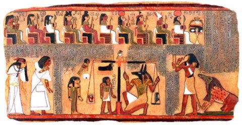
Egyptian Scales of Judgment

If you read “What’s the Big Deal About Branding? (part one)”, you got some of my thoughts on why it’s important. Namely, the pull and power of consistency and integrity ~ two key qualities that provide a valuable backdrop, a kind of moral yardstick for your business, while serving as a clear window for your audience to understand what you’re about.

Take a red target image for example. “Target” stores easily come to mind. It’s a consistent, steady symbol – exhibiting visual integrity. And that’s very good.

But take it a step further. If your experience at Target is repeatedly a good one, they’ve just about buttoned up the integrity piece, because you, the customer, feels confident, “safe and secure”. Trust has been earned; integrity deepens.

There are hundreds of similar examples. Like Mercedes, Nike, The Morton’s Salt girl. They’re consistent, identifiable, they stand for something, and the customer knows what that something is … and … there is trust.

So here’s the thing: imagery and words alone do not make a brand “work” … Three fundamental things feed into your success: your product, your service and your brand. One without the other will leave things flat (or send them spinning out of control) ~ but in tandem, goals are attainable. Basically:

  • If you’ve got a great product, but poor service, expect trouble.
  • With great service, but a bad product, good intentions won’t matter.
  • If you’ve got a great branding scheme, but a poor product or poor service, people are going to catch on – and move on.
  • A great product and great service, but a mixed-up brand message, creates confusion. Confusion is loss.

But when all three elements come together, singing the same song, in harmony, you’ve got strong branding and a heck of a better chance at success.

The wrapping on the package is that all three ~ product, service and “brand”  (your visual voice) ~ are your branding, and any business, marketer or designer worth their weight should consider all three in brand development. Ask the questions to find the commonality. Keep those 3 elements consistent, and integrity follows. And where integrity lives, people want to hang around.

© Patricia Saxton

Next up: Authenticity. Stay tuned.

2

Google Plays Les Paul

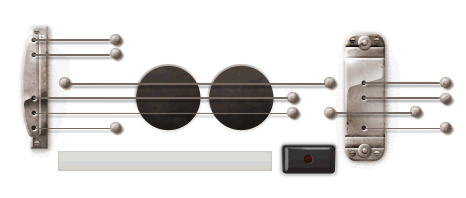
Didn’t expect to write two posts today, but more coolness came along that I couldn’t resist. Today’s Google Doodle is just too fun.

In honor of (what would have been) guitar legend Les Paul‘s 96th birthday, you can actually “strum” the strings. Of course, you won’t be able to play that Leo Kottke song like my brother did a few posts back, or recreate a Les Paul lick, but what a cute bit of ingenuity!

0

A More "Refined" Jack Daniel's… But Why?

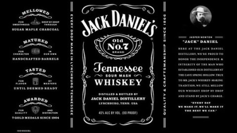
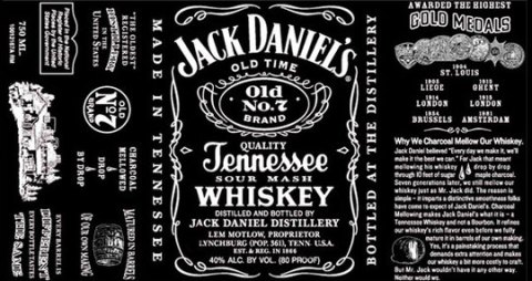
Brand makeovers are all the rage. And as a designer, I often see the value. But honestly, in this case I’m missing the point.

You wonder sometimes what drives a change like this,” when it ain’t broke”… unless it is. Or somebody with clout says it needs to happen, and it becomes more about what’s on the cover than what’s inside. Hmmm.

Not that the new label isn’t a good one. Thankfully it doesn’t kill the brand by overly modernizing, and I admit the cleaner look is attractive.  I just don’t know why they bothered. The old label was just … so … Jack Daniels. Classic JD, forever, the way it was…. until now. Cleaned up and  more refined. (Only Jack Daniel’s isn’t supposed to be refined, as I recall?)

new

old

I have to admit though, that reading some of the articles about it were pretty interesting. For example, I never knew that Jack is brewed in a dry county. That’s a little crazy.

As for the label, they got rid of a lot of the text, including fun details like the population count of 361 (so what if it wasn’t accurate? ~ it was an interesting historical tidbit). Gone is the folksy description of how they achieve the rich flavor. They’ve also removed the claim that Jack Daniel’s is America’s oldest distillery, and they took off the name of Lem Motlow.

Now as I’ve learned, Motlow inherited the distillery when his Uncle Jack died in 1911. Motlow promptly put his name on the bottle and kept the company alive throughout the dark days of prohibition and through the controversy arising after he drunkenly shot a man dead while riding aboard a train in 1924.

This is great stuff. But maybe legends are passe’ now.

Even Jack Daniel’s portrait boasts a new name: apparently his real name was Jasper Newton. Okay, that’s cool to know, but since he’s been called Jack since 1866, I wonder what he’d have to say about that.

Oh well, the deed is done, but the vote is out. The label is still very black, and I assume the whiskey is still quality Tennessee sour mash, and at the end of the day, no one will really care that the label got a facelift. Of course, they wouldn’t have cared if it hadn’t, either.

…………………….

Afterthought: If no one cares either way, and the company isn’t suffering, maybe they did it … under the guise of updating and being more “honest” (ie, population, possibility that JD might not be the oldest distillery, etc.)…  but really and simply, just for the heck of it? 

0

What's the Big Deal About Branding? (part one)

I’m not a big soda drinker. (“pop” for you midwesterners)

But the other day while filling up at the gas station, enjoying the first sunny day in forever, I realized it was downright hot outside. As I reveled in the solar warmth, the green green trees and blue blue skies, my eyes wandered over to a lonely looking soda machine. And quite suddenly, I was struck with desire. I wanted a soda. I just really wanted one.

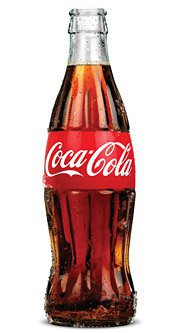
So I got change from the attendant, put my shiny coins in the slot, and wa-la! ~ down tumbled a beautiful, cold bottle of Coke.

Yes, definitely a Coke. Because to me, if you’re gonna have a soda (or a “pop”), it should be “the real thing”. I might even want to teach the world to sing… in perfect harmony….

You probably get my point… Coke has real brand recognition. It’s strong. So much so that I remember their ads from 20 years ago, maybe more. They’ve made (and continue to make) an impression.

So, you say, yea, well, they’re big guns. They’re a big deal with a big name and big budgets and a big audience. What does Coca-Cola’s great advertising have to do with a small business or an entrepreneur?

A lot.

Take away the “big name” and all the trappings that go with it and you’ve essentially got what branding is all about: Consistency and integrity.

Coke’s example is this: a steady graphic look since its inception, modernizing with the times, but never losing its core visual ~ AND a steady message that’s upbeat, positive and rings of authenticity. By keeping both their look and their message consistent, they maintain the vital quality of integrity.

Branding isn’t just a logo. It’s not just a website. It’s not a twitter account. It IS everything you or your business presents to the public.

Every word and every image in every medium and circumstance speaks on your behalf. These are your “brand”. They represent you in person, and when you can’t be there (which is most of the time), they represent a virtual reflection.

So if you have 3 different websites with 3 different looks, if you have people with different voices handling your social media, if your visuals look clean and sharp in one place and sloppy in another, you will confuse your audience. And confusing your audience is not something to take lightly in a world where so much is vying for people’s attention.

So, yes, your brand, your “identity”, is a big deal. Keep it consistent and let it walk, and talk, with integrity. More on integrity and authenticity in “part two”… For the time being, let’s just say, make it the real thing.


4

Ouch.

And they paid (one wonders how much) for this?

I was in Denver last week. Went to a Rockies game. It was fun. (It was also cold. I like the Rockies, but I don’t like cold.)  Anyway, we’re sitting in our seats, donning our new (and very spiffy) Rockies caps, wrapped in blankets, waiting to be wowed by Ubaldo, the newly returning post-injury star pitcher, when my vision is distracted by a bright, bigger-than-life banner across the stands. The banner is advertising something about Qwest and Century Link. That’s fine, whatever ~ I don’t really care, and I focus back on the game.

But wait.

My eyes flit back to the bigger-than-life sign. Somehow it’s demanding my attention… and I find that I do care. In fact, I care so much I’m appalled. Because there it is, a gaping grammatical error in full baseball-stadium-sized color for all the world to see.

And I think, “they paid for this”. They actually paid, big bucks, for this. Do they think it’s right? Do they not speak the language? (Oh, and by the way, these are communication companies…) Are they kidding me? Is our increasingly short attention-spanned society and the need for sound bites and quick one-two punch lines really more valuable than saying it right? Are we overriding “well spoken” for the “grab ’em fast” mentality?

Now I’ll admit that in the scheme of life, this is not a deal breaker. It’s not a catastrophe. It’s not “important”. But it definitely offends my inner nerd, my sense of language and yes, my professionalism! It’s not okay.

Note to Qwest and Century Link: Call me. (saxton studio) I can do it better, correctly, AND probably for a quite a few less dollars than your ad agency charged. :  )

4

Google Does Charlie Chaplin

Google dazzles with its doodling again ~ this time with some fancy animated footwork in honor of Charlie Chaplin’s 122nd birthday, and it’s a clever one. Enjoy!

0

Google Steals My Heart

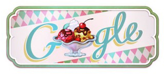
While doing a quick search for something online this morning, I noticed the Google logo had another fun interpretation. There on the screen was an old-fashioned illustration of a big ol’ double-o ice cream sundae ~ and my heart skipped a beat.

You don’t understand. Or maybe you do. Maybe you share my love for sundaes.

To explain: I am a hot-fudge sundae aficionado. I was weaned on chocolate, you see, and later treated to a secret family recipe for hot fudge sauce, which I now make on a regular basis. And of course the purpose of ice cream is to serve as a vehicle for the hot fudge. So I should probably admit that it’s really more about the good sauce than the ice cream, but in truth, together they’re dreamy.

Plus … ice cream sundaes are just “happy”. Did you ever see someone who was unhappy while eating ice cream? Seriously. It’s a gift from the Gods.

Now that you know this juicy personal tidbit, you can see why I was delighted to learn, via today’s clever Google logo, that today marks the 119th anniversary of The Ice Cream Sundae. How cool is that? (Maybe cooler if it were a rounder number, but I’ll take it.)

Apparently The Sundae was “invented” in 1893, by Ithaca, New York soda fountain proprietors Chester Platt and John M. Scott. It was first called a “Cherry Sunday”, because it was served on a Sunday, presumably with a cherry on top.

Eventually, I don’t know how, and am too excited to care, the name changed from “Cherry Sunday” to simply “Sundae” (although my word loving mind is a bit curious, how it went from Sunday, to the sort of Shakespearian spelling of Sundae… I’ll find that some other time…)

So please go ahead and enjoy an Ice Cream Sundae in honor of its anniversary. And smile all the while.

Thanks Google!

6

Warrior Gryphon

Gryphons are nobody’s fool.

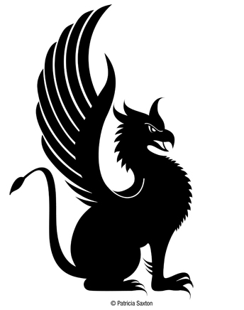
A winged monster with an eagle-like head and the body of a lion, gryphons make fierce warriors and noble guardians. I created this particular gryphon for The Silent Warrior Fund, a non-profit foundation that assists US Army Special Operations Command (USASOC) soldiers and their families.

A strong symbol for a worthy cause. I’m proud to take part, and grateful to be able to use my talents freely because of their dedication and incredible courage.

My client chose several treatments ~ for website, letterhead, gear, etc. ~ but the gryphon will be the steady mascot on all. I’ll share the final logos later, and provide links again for those who’d like to learn more / support the cause.

0

What's St. Patrick's Day Without Beer?

I’m not agreeing or disagreeing, except to say that it doesn’t have to be green to qualify. (in fact, yea … it’s better if it’s not.)

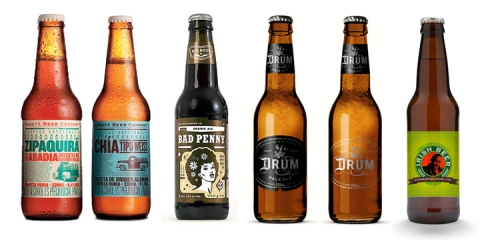
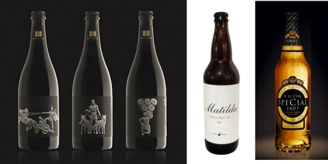
And so, to honor the day, the Irish, those who want to be Irish, and all who enjoy a good guzzling of design, I’ve pulled together some cool beer bottles to show. Labels are a great canvas for design creativity, and all of these fit the bill.

Feast your eyes on these ~ and have a safe and Happy St. Patrick’s Day!

1