Acoustic Spotlight: "Little Martha"
A great tune and more amazing string work from the talented David Saxton.
A great tune and more amazing string work from the talented David Saxton.
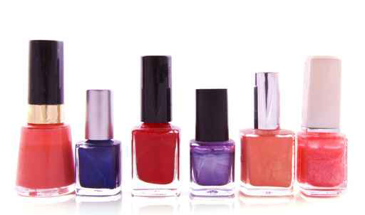
It’s the month for pink, the color of love, which got me thinking about color.

Which also got me thinking ~ I wish someone would give me the job of naming the new colors that come out each year. You know, all the new lipsticks shades, crayons and interior paint chips. Really, who gets to do that?
Does the fashion-company-president’s daughter sit around a kitchen table with friends and a couple glasses of wine and decide what trendy words will be uttered when asking for the latest pink nail gloss? Or do they hire a design team to consult with psychologists to scientifically determine what will spark the consumer’s emotionally-driven buying fancy this year?
And who decides ~ excuse me, “forecasts” ~ which colors will be “in” for a coming season. Of course all those colors need new names too. Really, I’d be willing to do that. You could twist my arm, and pay me instead of an entire design team/psychologist duo. But, what if it’s the company president’s daughter and her friends… forgot about that possibility. Can’t argue that one, unless of course, they lack imagination.
Maybe I could ask around at Sherwin Williams, or ask someone like my friend Marty who worked in the cosmetics industry for umpteen years. But I’d rather wonder…
Who comes up with Mermaid’s Tail Green, or Ol’ Swimmin’ Hole Green, Old Pickup Blue, or Blizzard Blue, Kinky Pink, Ballet-Slipper Pink, Curious Yellow (although I kinda like that one… as well as Unmellow Yellow)? Then there’s Really Red Red (particularly clever), Violet Groove, or I’m Not Really a Waitress (yes, an apparently fab-u-lously shimmery nail polish).
Seriously, I could do this.
And from Paris we now have spring’s 2011 fashion color-combo trends: Archaic Garden, Underwater Variation, Tropical Dramaturgy (huh?), Enchanted Picnic, Shadowy Shores.
Be still my heart. What would I wear if not for these tips?
I shouldn’t be sarcastic I guess, it just seems so … presumptuous? pedantic? pedestrian? provincial? (just seeing if you’re still reading, and catching the P words…) In all honesty, while “unnecessary”, some of the names are plain fun, and surely we could all use a bit more of that these days.
Plus, you see, we graphic designers get Pantone inks– Pantone 133, Pantone 345, Warm Gray 9. Glorious colors, but with useful, practical, “un-fun” names. (Which is for good reason, don’t get me wrong. Keeps things orderly.)
So, all in all, I think it’d be great if I got a chance to name a season of pinks. You probably would too. Just sayin’.![]()
Imagine each stroke of Van Gogh’s brush. Or Matisse or Manet’s.

Well, now you can see them. And from the short time I’ve had to wander through Google’s Art Project, the images are as brilliant and breathtaking as any virtual images could be. Possibly a masterpiece itself.
It boggles the mind – what a massive undertaking! – and it’s superbly done. Online, you can “Explore museums from around the world, discover and view hundreds of artworks at incredible zoom levels, and even create and share your own collection of masterpieces.”
If you haven’t already (I’m sure the buzz has swelled by now!), it’s a site completely worth visiting. It’s an experience!

Yesterday I talked about “presence”… today, “presents”!
But this isn’t one of my “Plethora of P’s” posts (even though presents can be positive too!). This one’s all because of Cupid and his quivering arrow. Or maybe it’s St. Valentine’s doing. Or St. Hallmark’s.
Ah, well, whoever’s responsible, love is always worth celebrating. And since Valentine’s Day is right around the corner, I put together some gifts over at my CafePress shop for gift-givers interested in something a little different.

Of course you can’t go wrong with flowers. But here’s an idea … you could fill the “52 Weeks of Peace” heart mug with chocolate truffles or yummy bath oils… write a clever, poetic line or two in the love journal … or maybe sweeten up someone’s iPhone. They’ve all got heart … and love … and peace!
And, right ~ flowers would go well with all three. ♥

Presence is a medium-sized word with larger than life impact. Presence is a simple act, but a very big deal. Presence is about being mindful, being aware, being completely, undistractedly, present right here and now.
Presence is granular. It’s thinking the thought, it’s feeling the feeling, it’s tasting the taste.
It’s not about “showing up”; it’s about being attentive. It’s a decision to listen, to see, to intentionally connect. It’s a very deliberate action based on the deliberate thought to be present. Presence is to choose, in this moment, this moment.
I would go so far as to promise you’ll feel a positive difference in your day when you consciously choose to practice being present. … You will truly enjoy that cup of coffee. You will appreciate the comfortable chair. You will experience an unexpected delight somewhere that you otherwise would have missed. And by allowing yourself the opportunity to make simple yet mindful choices each hour, all day, you even may find that you will slow down time a little bit. You will also give others one of the best gifts you can give – your sincere attention. And if you need to move on, remember that that sincerity ~ your presence ~ even in small doses ~ is far better than any amount of “yea, yea, uh-huh”.
Our world is fast-paced and gaining speed. I say, don’t let that fool us into passing by on the powerful thought, and simple action, of presence in our own lives.
•••
Note: the complete series of positive P words can be seen unfolding all together on the “Plethora of P’s” page of this blog,

Ansel Adams / Aspens / Northern New Mexico 1958
I wrote this post a year ago. The text (with some edits) remains meaningful to me, but the images are new. (If you want to skip to the pictures, the short version is that I love black and white art and feel it’s under-appreciated…!)
Each year, a new Ansel Adams wall calendar hangs on the door leading to my studio. His superbly articulated, stunning black and white photography reminds me daily of my love for the natural world and the innumerable shades, shapes, shadows and tones that create, change, and emerge from, our world.
Yet the classic beauty and the powerful visual possibilities of black and white are often neglected. Straight black and white design is often passed by in favor of any use of color. As if black and white implied something dull or less important.
But when used well, black and white is intensely dramatic, vigorous, elegant and rich. It can get a powerful point across without the distraction of colors. It can be bright or moody, edgy or slick in ways that color cannot. It can sparkle with cleanliness. Black and white carries undisguised strength, character and integrity … when used well.
Of course, not all photographers have the eye nor skill of an Ansel Adams. Not all designers *see* in black and white. Clients rarely consider it. But it would be nice to see a greater appreciation of the noble duo of black and white.
When people want straight talk, when they want the truth, they’ll say “tell me in black and white”. But people often speak in shades of gray, or dress their language in garish colors for dramatic effect. And so it can be with design – a multitude of colors becomes too competitive, potentially drowning in an undifferentiated sea of tones or gussied up so much the point is lost for the color, like shouting for attention in a crowd.
Color, in and of itself, is naturally beautiful. Bold, rich fusions of color. Subtle, earthy color. Pale, cool, warm or dense. It’s vibrant and alive and emotional. But color alone will not make a bad design good. And it’s not so much that color is overrated, but that black and white is underrated. You don’t see it a lot, which is too bad, because the effects of black and white can be pretty spectacular.
Stripped of color, a million shades become a lansdcape of lights and darks that blend and weave and bounce against one another to create a very rich whole. A striking black and white image often touches us unexpectedly … refreshing, engaging, and wonderfully inspiring. It’s raw and fundamental – and like a good story, it’s satisfying. Like a good story, it allows your mind to add its own color by filling in the parts left unsaid.
Enough said. Enjoy.


Ansel Adams / Tetons Snake River
“In Praise of Black & White: Part 1” images can be seen here.
Who knew? I certainly didn’t. But I’m honored to be part of this terrific list of women bloggers culled by WE magazine for women.

I don’t know anyone at WE magazine. I didn’t get an engraved invitation. (And I didn’t have to buy a directory!) I was, in fact, unaware that such a list existed. But looking through the other blogs selected, I’m very pleased to be among them. Go ahead and check them out for yourself.
It’s kind of interesting, really. You’re out there in cyberspace, sharing what feels right to share. Hoping someone may read it. Hoping it might make a difference. Not knowing, really, really for sure knowing. And then one day there’s some validation, and you think, wow, okay, this is nice. You noticed!
WE magazine’s mission is to showcase women, their talents, treasures and expertise. …. Thank you, WE magazine.
 Zest. Spice. Spirit. …Flavorful … Piquant.
Pepper your day with positivity. Sprinkle pleasing, pungent, uplifting thoughts of promise ~ give your dreams a kick!
More ways to inspire peace . . . by popular request, “52 Weeks of Peace” journals are available for the writers, artists and doodlers in your life.

Journals are 5X8″ with 160 pages for composing, scribbling and sketching to your heart’s content. You even get a choice of papers (blank, lines, dot grid or task/organizing)………….. Grab a pen and let the muse flow! (Or toss it in your “52 Weeks of Peace” Totebag if you’re on the go… good idea, right?)
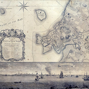
Maybe it’s my cartographic DNA (ancestor and renowned map-maker Christopher Saxton was commissioned by the 16th century Elizabethan court to survey the whole of England and Wales) that makes this feel so thrilling.

Original "Plan of the City of New York"
Alright, “thrilling” may be over the top. But it’s a juicy find, and stirs my designer/illustrator blood.
The story goes that a frail, crisp, tattered map was discovered last May, tucked in with some other old prints at the Brooklyn Historical Society ~ but this particular map happened to be crafted by master surveyor and draftsman Bernard Ratzer (known, according to the NY Times article, as the “DaVinci of New York cartography”). And there are only 3 existing copies of this map.
The map, “Plan of the City of New York”, dates back to 1770. The restoration process itself was a magnificent feat of skill and patience ~ and no doubt involved a good pinch of love and respect as well. (Click on either picture to see full images that can be magnified onscreen.) It’s quite the gem!

Restored "Plan of the City of New York"
………………………….
Of course, I can’t let this writing end without showing one of Christopher Saxton’s pieces. (… maybe I’ll write a little more on him in another post.)

Christopher Saxton / "Map of Cornwall" / 1579

